Slint学习文档
Slint学习文档
- Slint Learn
- 如何学习本文档
- 学习顺序
- 标志
- 说明
- Slint With VSCode
- Slint With Rust
- 依赖
- 👎定义宏
- Slint与Rust分离
- 1.添加编译依赖(slint-build)
- 2.编写slint文件
- 3.编写build.rs
- 4.编写main.rs
- 普通组件
- 主窗体Window
- example
- 文本Text
- example
- 按钮Button
- example
- functions
- 矩形盒子元素 Rectangle
- example
- 输入框TextInput
- example
- 图片Image
- example
- 滚动窗口 Flickable
- example
- 网格布局 GridLayout
- example
- 横纵布局 HorizontalLayout | VerticalLayout
- HorizontalLayout
- VerticalLayout
- 画板 Path
- SVG路径命令和Slint路径命令
- example
- 🚩Flag
- 基础知识
- Slint文件编写顺序与结构
- 正确的代码
- Slint组件结构
- 组件的访问与命名
- 组件的访问
- 标识符(命名规范)
- 命名组件
- 注释
- Slint中的类型
- 颜色
- 线性渐变
- 径向渐变
- 🚩Flag
- 自定义类型
- 结构体
- 匿名结构体
- 枚举
- 数组
- 属性
- 属性可见性
- 自定义属性
- 属性赋值(属性的单向绑定)
- 属性的双向绑定
- private属性访问
- 函数与回调
- 函数
- 回调
- 回调别名
- 条件于循环
- 条件
- 三元表达式
- 循环
- example
- 动画
- 🚩Flag
- 高级知识
- 状态
- example
- 通过状态更改动画
- 插槽
- 模块的导入和导出
- 全局变量
- 导出
- 导出重命名
- 导入
- example
- 🚩Flag
- 高级组件
- 触碰事件区域 TouchArea
- example
- functions
- PointerEvent
- FocusScope
- example
- functions
- KeyEvent
- EventResult
- KeyboardModifiers
- 弹出框 PopupWindow
- example
- functions
- Dialog 对话框
- 生命周期
- 属性速查
- 常用
- 高度 height
- 宽度 width
- 位置 x和y
- 叠放等级 z
- 网格布局 col,row, colspan,rowspan
- 拉伸 horizontal-stretch和vertical-stretch
- 元素的最大大小 max-width和max-height
- 元素的最小大小 min-width和min-height
- 元素的首选尺寸 preferred-width和preferred-height
- 是否显示 visible
- 透明度 opacity
- 加速渲染 cache-rendering-hint 👎
- 阴影半径 drop-shadow-blur
- 阴影颜色 drop-shadow-color
- 阴影位置 drop-shadow-offset-x和drop-shadow-offset-y
- 窗口属性Window Params
- 文字属性Text Params
- TextOverflow
- TextHorizontalAlignment
- TextVerticalAlignment
- TextWrap
- 输入框属性Textnput Params
- InputType
- 图片属性 Image Params
- ImageFit
- ImageRendering
- 滚动窗口 Flickable Params
- 网格布局 GridLayOut
- 横纵布局 HorizontalLayout | VerticalLayout
- LayoutAlignment
- 触碰事件区域 TouchArea
- MouseCursor
- 对话框 Dialog
- 可访问性
- 🚩Flag
Slint Learn
- author:syf20020816@outlook.com
- updateDate:20230902
- github:https://github.com/syf20020816/slint_learn
如何学习本文档
学习顺序
本文档的学习顺序基本上就从上至下的,按照由前到后的顺序依次进行学习知道你遇到这个🚩标志,这个标志将引导你的学习顺序进行改变!
标志
- 🚩:说明学习顺序将发送改变(可能)或提示
- 👎:说明不建议使用
说明
本文档和官方文档是有一定的区别的,并不是翻译官方文档,官方文档中的内容可能会和本文档内容有一定的出入(名词解释、名词称呼、标记等),或许你可以在下表中找到对应。
| 官方 | 本文更名 |
|---|---|
| Builtin Elements | 普通组件 |
| color | Color.color |
| brush | Color.brush |
| physical-length | Length.phx |
| length | Length.size |
| relative-font-size | Length.rem |
| Builtin Elements | 普通组件 |
| Builtin Callbacks | 生命周期 |
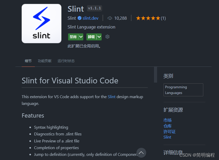
Slint With VSCode
我建议大家使用VSCode进行Slint开发,VSCode提供的插件对Slint十分友好,插件如下:
Slint With Rust
依赖
cargo add slint
👎定义宏
用于定义一个组件,这样就可以再rs文件中进行书写
slint::slint!{}
Slint与Rust分离
实际上更推荐更好的方式应该是slint文件于rs文件的分离
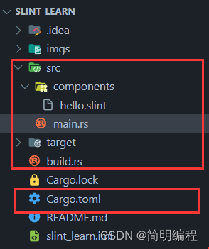
1.添加编译依赖(slint-build)
[package]
name = "slint_learn"
version = "0.1.0"
edition = "2021"[dependencies]
slint = "1.1.1"//添加编译依赖
[build-dependencies]
slint-build = "1.1.1"
2.编写slint文件
export component MainWindow inherits Window {Text{text: "Hello Slint";}
}
3.编写build.rs
fn main() {slint_build::compile("src/components/hello.slint").unwrap();
}
4.编写main.rs
//引入模块
slint::include_modules!();fn main() {MainWindow::new().unwrap().run().unwrap();
}
普通组件
组件需要使用componment进行声明使用export进行导出
主窗体Window
窗体需要继承(inherits)Window
example
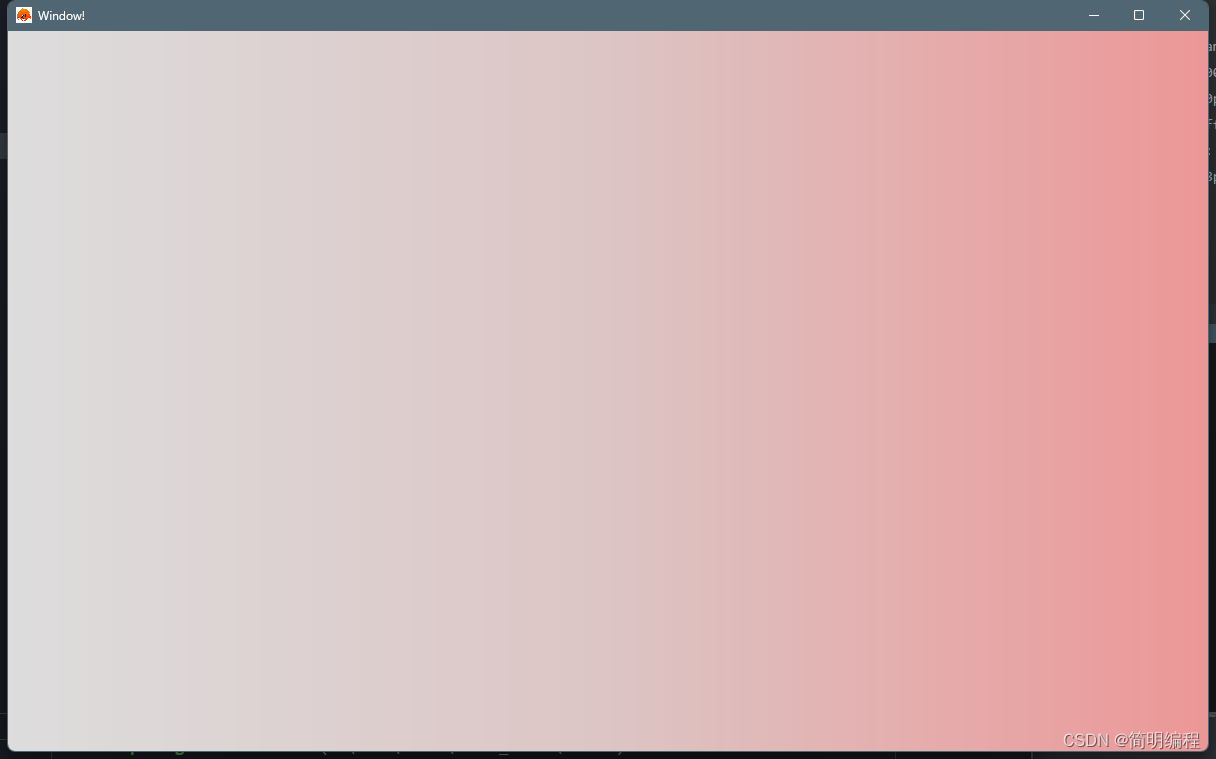
export component MainWindow inherits Window {default-font-family: "Helvetica,Verdana,Arial,sans-serif";default-font-size: 16px;default-font-weight: 700;background: @linear-gradient(90deg,#ddd 0%,#ddc5c5 50%,#ed9797 100%);always-on-top: true;no-frame: false;icon: @image-url("../../imgs/rust.png");title: "Window!";height: 720px;width: 1200px;
}
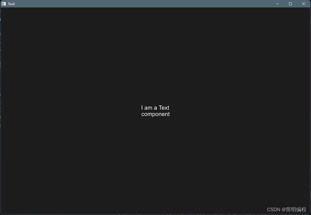
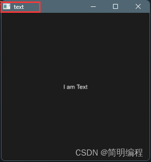
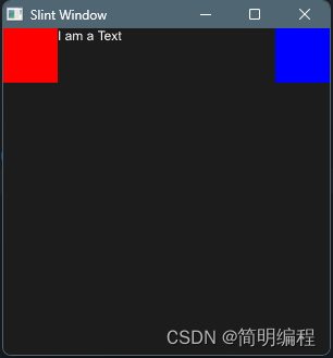
文本Text
example
export component MainWindow inherits Window {height: 720px;width: 1080px;title: "Text!";Text {text: "I am a Text component";height: 200px;width: 100px;//文字换行wrap: word-wrap;color: #fff;font-size: 20px;padding: 8px;letter-spacing: 2px;//横向对齐horizontal-alignment:center;//纵向对齐vertical-alignment: center;overflow: elide;}
}
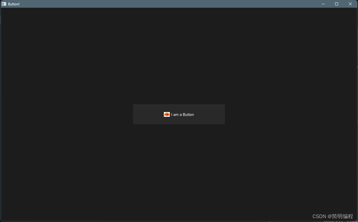
按钮Button
example
import { Button } from "std-widgets.slint";
export component MainWindow inherits Window {height: 720px;width: 1200px;title: "Button!";Button { height: 66px;width: 310px;icon: @image-url("../../imgs/rust.png");text: "I am a Button";clicked => {self.text = "Clicked!";self.width = 360px;}}
}
functions
| 事件名 | 说明 |
|---|---|
| clicked | 按钮点击事件 |
Button { height: 66px;width: 310px;text: "I am a Button";clicked => {self.text = "Clicked!";self.width = 360px;}}
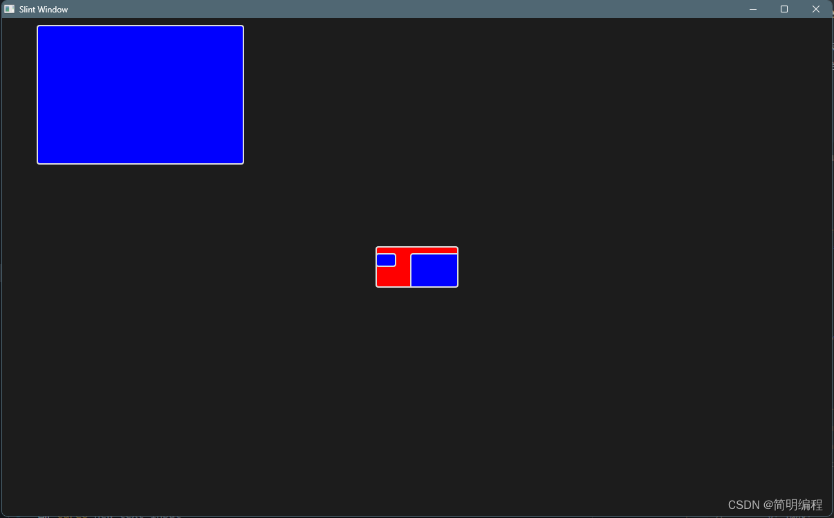
矩形盒子元素 Rectangle
Rectangle只是一个不显示任何内容的空项。通过设置颜色或配置边框,可以在屏幕上绘制矩形。当不是布局的一部分时,其宽度和高度默认为父元素的100%。
example
export component MainWindow inherits Window {height: 720px;width: 1200px;Rectangle {background: red;border-color: #ddd;border-radius: 4px;border-width: 2px;height: 60px;width: 120px;//like overflow clip表示超出容器是否显示clip: true;Rectangle {background: blue;border-color: #ddd;border-radius: 4px;border-width: 2px;height: 20px;width: 30px;x: 0px;y: 10px;}Rectangle {background: blue;border-color: #ddd;border-radius: 4px;border-width: 2px;height: 202px;width: 300px;x: 50px;y: 10px;}}Rectangle {background: blue;border-color: #ddd;border-radius: 4px;border-width: 2px;height: 202px;width: 300px;x: 50px;y: 10px;}
}
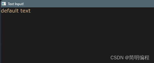
输入框TextInput
这是一种低级输入框,它将直接使用父级容器的宽高,无法自己设置
example
export component MainWindow inherits Window {height: 720px;width: 1200px;title: "Text Input!";TextInput {color: burlywood;font-family: "Verdana";font-size: 18px;font-weight: 400;horizontal-alignment: left;input-type: text;read-only: false;selection-background-color: blue;selection-foreground-color: red;single-line: false;wrap: word-wrap;text: "default text";text-cursor-width:8px;}
}
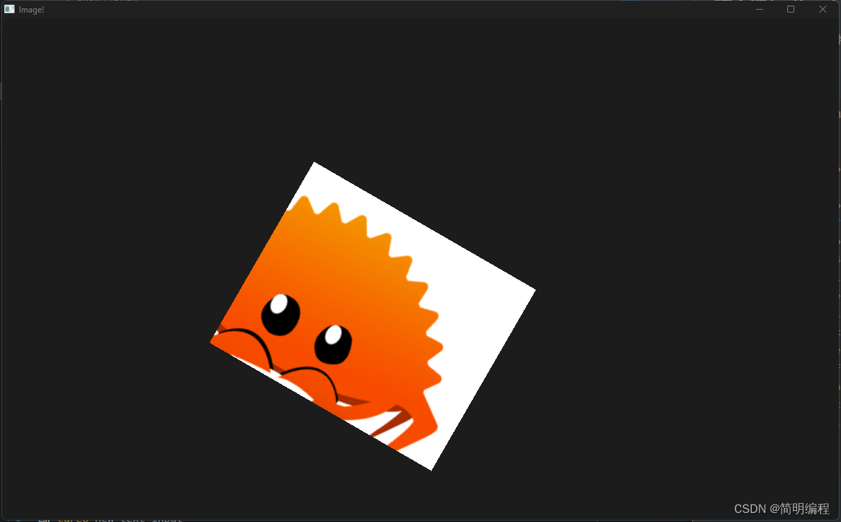
图片Image
example
export component MainWindow inherits Window {height: 720px;width: 1200px;title: "Image!";Image {source: @image-url("../../imgs/rust.png");image-fit:fill;image-rendering: smooth;//设置旋转中心rotation-origin-x: 23px;rotation-origin-y: 56px;rotation-angle: 30deg;source-clip-height: 200;source-clip-x: 100;height: 300px;}
}
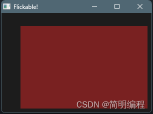
滚动窗口 Flickable
Flickable不是产生一个可滚动的窗口,而是给一个元素增加可滚动的容器。因为他是对于父容器而言,子容器可滚动,而不是使得父容器可滚动
example
export component MainWindow inherits Dialog {height: 200px;width: 300px;title: "Flickable!";Flickable {interactive: true;viewport-height: 300px;viewport-width: 400px;viewport-x: 0px;viewport-y: 0px;Rectangle {height: 200px;width: 300px;background: #792121;}}
}
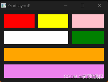
网格布局 GridLayout
使用网格布局下的元素会被添加
- col:所在列
- row:所在行
- colspan:列占比
- rowspan:行占比
这4个属性,通常使用这四个属性进行控制
也可以使用Row{}进行行声明将在同一行的元素全部放在一个Row下
❗值得注意的是:个人认为Slint的网格布局有一定的问题,期待在后续版本中修复 (列占比和所在列需要强指定,弱指定会导致推测错误)
问题如下:
这里的第二行的白色Rectangle列占比应该是2但是显示的却是1,经过叠放检查得出白色盒子的另一半被绿色覆盖,所以弱指定无法推测出绿色盒子实际上应该在第3列,需要手动指定
col:2
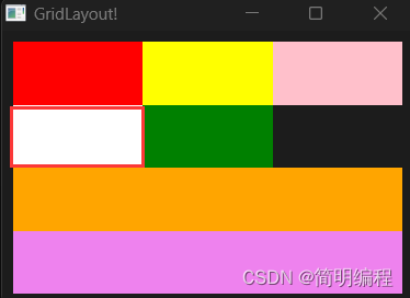
example
export component MainWindow inherits Dialog {height: 200px;width: 300px;title: "GridLayout!";GridLayout {spacing: 10px;padding: 4px;//使用Row进行行声明Row{Rectangle { background: red; }Rectangle { background: yellow;}Rectangle { background: pink; }}Row{Rectangle { background: white; colspan: 2; }Rectangle { background: green; colspan: 1; col: 2;} }Rectangle { background: violet; colspan: 3;row:3;}Rectangle { background: orange; colspan: 3;row:2;}}
}
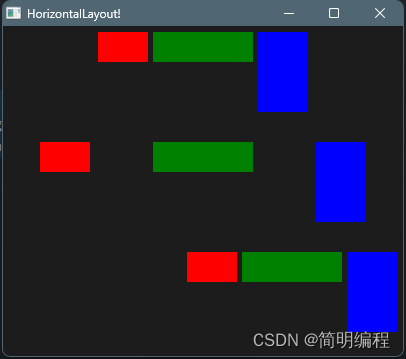
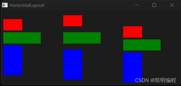
横纵布局 HorizontalLayout | VerticalLayout
通过alignment属性对元素排列方式进行控制。横纵布局常常组合使用相互配合
HorizontalLayout
横向布局即元素全部排列在同一行
export component MainWindow inherits Window {height: 330px;width: 400px;title: "HorizontalLayout!";HorizontalLayout {spacing: 5px;padding: 6px;height: 100px;width: 400px;x: 0px;y: 0px;alignment: center;Rectangle {background: red;height: 30px;width: 50px;}Rectangle {background: green; height: 30px;width: 100px;}Rectangle {background: blue; height: 80px;width: 50px;}}HorizontalLayout {spacing: 5px;padding: 6px;height: 100px;width: parent.width;x: 0px;y: 110px;alignment: space-around;Rectangle {background: red;height: 30px;width: 50px;}Rectangle {background: green; height: 30px;width: 100px;}Rectangle {background: blue; height: 80px;width: 50px;}}HorizontalLayout {spacing: 5px;padding: 6px;height: 100px;width: parent.width;x: 0px;y: 220px;alignment: end;Rectangle {background: red;height: 30px;width: 50px;}Rectangle {background: green; height: 30px;width: 100px;}Rectangle {background: blue; height: 80px;width: 50px;}}
}
VerticalLayout
export component MainWindow inherits Window {height: 200px;width: 480px;title: "HorizontalLayout!";VerticalLayout {spacing: 5px;padding: 6px;height: root.height;width: 150px;x: 0px;y: 0px;alignment: center;Rectangle {background: red;height: 30px;width: 50px;}Rectangle {background: green; height: 30px;width: 100px;}Rectangle {background: blue; height: 80px;width: 50px;}}VerticalLayout {spacing: 5px;padding: 6px;height: root.height;width: 150px;x: 160px;y: 0px;alignment: space-around;Rectangle {background: red;height: 30px;width: 50px;}Rectangle {background: green; height: 30px;width: 100px;}Rectangle {background: blue; height: 80px;width: 50px;}}VerticalLayout {spacing: 5px;padding: 6px;height: root.height;width: 150px;x: 320px;y: 0px;alignment: end;Rectangle {background: red;height: 30px;width: 50px;}Rectangle {background: green; height: 30px;width: 100px;}Rectangle {background: blue; height: 80px;width: 50px;}}
}
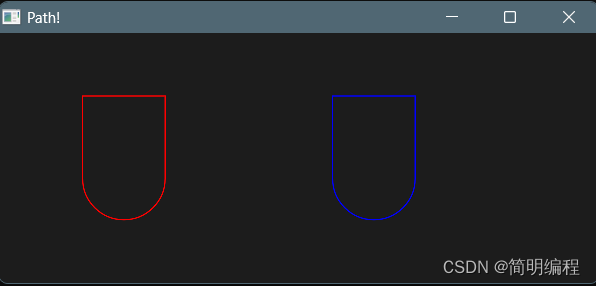
画板 Path
通过描边的方式绘制形状,我称之为画板
- 使用Slint的路径命令进行绘制
- 使用SVG的路径命令进行绘制
SVG路径命令和Slint路径命令
如果指令字母是大写的,例如M, 则表示坐标位置是绝对位置;如果指令字母小写的,例如m, 则表示坐标位置是相对位置。
使用commands属性进行声明(下面以函数形式书写帮助理解):
commands:"M ..."
M(x:float,y:float):MoveTo表示这是一个新的起点,将关闭上一个绘图。例子:M 0 100L(x:float,y:float):LineTo表示从上一个点到当前点,这将绘制一条直线段。例子:L 100 100A(radius_x:float,radius_y:float,large_arc:bool,sweep:bool,x_rotation:float,x:float,y:float):ArcTo-
radius_x : 内切椭圆横长半径
-
radius_y : 内切椭圆纵长半径
-
-
large_arc:在封闭椭圆的两个弧中,此标志选择要渲染较大的弧。如果属性为false,则会呈现较短的弧度
-
sweep:绘制顺时针或逆时针方向(true为顺时针)
-
x_rotation:内切椭圆按照x轴旋转的度数
-
C(control_1_x:float,control_1_y:float,control_2_x:float,control_2_y:float,x:float,y:float):CubicTo,光滑贝塞尔曲线- control_1_x:一号控制点的横坐标,后面也一样,这里不全写了
Q(control_x:float,control_y:float,x:float,y:float):QuadraticTo二次贝塞尔曲线Z():Close关闭当前子路径,从当前位置到起点进行连线
example
export component MainWindow inherits Window {height: 200px;width: 480px;title: "Path!";Path {width: 100px;height: 100px;x: 50px;y: 50px;commands: "M 0 0 L 0 100 A 1 1 0 0 0 100 100 L 100 0 Z";stroke: red;stroke-width: 1px;}Path {width: 100px;height: 100px;stroke: blue;stroke-width: 1px;x: 250px;y: 50px;MoveTo {x: 0;y: 0;}LineTo{x: 0;y: 100;}ArcTo {radius-x: 1;radius-y: 1;x: 100;y: 100;}LineTo {x: 100;y: 0;}Close {}}
}
🚩Flag
当你看到这里的时候,说明你已经把入门篇结束了,接下来为了你可以更好的理解高级组件,请移步到基础知识,学习完基础知识后进行高级组件学习!
基础知识
当你看到这里的时候说明普通组件已经掌握,为了让你无障碍学习高级组件等后续知识请耐心学习基础知识,基础知识中有些名词经过我的修改并非和翻译出的名词名称一致,若发现一个你无法理解的名词请查询说明表。
Slint文件编写顺序与结构
slint文件的编写顺序同js,是从上到下的,这意味着在下方块中的组件需要在上方块中进行定义才能使用(自定义组件),因此下面的代码是错误的!
import { Button } from "std-widgets.slint";
export component MainWindow inherits Window {MyButton{height: 50px;width: 50px;}
}component MyButton inherits Button { text: "My Button";
}
正确的代码
只需要将MyButton的声明移动到前面即可
import { Button } from "std-widgets.slint";component MyButton inherits Button { text: "My Button";
}export component MainWindow inherits Window {MyButton{height: 50px;width: 50px;}
}
Slint组件结构
slint的组件结构为树形结构,每个slint文件都可以定义一个或多个组件
组件的访问与命名
组件的访问
知道组件的结构为树形结构后,显而易见的,我们可以通过树进行组件层级访问,slint显然考虑到了这点,因此在slint中按照以下方式进行组件的层级访问:
root:树根组件,也就是组件的最外层组件,是所有子组件的根self:当前组件,通过self可以直接访问当前自己的所有属性以及方法parent:当前组件的父组件
标识符(命名规范)
和多数其他语言规范相同,由(a~z),(A~Z),(0~9),(_,-)组成,不能以数字或-开头,对于slint,_ 和 -在非开头位置起到规范化名称相同,意思是:my_button == my-button
命名组件
通过使用:=对组件进行命名,以此获取组件的引用!
export component MainWindow inherits Window {height: 300px;width: 300px;text1:=Text {text: "Hello" + num;}
}
注释
//: 单行注释/* ..*/:多行注释
Slint中的类型
❗注意:类型中我进行了些许的修改
| 类型 | 说明 | 默认值 |
|---|---|---|
| int | 有符号整数 | 0 |
| float | 有符号32位浮点数(f32) | 0 |
| bool | 布尔值 | false |
| string | 字符串 | “” |
| Color.color | RGB颜色,带有Alpha通道,每个通道的精度为8位,也可以是16进制色 | transparent |
| Color.brush | 特殊的颜色,可以从基础色进行渐变或更改,使用的更加广泛 | transparent |
| Length.phx | 用于进行单位转换的量,长度 = 整数 * 1phx | 0phx |
| Length.size | 常用长度单位,分为px,pt,in,mm,cm(pt:1/72英寸,in(英寸):2.54cm) | 0px |
| Length.rem | 跟组件字体大小单位 | 0rem |
| duration | 时间单位,用在动画上,分为:ms,s | 0ms |
| angle | 角度单位,多用于旋转,渐变。分为:deg,rad,turn(1turn = 360deg = 2Πrad) | 0deg |
| easing | 动画速率,分为:ease,ease_in,ease_in_out,ease_out,linear)就是常说的缓入缓出,线性 | linear |
| image | 图像,使用@image-url() | 空图像 |
| percent | 带有%的百分数 | 0% |
颜色
普通颜色Color.color和特殊颜色Color.brush是有区别的,brush使用画笔填充元素或画出轮廓。而且brush多了一些方法:
-
brighter(factor: float) -> brush返回从此颜色派生的新颜色,但其亮度增加了指定的系数。 例如,如果因子是0.5(或例如50%),则返回的颜色明亮50%。负面因素 降低亮度。
-
darker(factor: float) -> brush返回从该颜色派生的新颜色,但其亮度已按指定因子降低。 例如,如果因子是.5(或例如50%),则返回的颜色是50%更暗。负面因素 增加亮度。
-
mix(other: brush, factor: float) -> brush返回一个新颜色,它是此颜色和
other,有比例 因子由\一个因子给出(该因子将被限制在0.0和1.0). -
transparentize(factor: float) -> brush返回一个新的颜色,其不透明度减少了
factor. 透明度是通过将alpha通道乘以(1 - factor). -
with_alpha(alpha: float) -> brush返回alpha值设置为
alpha(介于0和1之间)
线性渐变
//语法:
@linear-gradient(渐变角度, 颜色 占比, 颜色 占比, ...);@linear-gradient(90deg, #3f87a6 0%, #ebf8e1 50%, #f69d3c 100%);
径向渐变
//语法
@linear-gradient(circle, 颜色 占比, 颜色 占比, ...);@radial-gradient(circle, #f00 0%, #0f0 50%, #00f 100%);
🚩Flag
在学习自定义类型前请先移步属性进行学习,这将有利于你对自定义属性的理解
自定义类型
结构体
通过自定义结构体就能声明复杂的类型,这通常来说并不能再称之为属性,而是内部数据!(按照作用)但在本文还是称为属性,但请严格进行辨别。
struct User {name:string,age:int,
}export component MainWindow inherits Window {height: 300px;width: 300px;Text {property <User> user:{name:"I am Mat",age:16};text: user.name;}
}
匿名结构体
匿名结构体指的是直接在进行声明而不再外部设置名称的无法被复用的结构体
export component MainWindow inherits Window {height: 300px;width: 300px;Text {property <{name:string,age:int}> user:{name:"I am Mat",age:16};text: user.name;}
}
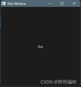
枚举
enum CompoentType{System,Define
}export component MainWindow inherits Window {height: 300px;width: 300px;Text {property <CompoentType> type : CompoentType.System ;text: type == CompoentType.System?"Sys":"Define";}
}
数组
数组的声明非常简单[数据类型]即可,其访问也是使用[索引]进行访问
export component MainWindow inherits Window {height: 300px;width: 300px;property <[color]> colors:[#fff,#dc3b3b,#eee] ;background: colors[1];
}
属性
所有组件都有属性,属性是组件的重要组成部分,属性有默认的也有自定义的,属性有四种访问等级,对应其可见性。
属性可见性
private:只能从组件内部访问,它是默认的in:属性是输入。它可以由该组件的用户设置和修改, 例如通过绑定或通过回调中的分配。 组件可以提供默认绑定,但不能对其进行分配out:只能由组件设置的输出属性,可以被外部获取in-out:公开读写的属性
自定义属性
export component MainWindow inherits Window {in property <int> num1;in-out property <int> num2;out property <int> num3;// property <int> num4private property <int> num4;
}
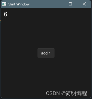
属性赋值(属性的单向绑定)
通过直接在声明的属性后设置值即为属性默认值,同时也代表对属性进行了单向绑定
export component MainWindow inherits Window {in property <int> counter : 10;
}
属性的双向绑定
属性的双向绑定能够响应式的修改属性,通过使用<=>起到双向绑定的效果
private属性访问
通过结合双向绑定和组件命名private属性也是可以被访问的
import { Button } from "std-widgets.slint";
export component MainWindow inherits Window {height: 300px;width: 300px;property <int> root-num <=> text1.num;title: root-num;text1:=Text {x: 0px;y: 0px;property <int> num : 10;text: "Hello" + num;}Button { text: "click here!";clicked => {parent.root-num +=2;}}
}
函数与回调
函数
我们可以在组件中定义一些函数帮助组件进行工作,对于函数而言,它在组件内进行定义,在 Slint 中,如果一个函数在组件的属性定义中被调用,它必须是纯函数,即给定相同的输入参数,始终返回相同的结果。纯函数需要使用pure关键字进行声明,纯函数也被称为一种回调(我这样认为)。
export component MainWindow inherits Window {height: 300px;width: 300px;title: text.get-name();text:=Text {text: "I am Text";property<string> name : "text";pure public function get_name()-> string {self.name;}}
}
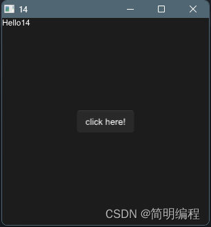
回调
组件可以声明回调,用来传递状态的变化到组件外。
对于回调我们通常需要经过2个步骤进行定义:
- 声明回调:使用
callback关键字进行声明 - 编写回调:使用箭头函数进行声明
回调是特殊的函数,因此回调也可以有入参和返回值,请在回调声明时进行控制
import { Button } from "std-widgets.slint";
component MyBtn inherits Text{in-out property <int> num:0;callback click;click => {self.num += 1;}
}export component MainWindow inherits Window {height: 300px;width: 300px;Button { text: "add 1";clicked => {btn.click()}}btn:=MyBtn {x: 10px;y: 10px;font-size: 20px;text: self.num;}
}
回调别名
回调也可以有别名,可以使用双向绑定的方式设置回调别名
export component Example inherits Rectangle {callback clicked <=> area.clicked;area := TouchArea {}
}
条件于循环
条件
在slint中条件语句的构造和其他语言一样都是if - else if - else
if(条件){}
else if (条件){}
else{}
当然条件也可以使用在构造组件上,用于判断组件状态
if 条件 : 组件
三元表达式
通过三元表达式可以做到条件语句的功能
条件?匹配成功返回值:失败的返回值
循环
通过使用循环可以做到组件复制,其中item是循环对象的中的某个元素(顺序),[index]当前item的索引,个人认为这样的语法较为不妥,我更喜欢如:for (item,index) in 这种
for item[index] in 循环对象
example
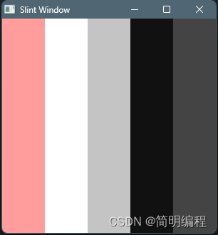
export component MainWindow inherits Window {height: 300px;width: 300px;property <[color]> colors : [#ff9d9d,#fff,#c4c4c4,#111,#444] ;for color[index] in colors:  Rectangle {height: root.height;width: root.width / colors.length;x:self.width *  index; background: color; }
}
动画
通过animate进行定义动画,动画中需要定义的参数如下:
delay:开始动画之前等待的时间量duration:动画完成所需的时间iteration-count:动画应运行的次数。负值指定动画无限重播easing:动画速率,可以linear、ease、ease-in、ease-out、ease-in-out、cubic-bezier(a, b, c, d)
export component MainWindow inherits Window {width: 300px;height: 300px;background: area.pressed ? #fff : red;animate background {duration: 100ms;}area := TouchArea {}
}
🚩Flag
当你看到这里时,说明大部分的基础知识已经掌握,请移步至高级组件进行学习直到下个Flag
高级知识
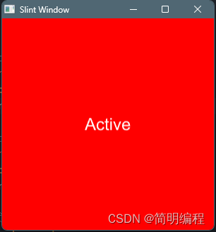
状态
对于组件来说,可以声明多种状态,每种状态的判断规则不同,状态需要使用states[]进行声明,具体语法:
states[状态1 when 条件{}状态2 when 条件{}...
]
example
export component MainWindow inherits Window {width: 300px;height: 300px;default-font-size: 24px;property <bool> active: true;label := Text { }area := TouchArea {clicked => {active = !active;}}states [//声明active-click状态active-click when active && !area.has-hover: {label.text: "Active";root.background: blue;}//声明active-hover状态active-hover when active && area.has-hover: {label.text: "Active Hover";root.background: green;}//声明clicked状态clicked when !active: {label.text: "Clicked";label.color:#000;root.background: #fff;}]
}
通过状态更改动画
这里修改了一下官方的案例,给出两个状态disabled和down,通过使用out 和in关键字向往或内的对动画进行改变,其中*表示通配符(所有)
export component AnStates inherits Window {width: 100px;height: 100px;text := Text { text: "hello"; }in-out property<bool> pressed;in-out property<bool> is-enabled;TouchArea {clicked => {root.is-enabled = !root.is-enabled;root.pressed = !root.pressed}}states [disabled when !root.is-enabled : {background: gray; // same as root.background: gray;text.color: white;out {animate * { duration: 800ms; }}}down when pressed : {background: blue;in {animate background { duration: 300ms; }}}]
}
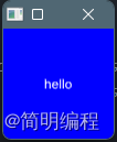
插槽
插槽的用处是可以在组件的某个部位插入所需要的子组件,在slint中使用@children进行指定插入位置
component MyComponent inherits HorizontalLayout {height: 300px;width: 300px;Rectangle {height: 50px;width: 50px;background: red;}@childrenText {text: "I am a Text";}
}export component MainWindow inherits Window {width: 300px;height: 300px;MyComponent {Rectangle {height: 50px;width: 50px;background: blue;}}
}
模块的导入和导出
导入和导出的作用是为了让组件或数据能够更好的复用,因此我们知道这几个关键字:
- global:全局变量
- export:导出
- import:导入
- from:文件地址
全局变量
要让一个属性或结构体或枚举在全局中都可以使用则需要使用global关键字进行定义,这样就能在整个项目中使用了
global MyColors {in-out property <color> red : #e24949;in-out property <color> green : #6de249;in-out property <color> blue : #4989e2;
}export component MainWindow inherits Window {width: 300px;height: 300px;background: MyColors.green;}export { MyColors
}
导出
导出的关键字export导出的方式有以下几种:
export{...}:导出内容,可进行选择export component ...:导出单个export * from "slint file address":导出所有
导出重命名
导出时可以使用as关键字对导出项进行重命名
export {MyColors as DefaultColors};
导入
使用import关键字联合from进行导入模块文件
import {MyColors} from "./colors.slint";
example
import { MyColors } from "./14_global.slint";component Example inherits Window {height: 100px;width: 100px;background: MyColors.red;
}
🚩Flag
当你看到这个标记时请移步至生命周期
高级组件
触碰事件区域 TouchArea
使用TouchArea来控制当它覆盖的区域被触摸或使用鼠标交互时会发生什么。当不是布局的一部分时,其宽度或高度默认为父元素的100%
example
export component Example inherits Window {width: 200px;height: 100px;background: area.pressed?red:blue;area := TouchArea {width: parent.width;height: parent.height;clicked => {root.background = #777}}
}
functions
- clicked():单击时调用,按下鼠标,然后释放此元素。
- moved():鼠标已被移动。只有在按下鼠标时才会调用。
- pointer-event(PointerEvent):按下或松开按钮时调用。
PointerEvent
此结构被生成并传递给TouchArea元素的pointer-event回调。包含字段:
- kind(enum PointerEventKind):事件的类型:以下之一
- down:按下了按钮。
- up:按钮被释放了。
- cancel:另一个元素或窗户抓住了抓斗。这适用于所有按下的按钮,该button与此无关。
- button(enum PointerEventButton):按下或松开的按钮。left、right、middlenone。
FocusScope
FocusScope暴露了回调以拦截关键事件。请注意,FocusScope只会在has-focus时调用它们。
KeyEvent有一个文本属性,这是输入的密钥的字符。当按下不可打印的键时,该字符要么是控制字符,要么被映射到私有Unicode字符。这些不可打印的特殊字符的映射在Key命名空间中可用
example
export component MainWindow inherits Window {width: 300px;height: 300px;text1:=Text {}text2:=Text{y:100px;}FocusScope {TextInput {}key-pressed(e) => {text1.text = "key pressed";accept}key-released(e) => {text2.text = "key released";accept}}}
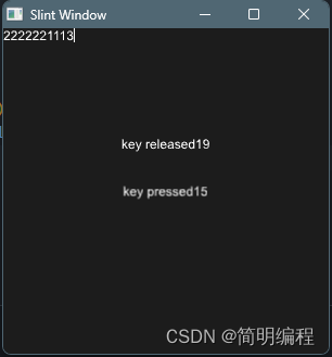
functions
- key-pressed(KeyEvent) -> EventResult:按下键时调用,参数是KeyEvent结构。(只有输入KeyboardModifiers中4种键才调用)
- key-released(KeyEvent) -> EventResult:在释放密钥时调用,参数是KeyEvent结构。(任意输入时都调用)
示例
KeyEvent
此结构被生成并传递给FocusScope元素的按键按下和释放回调。包含字段:
- text(字符串):键的字符串表示
- modifiers(KeyboardModifiers):事件期间按下的键盘修饰符
EventResult
此枚举描述了事件是否被事件处理程序拒绝或接受。
- reject:事件被此事件处理程序拒绝,然后可能由父项处理
- accept:该活动已被接受,将不再进一步处理
KeyboardModifiers
此结构作为KeyEvent的一部分生成,以指示在生成密钥事件期间按下了哪些修饰键。包含字段:
- control(bool):如果按下控制键,则true。在macOS上,这与命令键相对应。
- alt(bool):如果按下alt键,则true。
- shift(bool):如果按下Shift键,则true。
- meta(bool):如果在Windows上按下Windows键,或在macOS上按下控制键,则true。
弹出框 PopupWindow
一种低级的弹出框,无法从外部访问弹出框中的组件
通过show方法显示弹窗
example
import { Button } from "std-widgets.slint";
export component MainWindow inherits Window {width: 300px;height: 300px;popup := PopupWindow {Text {text: "I am Popup";}x: 20px;y: 20px;height: 50px;width: 50px;}Button { text: "Show Popup";clicked => {popup.show()}}
}
functions
- show:显示弹窗
Dialog 对话框
一种对话框,你可能觉得它和弹出框很像,但对话框被限定了,对话框可以具有任意数量的StandardButton或其他具有dialog-button-role属性的按钮。
import { Button , StandardButton} from "std-widgets.slint";
export component MainWindow inherits Dialog {height: 720px;width: 1200px;title: "Dialog!";icon: @image-url("../../imgs/rust.png");//主元素Text {font-size: 30px;text: "This is a dialog";}StandardButton { kind: ok;}StandardButton { kind: cancel;}Button {width: 120px;text: "info";// 假扮成dialog-button元素dialog-button-role: action;}
}
生命周期
每一个组件都有一个init初始化生命周期,表示组件被初始化(渲染)时激活
init => {//init...}
属性速查
常用
高度 height
height: 200px;
宽度 width
width:200px;
位置 x和y
元素相对于其父元素的位置
x:20px;
叠放等级 z
元素在同一级元素中的堆叠次序,默认值为0
z:1111;
网格布局 col,row, colspan,rowspan
Rectangle { background: green; colspan: 1; col: 2;}
拉伸 horizontal-stretch和vertical-stretch
horizontal-stretch: 2;
元素的最大大小 max-width和max-height
max-width:1000px;
元素的最小大小 min-width和min-height
min-width:120px;
元素的首选尺寸 preferred-width和preferred-height
preferred-height:100px;
是否显示 visible
可见性,默认true
visible:false;
透明度 opacity
默认值为1(0是完全透明的,1是完全不透明的)
opacity:0.5;
加速渲染 cache-rendering-hint 👎
默认false
阴影半径 drop-shadow-blur
阴影的模糊程度,默认值为0
drop-shadow-blur:2;
阴影颜色 drop-shadow-color
阴影位置 drop-shadow-offset-x和drop-shadow-offset-y
阴影与元素框架的水平和垂直距离,若为负值,阴影位于元素的左边和上方
drop-shadow-offset-x:2px;
窗口属性Window Params
| 属性 | 说明(类型) | 示例 |
|---|---|---|
| default-font-family | 默认文字类型(String) | default-font-family: “Helvetica,Verdana,Arial,sans-serif”; |
| default-font-size | 默认文字大小(Size) | default-font-size: 16px; |
| default-font-weight | 默认文字粗细(Int) | default-font-weight:700 |
| background | 背景(Color.brush) | background: @linear-gradient(90deg,#ddd 0%,#ddc5c5 50%,#ed9797 100%); |
| always-on-top | 永远处于其他页面上层(Bool) | always-on-top: true; |
| no-frame | 无边框,默认false(Bool) | no-frame: false; |
| icon | 窗口图标(Image) | icon: @image-url(“…/…/imgs/rust.png”); |
| title | 窗口标题(String) | title: “Window!”; |
文字属性Text Params
| 属性 | 说明(类型) | 示例 |
|---|---|---|
| horizontal-alignment | 横向对齐(TextHorizontalAlignment) | default-font-family: “Helvetica,Verdana,Arial,sans-serif”; |
| vertical-alignment | 纵向对齐(TextVerticalAlignment) | default-font-size: 16px; |
| wrap | 文字换行(TextWrap) | default-font-weight:700 |
| overflow | 文字超出策略(TextOverflow) | overflow: elide; |
| font-size | 文字大小(Length.size) | font-size: 20px; |
| color | 文字颜色(Color.color) | color: #fff; |
| font-weight | 文字粗细(Int) | font-weight:700; |
| letter-spacing | 文字间隔大小(Length.size) | letter-spacing:2px; |
| text | 文字内容(String) | text: “I am a Text component”; |
TextOverflow
此枚举描述了如果文本太宽而无法适应Text宽度,文本的显示方式。
- clip:文本将被简单地剪切。
- elide:文本将被省略为…
TextHorizontalAlignment
此枚举描述了文本沿Text元素水平轴对齐的不同类型的内容。
- left:文本将与包含框的左边缘对齐。
- center:文本将在包含框中水平居中。
- right:文本将排列在包含框的右侧。
TextVerticalAlignment
此枚举描述了文本沿Text元素垂直轴对齐的不同类型的内容。
- top:文本将与包含框的顶部对齐。
- center:文本将垂直居中于包含框中。
- bottom:文本将与包含框的底部对齐。
TextWrap
此枚举描述了文本太宽而无法适应Text宽度时如何包装。
- no-wrap:文本不会包装,而是会溢出。
- word-wrap:文本将以单词边界包装。
输入框属性Textnput Params
含有文字属性(Text Param)
| 属性 | 说明(类型) | 示例 |
|---|---|---|
| input-type | 输入框类型(InputType) | input-type: text; |
| read-only | 是否只读(Bool) | read-only: false; |
| selection-background-color | 输入时文字的背景色(Color) | selection-background-color: blue; |
| selection-foreground-color | 输入时文字的颜色(Color) | selection-foreground-color: red; |
| single-line | 是否为单行,即不换行(Bool) | single-line: false; |
| text-cursor-width | 光标的宽度(Length.size) | text-cursor-width:8px; |
InputType
此枚举用于定义输入字段的类型。目前,这只能区分文本和密码输入,但将来可以扩展它,以定义应该显示哪种类型的虚拟键盘,例如。
- text:默认值。这将正常呈现所有字符
- password:这将呈现所有字符,其字符默认为
*
图片属性 Image Params
| 属性 | 说明(类型) | 示例 |
|---|---|---|
| colorize | 覆盖前景色(Color) | colorize:Colors.aliceblue; |
| source | 图像源(Image) | source: @image-url(“…/…/imgs/rust.png”); |
| image-fit | 图片填充类型(ImageFit) | image-fit:fill; |
| image-rendering | 图片缩放方式(ImageRendering) | image-rendering: smooth; |
| rotation-origin-x,rotation-origin-y | 设置旋转中心的位置(Length.size) | rotation-origin-x: 23px; |
| rotation-angle | 旋转角度(angle) | rotation-angle: 30deg; |
| source-clip-height,source-clip-width | 裁剪高度|宽度(Length.size) | source-clip-height: 200; |
| source-clip-x,source-clip-y | 裁剪位置(Length.size) | source-clip-x: 100; |
ImageFit
该枚举定义了源图像如何融入Image元素。
- fill:缩放和拉伸源图像,以适应Image元素的宽度和高度。
- contain:源图像被缩放以适应Image元素的尺寸,同时保留宽高比。
- cover:源图像被缩放以覆盖到Image元素的尺寸,同时保留宽高比。如果源图像的宽高比与元素的宽高比不匹配,那么图像将被裁剪以适合。
ImageRendering
此枚举指定了源图像的缩放方式。
- smooth:使用线性插值算法对图像进行缩放。
- pixelated:使用最近邻算法缩放图像。
滚动窗口 Flickable Params
| 属性 | 说明(类型) | 示例 |
|---|---|---|
| interactive | 输入框类型(InputType) | interactive: true; |
| viewport-height,viewport-width | 滚动窗口大小(Length.size) | viewport-height: 300px; |
| viewport-x,viewport-y | 子元素相对滚动窗口的位置(Length.size) | viewport-x: 0px; |
网格布局 GridLayOut
| 属性 | 说明(类型) | 示例 |
|---|---|---|
| spacing | 元素间距(Length.size) | spacing: 10px; |
| padding(left,right,top,bottom) | 布局内边距(Length.size) | padding: 4px; |
横纵布局 HorizontalLayout | VerticalLayout
| 属性 | 说明(类型) | 示例 |
|---|---|---|
| spacing | 元素间距(Length.size) | spacing: 10px; |
| padding(left,right,top,bottom) | 布局内边距(Length.size) | padding: 4px; |
| alignment | 元素排列对齐方式(LayoutAlignment) | alignment: end |
LayoutAlignment
表示HorizontalBox、VerticalBox、HorizontalLayout或VerticalLayout的对齐属性的枚举。
- stretch:使用布局中所有元素的最小大小,根据元素拉伸属性在所有元素之间分配剩余空间。
- center:使用所有元素的首选大小,在第一个元素之前和最后一个元素之后均匀分布剩余空间。
- start:使用所有元素的首选大小,将剩余空间放在最后一个元素之后。
- end:对所有元素使用首选大小,将剩余空间放在第一个元素之前。
- space-between:对所有元素使用首选大小,在元素之间均匀地分配剩余空间。
- space-around:使用所有元素的首选大小,在第一个元素之前、最后一个元素之后和元素之间均匀分布剩余空间。
触碰事件区域 TouchArea
| 属性 | 说明(类型) | 示例 |
|---|---|---|
| has-hover | 鼠标接触事件(out Bool) | |
| mouse-cursor | 鼠标悬停事件(TouchArea) | |
| mouse-x,mouse-y | 鼠标在TouchArea中的位置 | |
| pressed-x,pressed-y | 鼠标上次按下时在TouchArea的位置 | |
| pressed | 鼠标长按事件(out bool) |
MouseCursor
这个枚举表示不同类型的鼠标光标。它是CSS中可用的鼠标光标的子集。有关详细信息和象形图,请参阅光标的MDN文档。根据后端和使用的操作系统,单向调整大小光标可能会被双向光标取代。
- default:系统默认光标。
- none:没有显示光标。
- help:指示帮助信息的光标。
- pointer:指向链接的指针。
- progress:该程序很忙,但仍然可以与之互动。
- wait:程序很忙。
- crosshair:十字准线。
- text:指示可选择文本的光标。
- alias:正在创建别名或快捷方式。
- copy:正在创建副本。
- move:有些东西需要移动。
- no-drop:有些东西不能在这里掉落。
- not-allowed:不允许采取行动
- grab:有些东西是可抓的。
- grabbing:有东西被抓住了。
- col-resize:表示一列可以水平调整大小。
- row-resize:表示一行可以垂直调整大小。
- n-resize:单向向向北调整。
- e-resize:单向向东调整大小。
- s-resize:单向向调整南尺寸。
- w-resize:单向西调整大小。
- ne-resize:单向调整东北方向的大小。
- nw-resize:单向调整西北大小。
- se-resize:东南方向调整大小。
- sw-resize:单向调整西南大小。
- ew-resize:东西方向双向调整大小。
- ns-resize:双向调整大小。
- nesw-resize:双向调整东北-西南的大小。
- nwse-resize:双向调整西北-东南方向的大小。
对话框 Dialog
| 属性 | 说明(类型) | 示例 |
|---|---|---|
| icon | 窗口图标(Image) | |
| title | 窗口标题(String) |
可访问性
我认为这是一种特性并不算属性
- accessible-role:元素角色(大多数元素默认为none,但文本元素为text)
- accessible-checkable:是否可以选中元素
- accessible-checked:是否选中了元素——对应复选框、单选按钮和其他小部件的“已选中”状态
- accessible-description:当前元素的描述
- accessible-has-focus:当当前元素当前具有焦点时,设置为true。
- accessible-label:交互式元素的标签(大多数元素默认为空,或文本元素的text属性值)
- accessible-value-maximum:最大值
- accessible-value-minimum:最小值
- accessible-value-step:当前值可以改变的最小增量
- accessible-value:当前值。
🚩Flag
当你看到这个标记时说明你已经完成了slint的85%的学习,接下来的15%请查看系统自定义组件.md文档,该文档的发布日期为20230904
相关文章:
Slint学习文档
Slint学习文档 Slint Learn如何学习本文档学习顺序标志说明 Slint With VSCodeSlint With Rust依赖👎定义宏 Slint与Rust分离1.添加编译依赖(slint-build)2.编写slint文件3.编写build.rs4.编写main.rs 普通组件主窗体Windowexample 文本Texte…...
【最新!七麦下载量analysis参数】逆向分析与Python实现加密算法
文章目录 1. 写在前面2. 请求分析3. 加密分析4. 算法实现 1. 写在前面 之前出过一个关于榜单analysis的分析,有兴趣的可以查看这篇文章:七麦榜单analysis加密分析 最近运营团队那边有同事找到我们,说工作中偶尔需要统计分析一下某APP在一些主…...
)
蓝桥杯练习题(3的倍数)
问题描述 小蓝对 3 的倍数很感兴趣。现在他手头有三个不同的数 a,b,c, 他想知道, 这三个数中是不是有两个数的和是 3 的倍数。 例如, 当 a3,b4,c6 时, 可以找到 a 和 c 的和是 3 的倍数。 例如, 当 a3,b4,c7 时, 没办法找到两个数的和是 3 的倍数。 输入格式 输入三行, 每行…...

安装Qe-7.2细节
编译 直接编译报错,发现要使用gpu加速。 检查linux的GPU: nvidia-smi lspci |grep -i nvidia module load cuda ./configure make all 安装curl mkdir build cd build …/configure --prefix/home/bin/local/curl make make install 加入路径: expor…...
3.运行项目
克隆项目 使用安装的git克隆vue2版本的若依项目,博主使用的版本是3.8.6. git clone https://gitee.com/y_project/RuoYi-Vue.git目录结构如下图所示,其中ruoyi-ui是前端的内容,其它均为后端的内容。 配置mysql数据库 在数据库里新建一个…...

【算法题】2651. 计算列车到站时间
题目: 给你一个正整数 arrivalTime 表示列车正点到站的时间(单位:小时),另给你一个正整数 delayedTime 表示列车延误的小时数。 返回列车实际到站的时间。 注意,该问题中的时间采用 24 小时制。 示例 1…...
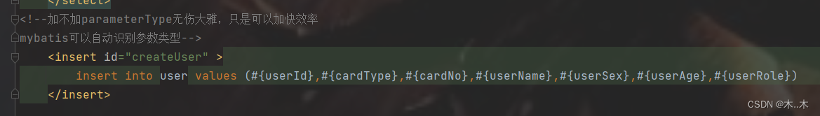
Mybatis传递实体对象只能直接获取,不能使用对象.属性方式获取
mybatis的自动识别参数功能很强大,pojo实体类可以直接写进mapper接口里面,不需要在mapper.xml文件中添加paramType,但是加了可以提高mybatis的效率 不加Param注解,取值的时候直接写属性 //这里是单参数,可以不加param!…...
flink 写入数据到 kafka 后,数据过一段时间自动删除
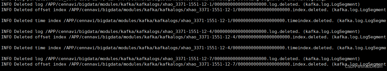
版本 flink 1.16.0kafka 2.3 流程描述: flink利用KafkaSource,读取kafka的数据,然后经过一系列的处理,通过KafkaSink,采用 EXACTLY_ONCE 的模式,将处理后的数据再写入到新的topic中。 问题描述࿱…...
golong基础相关操作--一
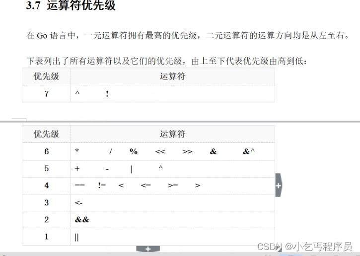
package main//go语言以包作为管理单位,每个文件必须先声明包 //程序必须有一个main包 // 导入包,必须要要使用 // 变量声明了,必须要使用 import ("fmt" )/* * 包内部的变量 */ var aa 3var ss "kkk"var bb truevar …...
【深度学习】基于卷积神经网络的铁路信号灯识别方法
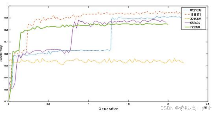
基于卷积神经网络的铁路信号灯识别方法 摘 要:1 引言2 卷积神经网络模型2.1 卷积神经网络结构2.2.1 卷积层2.2.2 池化层2.2.3 全连接层 3 卷积神经网络算法实现3.1 数据集制作3.2 卷积神经网络的训练过程3.2.1 前向传播过程 4 实验5 结语 摘 要: 目前中…...

DR IP-SoC China 2023 Day演讲预告 | 龙智Perforce专家解析芯片开发中的数字资产管理
2023年9月6日(周三),龙智即将亮相于上海举行的D&R IP-SoC China 2023 Day,呈现集成了Perforce与Atlassian产品的芯片开发解决方案,助力企业更好、更快地进行芯片开发。 D&R IP-SoC China 2023 Day 是中国首个…...

解决github连接不上的问题
改 hosts 我们在浏览器输入 GitHub 的网址时,会向 DNS 服务器发送一个请求,获取到 GitHub 网站所在的服务器 IP 地址,从而进行访问。 就像你是一名快递员,在送快递前要先找中间人询问收件人的地址。而 DNS 就是这个告诉你目标地址…...

# DevOps名词定义梳理
DevOps名词定义梳理 极限编程座右铭:如果它令你很受伤,那么就做更多的练习(If it hurts, do it more often) 经常人们会把这些名词用错: 构建:就是把源代码制成成品的过程,这个过程一般会有单元…...

Redis Cluster
文章目录 一、集群搭建1 节点规划2 集群启动 二、配置一致性1 基本分工2 更新规则 三、Sharding1 数据分片分片实现分片特点 2 slot迁移迁移原因迁移支持集群扩容迁移错误背景现象问题分析验证猜想 集群缩容 3. 请求路由client端server端migrating节点的读写importing节点的读写…...
Pandas常用指令
astype astype的作用是转换数据类型,astype是没办法直接在原df上进行修改的,只能通过赋值的形式将原有的df进行覆盖,即df df.astype(dtype) astype的基本语法 DataFrame.astype(dtype, copyTrue, errorsraise) dtype参数指定将数据类型转换…...

FPGA实战小项目3
基于FPGA的波形发生器 基于FPGA的波形发生器 基于FPGA的beep音乐播放器设计 基于FPGA的beep音乐播放器设计 基于FPGA的cordic算法实现DDS sin和cosine波形的产生 基于FPGA的cordic算法实现DDS sin和cosine波形的产生...
mysql创建用户
创建用户 创建 -- 创建用户 itcast , localhost只能够在当前主机localhost访问, 密码123456; create user test01localhost identified by 123456;使用命令show databases;命令,只显示一个数据库,因为没有权限 -- 创建用户 test02, 可以在任意主机访问…...
程序员写好简历的5个关键点
程序员就业竞争大?找不到工作?也许,从简历开始你就被淘汰了.... 在很多的公司中,HR的招聘压力是很大的,浏览每个人的简历的时间可能只有20几秒,所以即使你的工作能力十分的强,但如果你没有在简…...

Vue:关于如何配置一级路由和二级路由的方法
路由的嵌套配置 文章目录 路由的嵌套配置配置一级路由 配置一级路由 创建router文件夹,里面添加index.js文件配置以下代码: import Vue from vue import VueRouter from "vue-router"; import Layout from /views/Layout import ArticleDeta…...
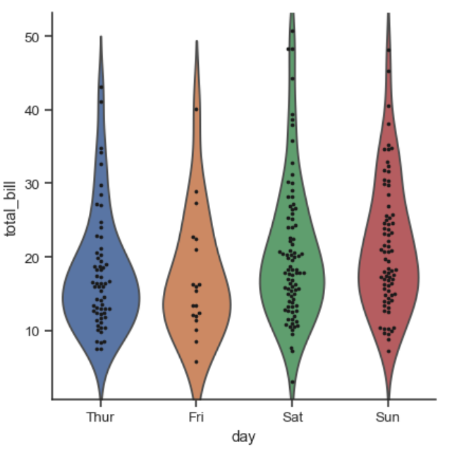
【论文绘图】seaborn分类数据绘图
参考:https://seaborn.pydata.org/tutorial/categorical.html 分类变量关系图中的catplot类似于连续变量中的relplot,默认是stripplot。 分类变量图种类 分类散点图 stripplotswarmplot (kind‘swarm’) 类别分布图 boxplotviolinplotboxenplot …...

ShardingSphere-Proxy 5.2 容器化部署与开发调试实战指南
1. 为什么选择ShardingSphere-Proxy 5.2作为开发调试工具 在分库分表场景下开发应用时,最让人头疼的就是数据查询和调试问题。想象一下,你的订单数据被分散在4个库的8张表中,每次测试时想确认数据是否正确写入,都得手动连接不同数…...
RPA 在电力业扩报装中的自动化应用与实现)
大数据在电力行业应用案例解析 -【电力技术】(25)RPA 在电力业扩报装中的自动化应用与实现
目录 一、引言:业扩报装的效率瓶颈 二、RPA 技术特点与电力适用性 三、RPA 在业扩报装中的四大核心应用场景 3.1 预受理自动审核 3.2 批量用户信息自动导入 3.3 勘查工单自动派工 3.4 流程自动流转与归档 四、RPA 实施流程(标准化) 五、典型应用成效 六、完整可运行…...

突破方舟生存进化技术壁垒的智能管理工具
突破方舟生存进化技术壁垒的智能管理工具 【免费下载链接】TEKLauncher Launcher for ARK: Survival Evolved 项目地址: https://gitcode.com/gh_mirrors/te/TEKLauncher 你是否曾因MOD安装顺序错误导致游戏频繁崩溃?是否在搭建私人服务器时被端口配置弄得晕…...

如何免费使用Pyfa:EVE Online舰船配置终极实用指南
如何免费使用Pyfa:EVE Online舰船配置终极实用指南 【免费下载链接】Pyfa Python fitting assistant, cross-platform fitting tool for EVE Online 项目地址: https://gitcode.com/gh_mirrors/py/Pyfa Pyfa(Python Fitting Assistant)…...

IP被封禁?5招快速恢复访问权限
使用网站或平台时,如果你突然遇到“Your IP has been banned(您的IP已被封禁)”的提示,通常意味着该平台已经限制了你当前网络的访问权限。很多人第一反应是账号出问题,但实际上,IP封禁针对的是网络环境&am…...

AI模型版本控制:Git for ML最佳实践
当软件测试遇上AI模型迭代对于软件测试从业者而言,版本控制是保障软件质量、实现可追溯性的基石。然而,当测试对象从传统的功能模块转变为动态演进的AI模型时,版本管理的复杂性陡然增加。一个推荐模型本周表现优异,下周却因数据漂…...
)
【2026年最新600套毕设项目分享】基于springboot+vue的无人机共享管理系统(14299)
有需要的同学,源代码和配套文档领取,加文章最下方的名片哦 一、项目演示 项目演示视频 二、资料介绍 完整源代码(前后端源代码SQL脚本)配套文档(LWPPT开题报告/任务书)远程调试控屏包运行一键启动项目&…...

Ubuntu20.04下ROS2与MoveIt2环境配置全攻略:从虚拟环境到避坑指南
Ubuntu 20.04下ROS2与MoveIt2环境配置实战指南 机器人操作系统(ROS)作为现代机器人开发的基石,其第二代的ROS2凭借更强大的实时性和分布式架构,正在成为工业界和学术界的新宠。而MoveIt2作为ROS2中的运动规划框架,为机…...
)
超越rviz_satellite:用Mapviz实现高精度SLAM地图与卫星图叠加(附开源数据集测试)
超越rviz_satellite:用Mapviz实现高精度SLAM地图与卫星图叠加(附开源数据集测试) 当自动驾驶车辆在复杂城市环境中穿行,或是无人机在未知区域执行勘探任务时,将实时构建的SLAM地图与卫星影像精准叠加,已成…...

电视盒子播放视频总出错?TVBoxOSC让所有格式文件流畅播放
电视盒子播放视频总出错?TVBoxOSC让所有格式文件流畅播放 【免费下载链接】TVBoxOSC TVBoxOSC - 一个基于第三方项目的代码库,用于电视盒子的控制和管理。 项目地址: https://gitcode.com/GitHub_Trending/tv/TVBoxOSC 你是否遇到过电视盒子播放视…...