qml入门
window
import QtQuick 2.15
import QtQuick.Window 2.15
import QtQuick.Controls 2.5Window { //root控件,父窗口是主界面width: 640height: 480visible: true//相对于父控件的偏移量x: 100y:100minimumWidth: 400   //最小宽度minimumHeight: 300  //最小高度maximumWidth: 600   //最大宽度maximumHeight: 450  //最大高度opacity: 0.9 //0-1,窗口透明度onWidthChanged: {console.log("width: ", width)}Button {id: btn1width: 80height: 80focus: trueobjectName: "btn1"background: Rectangle {border.color: btn1.focus ? "blue" : "red"}onClicked: {console.log("btn1 clicked")}Keys.onRightPressed: {btn2.focus = true}}Button {id: btn2x: 120width: 80height: 80objectName: "btn2"background: Rectangle {border.color: btn2.focus ? "blue" : "red"}onClicked: {console.log("btn2 clicked")}Keys.onLeftPressed: {btn1.focus = true}}//保存了整个窗口中当前获取焦点的控件onActiveFocusItemChanged: {console.log("active focus item changed", activeFocusItem, activeFocusItem.objectName)}title: qsTr("my qml")
}

Item与Rectangle
Rectangle控件:自身属性不多,但它继承自Item,因此Item的诸多属性可以使用
focus属性
import QtQuick 2.15
import QtQuick.Window 2.15
import QtQuick.Controls 2.5Window {width: 640height: 480visible: truetitle: qsTr("my qml")Rectangle {x: 100y: 100z: 1width : 100height: 50color: "red"focus: false  //当前控件可获取焦点MouseArea {anchors.fill: parentonClicked: {console.log("on clicked")}}Keys.onReturnPressed: {console.log("on return pressed")}}Rectangle {x: 120y: 120width : 100height: 50color: "green"}
}
anchor属性
anchors.fill→ \to →填充父控件
import QtQuick 2.15
import QtQuick.Window 2.15
import QtQuick.Controls 2.5Window {width: 640height: 480visible: truetitle: qsTr("my qml")Rectangle {id: rect1anchors.fill: parentcolor: "red"}Rectangle {id: rect2width : 100height: 50color: "green"}
}

anchors.left、anchors.leftMargin、anchors.top、anchors.topMargin
import QtQuick 2.15
import QtQuick.Window 2.15
import QtQuick.Controls 2.5Window {width: 640height: 480visible: truetitle: qsTr("my qml")Rectangle {id: rect1width : 100height: 50color: "red"}Rectangle {id: rect2width : 100height: 50anchors.left: rect1.rightanchors.leftMargin: 20color: "green"}Rectangle {id: rect3width : 100height: 50anchors.top: rect1.bottomanchors.topMargin: 20color: "blue"}
}

3. anchors.centerIn、anchors.horizontalCenter、anchors.verticalCenter
import QtQuick 2.15
import QtQuick.Window 2.15
import QtQuick.Controls 2.5Window {width: 640height: 480visible: truetitle: qsTr("my qml")Rectangle {id: rect1width : 100height: 50color: "red"//anchors.centerIn: parentanchors.horizontalCenter: parent.horizontalCenteranchors.verticalCenter: parent.verticalCenter}
}

4. border
import QtQuick 2.15
import QtQuick.Window 2.15
import QtQuick.Controls 2.5Window {width: 640height: 480visible: truetitle: qsTr("my qml")Rectangle {id: rect1x: 320y: 240width : 100height: 100color: "red"border.color: "blue"border.width: 3radius: 5}
}

5. gradient
import QtQuick 2.15
import QtQuick.Window 2.15
import QtQuick.Controls 2.5Window {width: 640height: 480visible: truetitle: qsTr("my qml")Rectangle {id: rect1x: 320y: 240width : 100height: 100color: "red"gradient: Gradient {GradientStop { position: 0.0; color: "lightsteelblue" }GradientStop { position: 1.0; color: "blue" }}}
}

Rectangle自定义边框
main.qml
import QtQuick 2.15
import QtQuick.Window 2.15
import QtQuick.Controls 2.5Window {width: 640height: 480visible: truetitle: qsTr("my qml")MyRectangle {x: 200y: 200myTop: 10myBottom: 10}
}
MyRectangle.qml
import QtQuick 2.15Rectangle {id: borderRectproperty int myTop: 0property int myBottom: 0width: 200height: 100color: "red"Rectangle {id: innerRectcolor: "blue"anchors.fill: parentanchors.topMargin: myTopanchors.bottomMargin: myBottomanchors.leftMargin: 5anchors.rightMargin: 5}
}

states与transitions
Item的两个重要属性:states与transitions
状态机states
import QtQuick 2.15
import QtQuick.Window 2.15
import QtQuick.Controls 2.5Window {width: 640height: 480visible: truetitle: qsTr("my qml")Rectangle {id: rootwidth: 100; height: 100color: "blue"state: "normal"states: [State {name: "red_color"PropertyChanges { target: root; color: "red"; width: 200 }},State {name: "blue_color"PropertyChanges { target: root; color: "blue"; height: 200 }},State {name: "normal"PropertyChanges { target: root; color: "black"; height: 200; width: 200 }}]MouseArea {anchors.fill: parentonPressed: {root.state = "red_color"}onReleased: {root.state = "blue_color"}}}
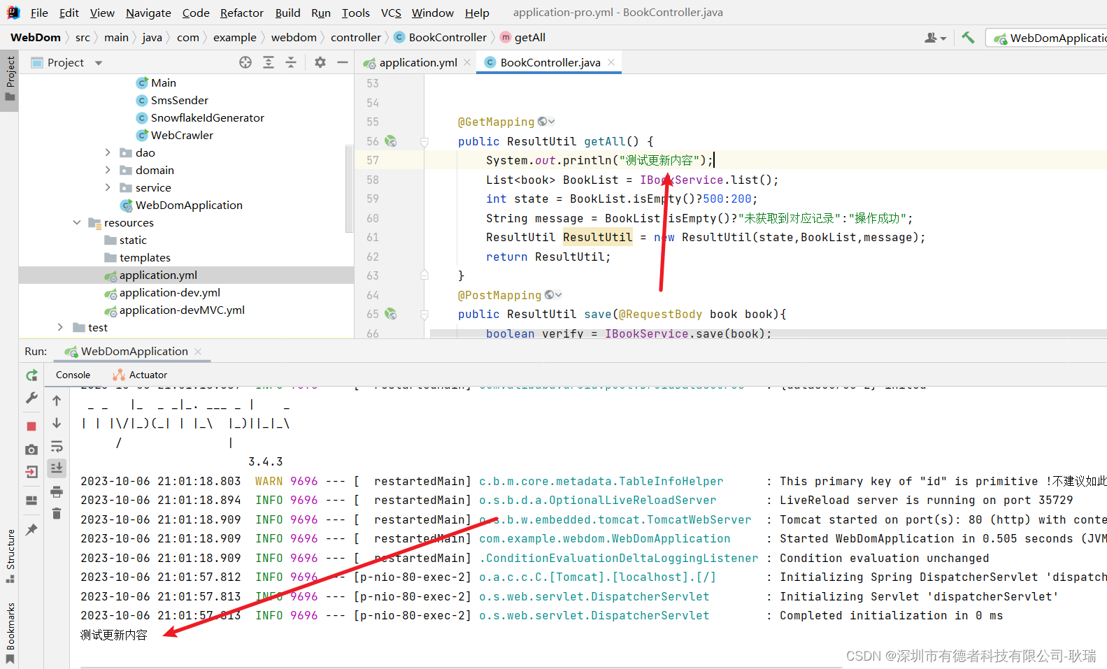
}
transitions
- 第一种方法:直接属性动画
点击控件产生渐变效果
import QtQuick 2.15
import QtQuick.Window 2.15
import QtQuick.Controls 2.5Window {width: 640height: 480visible: truetitle: qsTr("my qml")Rectangle {id: flashingblobwidth: 75; height: 75color: "blue"opacity: 1.0MouseArea {anchors.fill: parentonClicked: {animateColor.start()animateOpacity.start()}}PropertyAnimation {id: animateColortarget: flashingblobproperties: "color"to: "green"duration: 1000   //持续时间(ms)}NumberAnimation {id: animateOpacitytarget: flashingblobproperties: "opacity"from: 0.5to: 1.0duration: 1000   //持续时间(ms)}}
}
点击控件产生伸长效果
import QtQuick 2.15
import QtQuick.Window 2.15
import QtQuick.Controls 2.5Window {width: 640height: 480visible: truetitle: qsTr("my qml")Rectangle {id: flashingblobwidth: 75; height: 75color: "blue"opacity: 1.0MouseArea {anchors.fill: parentonClicked: {animateOpacity.start()}}NumberAnimation {id: animateOpacitytarget: flashingblobproperties: "width"from: 75to: 150duration: 3000   //持续时间(ms)}}
}
- 第二种方法:使用预定义的目标与属性
import QtQuick 2.15
import QtQuick.Window 2.15
import QtQuick.Controls 2.5Window {width: 640height: 480visible: truetitle: qsTr("my qml")Rectangle {id: rectwidth: 100; height: 100color: "red"PropertyAnimation on x { //修改当前控件的位置to: 100duration: 1000}PropertyAnimation on y {to: 100duration: 1000}}
}
还可以定义动画的执行顺序
import QtQuick 2.15
import QtQuick.Window 2.15
import QtQuick.Controls 2.5Window {width: 640height: 480visible: truetitle: qsTr("my qml")Rectangle {width: 100; height: 100color: "red"SequentialAnimation on color {ColorAnimation { to: "yellow"; duration: 1000 }ColorAnimation { to: "blue"; duration: 1000 }}}
}
- 第三种:在状态改变的时候做动画
import QtQuick 2.15
import QtQuick.Window 2.15
import QtQuick.Controls 2.5Window {width: 640height: 480visible: truetitle: qsTr("my qml")Rectangle {width: 75; height: 75id: buttonstate: "RELEASED"MouseArea {anchors.fill: parentonPressed: button.state = "PRESSED"onReleased: button.state = "RELEASED"}states: [State {name: "PRESSED"PropertyChanges { target: button; color: "lightblue"}},State {name: "RELEASED"PropertyChanges { target: button; color: "lightsteelblue"}}]transitions: [Transition {from: "PRESSED"to: "RELEASED"ColorAnimation { target: button; duration: 1000 }},Transition {from: "RELEASED"to: "PRESSED"ColorAnimation { target: button; duration: 1000 }}]}
}
- 第四种:预定好行为
import QtQuick 2.15
import QtQuick.Window 2.15
import QtQuick.Controls 2.5Window {width: 640height: 480visible: truetitle: qsTr("my qml")Rectangle {width: 75; height: 75; radius: widthid: ballcolor: "salmon"MouseArea {anchors.fill: parentonClicked: {ball.x += 50ball.y += 50}}Behavior on x {NumberAnimation {id: bouncebehavioreasing {type: Easing.OutElasticamplitude: 1.0period: 0.5}}}Behavior on y {animation: bouncebehavior}Behavior {ColorAnimation { target: ball; duration: 100 }}}
}
Component和Loader
qml中window组件也是一个Component
import QtQuick 2.15
import QtQuick.Window 2.15
import QtQuick.Controls 2.5Window {width: 640height: 480visible: truetitle: qsTr("my qml")Component.onCompleted: {console.log("onCompleted", width, height, color)}Component.onDestruction: {console.log("onDestruction")}
}
Component与Loader配合使用加载控件,在加载控件完成后想对控件进行修改,可使用loader.item属性对控件进行修改
import QtQuick 2.15
import QtQuick.Window 2.15
import QtQuick.Controls 2.5Window {width: 640height: 480visible: truetitle: qsTr("my qml")Button {id: btnx: 200; y:0width: 50; height: 50onClicked: {//loader.sourceComponent = nullloader.item.width = 50loader.item.height = 50loader.item.color = "blue"console.log("onClicked")}}Component {id: comRectangle {width: 100; height: 100color: "red"}}Loader {id: loaderasynchronous: true     //异步加载sourceComponent: comsource: "./MyRectangle.qml"onStatusChanged: {console.log("status: ", loader.status)}}
}
加载图片
import QtQuick 2.15
import QtQuick.Window 2.15
import QtQuick.Controls 2.5Window {width: 640height: 480visible: truetitle: qsTr("my qml")Component {id: comImage {id: imgsource: "./asset/image.png"}}Loader {id: loaderasynchronous: truesourceComponent: comsource: "./MyRectangle.qml"onStatusChanged: {console.log("status: ", loader.status)}}
}

加载动图
import QtQuick 2.15
import QtQuick.Window 2.15
import QtQuick.Controls 2.5Window {width: 640height: 480visible: truetitle: qsTr("my qml")Component {id: comAnimatedImage {id: imgsource: "/asset/test.gif"width: 100height: 100}}Loader {id: loaderasynchronous: truesourceComponent: comsource: "./MyRectangle.qml"onStatusChanged: {console.log("status: ", loader.status)}}
}
MouseArea组件
MouseArea也是继承自Item
acceptedButtons属性
import QtQuick 2.15
import QtQuick.Window 2.15
import QtQuick.Controls 2.5Window {width: 640height: 480visible: truetitle: qsTr("my qml")MouseArea {id: mouseAreawidth: 100height: 100acceptedButtons: Qt.LeftButton | Qt.RightButton //支持左键和右键Rectangle {anchors.fill: parentcolor: "green"}onClicked: {console.log("onClicked")}onReleased: {console.log("onReleased")}onPressed: {var ret = pressedButtons & Qt.LeftButtonvar ret2 = pressedButtons & Qt.RightButtonconsole.log(ret ? "left" : ret2 ? "right" : "other")console.log("onPressed")}}
}
containsMouse属性、ContainsPress属性
import QtQuick 2.15
import QtQuick.Window 2.15
import QtQuick.Controls 2.5Window {width: 640height: 480visible: truetitle: qsTr("my qml")MouseArea {id: mouseAreawidth: 100height: 100acceptedButtons: Qt.LeftButton | Qt.RightButton //支持左键和右键hoverEnabled: true    cursorShape: Qt.CrossCursor   //十字光标Rectangle {anchors.fill: parentcolor: "green"}onClicked: {console.log("onClicked")}onHoveredChanged: {console.log("onHoveredChanged")}onContainsMouseChanged: {console.log("onContainsMouseChanged", containsMouse)}onContainsPressChanged: {console.log("onContainsPressed", containsPress)}}
}
drag属性
拖动控件移动
import QtQuick 2.15
import QtQuick.Window 2.15
import QtQuick.Controls 2.5Window {width: 640height: 480visible: truetitle: qsTr("my qml")Rectangle {id: containerwidth: 600; height: 200Rectangle {id: rectwidth: 50; height: 50color: "red"opacity: (600.0 - rect.x) / 600MouseArea {anchors.fill: parentdrag.target: rectdrag.axis: Drag.XAxisdrag.minimumX: 0drag.maximumX: container.width - rect.width}}}
}
连同子控件一起移动,由drag.filterChildren所控制
import QtQuick 2.15
import QtQuick.Window 2.15
import QtQuick.Controls 2.5Window {width: 640height: 480visible: truetitle: qsTr("my qml")Rectangle {width: 480height: 320Rectangle {x: 30; y: 30width: 300; height: 240color: "lightsteelblue"MouseArea {anchors.fill: parentdrag.target: parent;drag.axis: "XAxis"drag.minimumX: 30drag.maximumX: 150drag.filterChildren: trueRectangle {color: "yellow"x: 50; y : 50width: 100; height: 100MouseArea {anchors.fill: parentonClicked: console.log("Clicked")}}}}}
}
Button组件
Button控件继承自AbstractButton,AbstractButton继承自Control,Control继承自Item
autoExclusive属性
import QtQuick 2.15
import QtQuick.Window 2.15
import QtQuick.Controls 2.5Window {width: 640height: 480visible: truetitle: qsTr("my qml")Button {id: btn1width: 50height: 50checkable: trueautoExclusive: true}Button {id: btn2x: 60width: 50height: 50checkable: trueautoExclusive: true}Button {id: btn3x: 120width: 50height: 50checkable: trueautoExclusive: true}
}
同一时间只有一个按钮处于checked状态

autoRepeat、autoRepeatDelay、autoRepeatInterval
import QtQuick 2.15
import QtQuick.Window 2.15
import QtQuick.Controls 2.5Window {width: 640height: 480visible: truetitle: qsTr("my qml")Button {id: btn1width: 50height: 50autoRepeat: trueautoRepeatDelay: 3000 //控制第一次重复触发的时间autoRepeatInterval: 1000 //重复触发的时间间隔onClicked: {console.log("onClicked")}onReleased: {console.log("onReleased")}onPressed: {console.log("onPressed")}}
}
icon属性
import QtQuick 2.15
import QtQuick.Window 2.15
import QtQuick.Controls 2.5Window {width: 640height: 480visible: truetitle: qsTr("my qml")Button {id: btn1width: 50height: 50icon.source: "/asset/8666542_save_icon.png"icon.color: "black"}
}

text属性
import QtQuick 2.15
import QtQuick.Window 2.15
import QtQuick.Controls 2.5Window {width: 640height: 480visible: truetitle: qsTr("my qml")Button {id: btn1width: 50height: 20text: "btn"}
}

background属性
import QtQuick 2.15
import QtQuick.Window 2.15
import QtQuick.Controls 2.5Window {width: 640height: 480visible: truetitle: qsTr("my qml")Button {id: btn1width: 50height: 20background: Rectangle {anchors.fill: btncolor: "blue"}}
}

Property的使用
MyRectangle.qml
import QtQuick 2.15Rectangle {id: borderRectwidth: 200height: 200color: "red"property int myTop: 0property int myBottom: 0property real myReal: 0.0property string myString: "black"property color myColor: "red"property url myUrl: "/asset/test.jpg"required property Component myCom    //外界一定设置才行property Rectangle myRectproperty var myVar: "0.0"property list<Rectangle> myListreadonly property int rectWidth: width //外界不可修改property alias newInnerRect: innerRect //给子控件取别名Rectangle {id: innerRectLoader {id: loadersourceComponent: myCom}color: "blue"anchors.fill: parentanchors.topMargin: myTopanchors.bottomMargin: myBottomanchors.leftMargin: 5anchors.rightMargin: 5}
}
main.qml
import QtQuick 2.15
import QtQuick.Window 2.15
import QtQuick.Controls 2.5Window {width: 640height: 480visible: truetitle: qsTr("my qml")Component {id: comButton {width: 50height: 50}}MyRectangle {id: rectmyCom: comComponent.onCompleted: {newInnerRect.color = "green"console.log(rectWidth)}}
}

CheckBox控件
CheckBox继承自AbstractButton
tristate属性
import QtQuick 2.15
import QtQuick.Window 2.15
import QtQuick.Controls 2.5Window {width: 640height: 480visible: truetitle: qsTr("my qml")Column {CheckBox {checked: truetristate: truetext: qsTr("First")onCheckStateChanged: {console.log("checkState: ", checkState)}}CheckBox {text: qsTr("Second")}CheckBox {checked: truetext: qsTr("Third")}}
}
checkBox控件无法用autoExclusive属性实现单选框,但可用ButtonGroup来实现
import QtQuick 2.15
import QtQuick.Window 2.15
import QtQuick.Controls 2.5Window {width: 640height: 480visible: truetitle: qsTr("my qml")ButtonGroup {id: childGroupexclusive: truebuttons: column.children}Column {id: columnCheckBox {checked: truetext: qsTr("First")}CheckBox {text: qsTr("Second")}CheckBox {checked: truetext: qsTr("Third")}}
}
以下示例说明了如何将子项的组合检查状态绑定到父复选框的检查状态
import QtQuick 2.15
import QtQuick.Window 2.15
import QtQuick.Controls 2.5Window {width: 640height: 480visible: truetitle: qsTr("my qml")Column {ButtonGroup {id: childGroupexclusive: falsecheckState: parentBox.checkState}CheckBox {id: parentBoxtext: qsTr("Parent")checkState: childGroup.checkState}CheckBox {checked: truetext: qsTr("Child 1")leftPadding: indicator.widthButtonGroup.group: childGroup}CheckBox {text: qsTr("Child 2")leftPadding: indicator.widthButtonGroup.group: childGroup}}
}

nextCheckState
import QtQuick 2.15
import QtQuick.Window 2.15
import QtQuick.Controls 2.5Window {width: 640height: 480visible: truetitle: qsTr("my qml")CheckBox {tristate: truenextCheckState: function() {if (checkState === Qt.Checked)return Qt.Uncheckedelsereturn Qt.Checked}}
}
DelayButton控件
import QtQuick 2.15
import QtQuick.Window 2.15
import QtQuick.Controls 2.5Window {width: 640height: 480visible: truetitle: qsTr("my qml")DelayButton {width: 150height: 50delay: 3000onPressedChanged: {console.log(progress)}}
}
RadioButton控件
import QtQuick 2.15
import QtQuick.Window 2.15
import QtQuick.Controls 2.5Window {width: 640height: 480visible: truetitle: qsTr("my qml")Column {RadioButton {checked: truetext: qsTr("First")}RadioButton {text: qsTr("Second")}RadioButton {text: qsTr("Third")}}
}
RadioButton控件具有自动排他性

Switch控件
import QtQuick 2.15
import QtQuick.Window 2.15
import QtQuick.Controls 2.5Window {width: 640height: 480visible: truetitle: qsTr("my qml")ButtonGroup {id: btngrpexclusive: truebuttons: column.children}Column {id: columnSwitch {text: qsTr("Wi-Fi")onPositionChanged: {console.log("pos: ",position)}onVisualPositionChanged: {console.log("vis pos: ", visualPosition)}}Switch {text: qsTr("Bluetooth")}}
}

TabButton控件
一般用作切换界面的按钮
import QtQuick 2.15
import QtQuick.Window 2.15
import QtQuick.Controls 2.5Window {width: 640height: 480visible: truetitle: qsTr("my qml")TabBar {TabButton {text: qsTr("Home")}TabButton {text: qsTr("Discover")//width: 80}TabButton {text: qsTr("Activity")}}
}

Button扩展
import QtQuick 2.15
import QtQuick.Window 2.15
import QtQuick.Controls 2.5Window {width: 640height: 480visible: truetitle: qsTr("my qml")Button {id: controltext: qsTr("Button")contentItem: Rectangle {color: "transparent" //默认颜色是白色Text {text: control.textfont.pixelSize: 18font.bold: truefont.italic: truex: 28; y: 5}Image {id: imgsource: "/asset/rocket.png"width: 25height: 25}}}
}

Text控件
elide属性
import QtQuick 2.15
import QtQuick.Window 2.15
import QtQuick.Controls 2.5Window {width: 640height: 480visible: truetitle: qsTr("my qml")Rectangle {width: 80height: 30anchors.centerIn: parentborder.color: "red"Text {id: txtelide: Text.ElideMiddleanchors.fill: parenttext: qsTr("https://example.com/sjdflk/shdlsj/sdflksjf")}}
}

font属性
import QtQuick 2.15
import QtQuick.Window 2.15
import QtQuick.Controls 2.5Window {width: 640height: 480visible: truetitle: qsTr("my qml")Text {id: txttext: qsTr("https://example.com\nhttps://\nsss.com")font.bold: true //粗体font.family: "Courier New"  //字体font.italic: true  //斜体font.letterSpacing: 3 //字体间距离//font.pixelSize: 36  //字体 像素为单位font.pointSize: 20  //字体 磅font.underline: truelineHeight: 2 //行间距Component.onCompleted: {console.log("lineCount: ", lineCount)}}
}

textFormat属性
import QtQuick 2.15
import QtQuick.Window 2.15
import QtQuick.Controls 2.5Window {width: 640height: 480visible: truetitle: qsTr("my qml")Column {Text {font.pointSize: 24text: "<b>Hello</b> <i>World!</i>"}Text {font.pointSize: 24textFormat: Text.RichTexttext: "<b>Hello</b> <i>World!</i>"}Text {font.pointSize: 24textFormat: Text.PlainTexttext: "<b>Hello</b> <i>World!</i>"}Text {font.pointSize: 24textFormat: Text.MarkdownTexttext: "**Hello** *World!*"}}
}

linkActivated信号
import QtQuick 2.15
import QtQuick.Window 2.15
import QtQuick.Controls 2.5Window {width: 640height: 480visible: truetitle: qsTr("my qml")Text {textFormat: Text.RichTexttext: "See the <a href=\"http://qt-project.org\">Qt Project website</a>."MouseArea {anchors.fill:  parentcursorShape: Qt.PointingHandCursorhoverEnabled: trueonClicked: {}}//将被MouseArea拦截失效onLinkActivated: {console.log(link + " link activated")}onLinkHovered: {console.log("hover", link)}onHoveredLinkChanged: {console.log("hover link changed: ", hoveredLink)}}
}

Popup和Overlay

当Popup为子控件时,且设置visible为true时,仍然可以显示
import QtQuick 2.15
import QtQuick.Window 2.15
import QtQuick.Controls 2.5Window {width: 640height: 480visible: truetitle: qsTr("my qml")Rectangle {width: 100; height: 100color: "red"visible: falsePopup {width: 50; height: 50visible: true}}
}
Popup的z顺序是个例外
import QtQuick 2.15
import QtQuick.Window 2.15
import QtQuick.Controls 2.5Window {width: 640height: 480visible: truetitle: qsTr("my qml")Rectangle {width: 100; height: 100color: "red"visible: true}//Popup的z顺序为例外Popup {width: 50; height: 50x: 20; y: 20//color: "blue"visible: truez: -1}
}
closePolicy属性:窗口关闭逻辑
MyPopup.qml
import QtQuick 2.15
import QtQuick.Controls 2.5Popup {id: popupx: 100y: 100width: 200height: 300visible: truemodal: trueclosePolicy: Popup.NoAutoClose
}
main.qml
import QtQuick 2.15
import QtQuick.Window 2.15
import QtQuick.Controls 2.5Window {width: 640height: 480visible: truetitle: qsTr("my qml")Popup {width: 50; height: 50x: 20; y: 20//color: "blue"visible: truez: -1}MyPopup {}
}
如此,按下Esc或者在Popup控件周围按下不会让控件消失

modal模态对话框属性dim:配合modal使用enter、exit属性
import QtQuick 2.15
import QtQuick.Controls 2.5Popup {id: popupx: 100y: 100width: 200height: 300visible: truemodal: truedim: true//closePolicy: Popup.NoAutoCloseenter: Transition { //打开的时候NumberAnimation { property: "opacity"; from: 0.0; to: 1.0 }}exit: Transition { //推出的时候NumberAnimation { property: "opacity"; from: 1.0; to: 0.0 }}
}
contentItem属性
import QtQuick 2.15
import QtQuick.Controls 2.5Popup {id: popupx: 100; y: 100width: 400; height: 300visible: truemodal: truedim: true//closePolicy: Popup.NoAutoCloseenter: Transition { //打开的时候NumberAnimation { property: "opacity"; from: 0.0; to: 1.0 }}exit: Transition { //推出的时候NumberAnimation { property: "opacity"; from: 1.0; to: 0.0 }}contentItem: Rectangle {anchors.fill: parentText {id: txttext: qsTr("Message Box popup")}}Button {anchors.bottom: parent.bottomanchors.bottomMargin: 30anchors.right: parent.rightanchors.rightMargin: 30text: "cancel"}Button {anchors.bottom: parent.bottomanchors.bottomMargin: 30anchors.right: parent.rightanchors.rightMargin: 150text: "ok"}
}

overlay属性
import QtQuick 2.15
import QtQuick.Controls 2.5Popup {id: popupx: 100; y: 100width: 400; height: 300visible: truemodal: truedim: true//closePolicy: Popup.NoAutoCloseenter: Transition { //打开的时候NumberAnimation { property: "opacity"; from: 0.0; to: 1.0 }}exit: Transition { //推出的时候NumberAnimation { property: "opacity"; from: 1.0; to: 0.0 }}contentItem: Rectangle {anchors.fill: parentText {id: txttext: qsTr("Message Box popup")}}Button {anchors.bottom: parent.bottomanchors.bottomMargin: 30anchors.right: parent.rightanchors.rightMargin: 30text: "cancel"}Button {anchors.bottom: parent.bottomanchors.bottomMargin: 30anchors.right: parent.rightanchors.rightMargin: 150text: "ok"}Overlay.modal: Rectangle {color: "#33000000"}Overlay.modeless: Rectangle {color: "blue"}
}
Reapter
model属性
import QtQuick 2.15
import QtQuick.Window 2.15
import QtQuick.Controls 2.5Window {width: 640height: 480visible: truetitle: qsTr("my qml")Row {Repeater {model: 3 //模型, 数字表示有几个控件Rectangle {width: 100; height: 40border.width: 1color: "yellow"}}}
}

import QtQuick 2.15
import QtQuick.Window 2.15
import QtQuick.Controls 2.5Window {width: 640height: 480visible: truetitle: qsTr("my qml")Repeater {model: ["Button", "Rectangle", "MouseArea"]Button {y: index * 50width: 100; height: 40text: modelData}}
}

ListView控件
MyListView.qml
import QtQuick 2.15
import QtQuick.Controls 2.5ListView {width: 180; height: 200model: ['Button', 'Rectangle', "List", "CheckBox"]        //数字, 控制所有数据spacing: 10delegate: Button { //控制每一项数据如何绘制text: modelData}
}

还可以用ListModel这么搞
import QtQuick 2.15
import QtQuick.Controls 2.5ListView {width: 180; height: 200model:  ListModel {ListElement {name: "Bill Smith"number: "555 3264"}ListElement {name: "John Brown"number: "555 8426"}ListElement {name: "Sam Wise"number: "555 0473"}}//控制所有数据spacing: 10delegate: Button { //控制每一项数据如何绘制text: name + ": " + number}
}

highlight属性
import QtQuick 2.5
import QtQuick.Controls 2.5ListView {id: listwidth: 180; height: 200model:  ListModel {ListElement {name: "Bill Smith"number: "555 3264"}ListElement {name: "John Brown"number: "555 8426"}ListElement {name: "Sam Wise"number: "555 0473"}}//控制所有数据spacing: 15highlight: Rectangle {color: "lightsteelblue"//radius: 5}delegate: Rectangle { //控制每一项数据如何绘制width: 80height: 15color: "transparent"Text {id: txttext: name}MouseArea {anchors.fill: parentonClicked: {currentIndex = indexconsole.log(index)}}}
}

head和foot
import QtQuick 2.5
import QtQuick.Controls 2.5Rectangle {width: 400height: 200border.color: "black"anchors.centerIn: parentListView {id: listwidth: 180; height: 200model:  ListModel {ListElement {name: "Bill Smith"number: "555 3264"}ListElement {name: "John Brown"number: "555 8426"}ListElement {name: "Sam Wise"number: "555 0473"}}//控制所有数据header: Rectangle {width: 180height: 20color: "red"}footer: Rectangle {width: 180height: 20color: "blue"}spacing: 15highlight: Rectangle {color: "lightsteelblue"//radius: 5}delegate: Rectangle { //控制每一项数据如何绘制width: 80height: 15color: "transparent"Text {id: txttext: name}MouseArea {anchors.fill: parentonClicked: {list.currentIndex = indexconsole.log(index)}}}}
}

section
import QtQuick 2.5
import QtQuick.Controls 2.5Rectangle {width: 400height: 200border.color: "black"anchors.centerIn: parentListView {id: listwidth: 180; height: 200Component {id: sectionHeadingRectangle {width: 400height: childrenRect.heightcolor: "blue"required property string sectionText {text: parent.sectionfont.bold: truefont.pixelSize: 20}}}model:  ListModel {ListElement {name: "Bill Smith"number: "555 3264"size: "s"}ListElement {name: "John Brown"number: "555 8426"size: "l"}ListElement {name: "Sam Wise"number: "555 0473"size: "xl"}}//控制所有数据//        header: Rectangle {
//            width: 180
//            height: 20//            color: "red"
//        }//        footer: Rectangle {
//            width: 180
//            height: 20//            color: "blue"
//        }spacing: 15highlight: Rectangle {color: "lightsteelblue"//radius: 5}delegate: Rectangle { //控制每一项数据如何绘制width: 80height: 15color: "transparent"Text {id: txttext: name}MouseArea {anchors.fill: parentonClicked: {list.currentIndex = indexconsole.log(index)}}}section.property: "size"section.criteria: ViewSection.FullStringsection.delegate: sectionHeading  //每一个property如何绘制}
}

Combox控件
Combox控件继承自Control,Control继承自Item
MyComboBox.qml
import QtQuick 2.5
import QtQuick.Controls 2.5ComboBox {editable: truemodel: ListModel {id: modelListElement { text: "Banana" }ListElement { text: "Apple" }ListElement { text: "Coconut" }}onAccepted: {if (find(editText) === -1)model.append({text: editText})}
}

currentText、currentValue
import QtQuick 2.5
import QtQuick.Controls 2.15ComboBox {textRole: "text"valueRole: "name"displayText: currentText + " " + currentValuemodel: [{ value: 100, text: qsTr("No modifier"), name: "lindong" },{ value: 200, text: qsTr("Shift") , name: "xiaoyan" },{ value: 300, text: qsTr("Control"), name: "muchen" }]onCurrentTextChanged: {console.log("text: ", currentText)}onCurrentValueChanged: {console.log("value: ", currentValue)}
}

validator
此属性保存可编辑组合框的输入文本验证器。设置验证器后,文本字段将仅接受使文本属性处于中间状态的输入。仅当按下 Return 或 Enter 键时文本处于可接受状态时,才会发出接受的信号。
import QtQuick 2.5
import QtQuick.Controls 2.15ComboBox {model: 10editable: true
//    validator: IntValidator {
//        top: 9
//        bottom: 0
//    }validator: RegExpValidator {regExp: /[0-9A-F]+/}onAcceptableInputChanged: {  //当前有没有匹配validator验证器console.log(acceptableInput)}
}
自定义ComboBox
indicator
此属性保存放置指示器项。
import QtQuick 2.12
import QtQuick.Controls 2.12ComboBox {id: controlmodel: ["First", "Second", "Third"]delegate: ItemDelegate { //针对model中 每一项的具体绘制width: control.widthcontentItem: Text {text: modelDatacolor: "red"font: control.fontelide: Text.ElideRightverticalAlignment: Text.AlignVCenter}highlighted: control.highlightedIndex === index}indicator: Canvas {id: canvasx: control.width - width - control.rightPaddingy: control.topPadding + (control.availableHeight - height) / 2width: 12height: 8contextType: "2d"Connections {target: controlfunction onPressedChanged() { canvas.requestPaint(); }}onPaint: {context.reset();context.moveTo(0, 0);context.lineTo(width, 0);context.lineTo(width / 2, height);context.closePath();context.fillStyle = control.pressed ? "#17a81a" : "#21be2b";context.fill();}}contentItem: Text { //控件显示内容leftPadding: 0rightPadding: control.indicator.width + control.spacingtext: control.displayTextfont: control.fontcolor: control.pressed ? "red" : "blue"verticalAlignment: Text.AlignVCenterelide: Text.ElideRight}background: Rectangle {  //控件背景implicitWidth: 120implicitHeight: 40border.color: control.pressed ? "#17a81a" : "#21be2b"border.width: control.visualFocus ? 2 : 1radius: 3}popup: Popup {  //绘制整个下拉控件y: control.height - 1width: control.widthimplicitHeight: contentItem.implicitHeightpadding: 1contentItem: ListView {clip: trueimplicitHeight: contentHeightmodel: control.popup.visible ? control.delegateModel : nullcurrentIndex: control.highlightedIndexScrollIndicator.vertical: ScrollIndicator { }}background: Rectangle {border.color: "gray"radius: 2}}
}
StackView控件
可用于管理具有多个页面的应用程序
import QtQuick 2.15
import QtQuick.Window 2.15
import QtQuick.Controls 2.15ApplicationWindow {title: qsTr("Hello World")width: 640height: 480visible: trueStackView {id: stackinitialItem: mainViewanchors.fill: parent}Component {id: mainViewRow {spacing: 10Button {text: "Push"onClicked: stack.push(mainView)}Button {text: "Pop"enabled: stack.depth > 1onClicked: stack.pop()}Text {text: stack.depth}}}}

自定义Model
ListView显示数据必须构造相应的模型类,继承自QAbstractListModel
mylistmodel.h
#ifndef MYLISTMODEL_H
#define MYLISTMODEL_H#include <QAbstractListModel>
#include <QJsonObject>
#include <QJsonArray>
#include <QJsonDocument>
#include <QJsonValue>class MyListModel : public QAbstractListModel
{Q_OBJECTpublic:enum MyRoleName {Name = Qt::DisplayRole + 1,};explicit MyListModel(QObject *parent = nullptr);static MyListModel* instance();// Basic functionality:int rowCount(const QModelIndex &parent = QModelIndex()) const override;QVariant data(const QModelIndex &index, int role = Qt::DisplayRole) const override;QHash<int, QByteArray> roleNames() const override;private:QList<QString> m_data;
};#endif // MYLISTMODEL_H
mylistmodel.cpp
#include "mylistmodel.h"MyListModel::MyListModel(QObject *parent): QAbstractListModel(parent)
{m_data.append("韩立 200");m_data.append("银月 666");m_data.append("紫灵 111");
}MyListModel *MyListModel::instance()
{static MyListModel* obj = new MyListModel;return obj;
}int MyListModel::rowCount(const QModelIndex &parent) const
{// For list models only the root node (an invalid parent) should return the list's size. For all// other (valid) parents, rowCount() should return 0 so that it does not become a tree model.if (parent.isValid())return 0;return m_data.count();// FIXME: Implement me!
}QVariant MyListModel::data(const QModelIndex &index, int role) const
{if (!index.isValid())return QVariant();if (role == MyRoleName::Name) {return m_data[index.row()];}// FIXME: Implement me!return QVariant();
}QHash<int, QByteArray> MyListModel::roleNames() const
{QHash<int, QByteArray> roles;roles.insert(MyRoleName::Name, "name");return roles;
}
main.cpp中注册模型类
#include <QGuiApplication>
#include <QQmlApplicationEngine>
#include <QQmlContext>
#include "mylistmodel.h"int main(int argc, char *argv[])
{
#if QT_VERSION < QT_VERSION_CHECK(6, 0, 0)QCoreApplication::setAttribute(Qt::AA_EnableHighDpiScaling);
#endifQGuiApplication app(argc, argv);QQmlApplicationEngine engine;engine.rootContext()->setContextProperty("MyListModel", MyListModel::instance());const QUrl url(QStringLiteral("qrc:/main.qml"));QObject::connect(&engine, &QQmlApplicationEngine::objectCreated,&app, [url](QObject *obj, const QUrl &objUrl) {if (!obj && url == objUrl)QCoreApplication::exit(-1);}, Qt::QueuedConnection);engine.load(url);return app.exec();
}
qml当中用ListView显示
import QtQuick 2.15
import QtQuick.Window 2.15Window {width: 640height: 480visible: truetitle: qsTr("Hello World")ListView {width: 200height: 300model: MyListModeldelegate: Text {id: txt;text: name}}
}

相关文章:
qml入门
window import QtQuick 2.15 import QtQuick.Window 2.15 import QtQuick.Controls 2.5Window { //root控件,父窗口是主界面width: 640height: 480visible: true//相对于父控件的偏移量x: 100y:100minimumWidth: 400 //最小宽度minimumHeight: 300 //最小高度ma…...

一文熟练使用python修改Excel中的数据
使用python修改Excel中的内容 1.初级修改 1.1 openpyxl库的功能: openpyxl模块是一个读写Excel 2010文档的Python库,如果要处理更早格式的Excel文档,需要用到额外的库,例如Xlwings。openpyxl是一个比较综合的工具,能…...
java Spring Boot在配置文件中关闭热部署
之前更大家一起搭建了一个热部署的开发环境 但是 大家要清楚一个情况 我们线上程序运行突然内部发生变化这是不可能的。 所以 他就只会对我们开发环境有效 是否开启 我们可以通过 application配置文件来完成 我这里是yml格式的 参考代码如下 spring:devtools:restart:enabled…...

【物联网】Arduino+ESP8266物联网开发(一):开发环境搭建 安装Arduino和驱动
ESP8266物联网开发 1.开发环境安装 开发软件下载地址: 链接: https://pan.baidu.com/s/1BaOY7kWTvh4Obobj64OHyA?pwd3qv8 提取码: 3qv8 1.1 安装驱动 将ESP8266连接到电脑上,安装ESP8266驱动CP210x 安装成功后,打开设备管理器,…...

自定义UI对象转流程节点
自定义UI对象转流程节点 实体自定义对象转bpmn activitiy学习 (动态加签,动态流程图,指定节点跳转,指定多人节点跳转) 前端页面仿的这个 提供一个思路 实体 ActivitiValueVo import io.swagger.annotations.ApiModel; import io.swagger.a…...
P1-P5_动手学深度学习-pytorch(李沐版,粗浅的笔记)
目录 预告 1.学习深度学习的关键是动手 2.什么是《动手学深度学习》 3.曾经推出的版本(含github链接) 一、课程安排 1.目标 2.内容 3.上课形式 4.你将学到什么 5.资源 二、深度学习的介绍 1.AI地图 2.深度学习在一些应用上…...
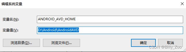
Android Studio修改模拟器AVD Manger目录
Android Studio修改虚拟机AVD Manger目录 1、在AS的设备管理器Device Manager中删除原来创建的所有虚拟机(Android Virtual Device); 2、新建一个自定义的AVD目录,例如:D:\Android\AndroidAVD 3、在高级系统设置中增加…...
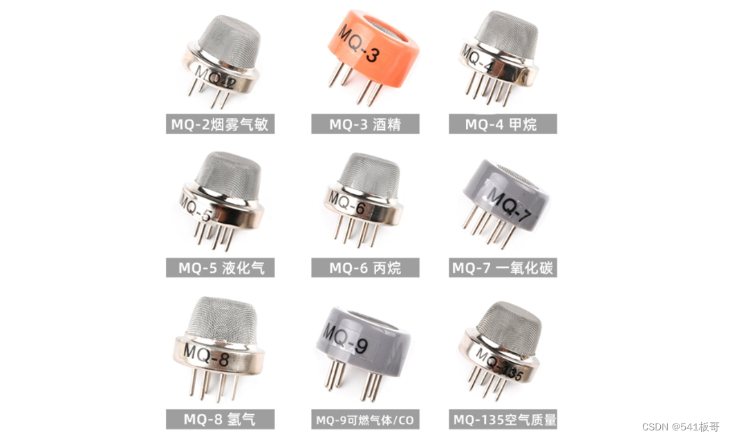
STM32--MQ2烟雾传感器
本文主要介绍STM32F103C8T6和烟雾传感器模块的控制算法 简介 烟雾模块选用MQ-2气体传感器,根据传感器的电导率随空气中可燃气体浓度的增加而增大的特性检测空气中可燃气体,然后将电导率的变化转换成对应的电信号 MQ系列烟雾传感分类如下: 该…...
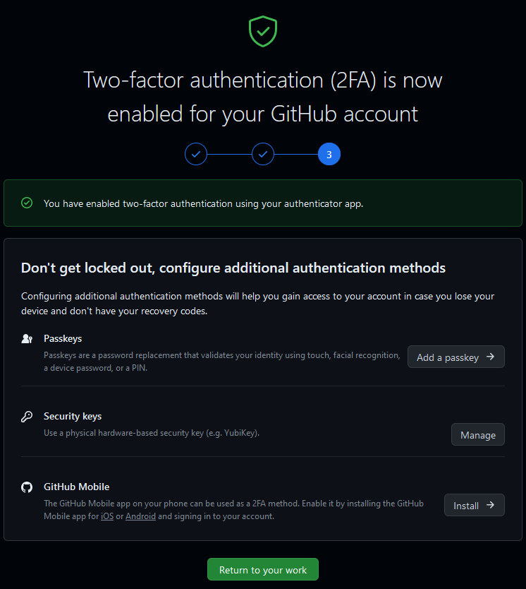
GitHub要求开启2FA,否则不让用了。
背景 其实大概在一个多月前,在 GitHub 网页端以及邮箱里都被提示:要求开启 2FA ,即双因子认证;但是当时由于拖延症和侥幸心理作祟,直接忽略了相关信息,毕竟“又不是不能用”。。 只到今天发现 GitHub 直接…...

Python 编程基础 | 第三章-数据类型 | 3.6、元组
一、元组 Python 的元组与列表类似,不同之处在于元组的元素不能修改。元组使用小括号,列表使用方括号。 1、创建元组 元组创建很简单,只需要在括号中添加元素,并使用逗号隔开即可,例如: tup1 (physics, ch…...
2023/10/7 -- ARM
【程序状态寄存器读写指令】 1.指令码以及格式 mrs:读取CPSR寄存器的值 mrs 目标寄存器 CPSR:读取CPSR的数值保存到目标寄存器中msr:修改CPSR寄存器的数值msr CPSR,第一操作数:将第一操作数的数值保存到CPSR寄存器中//修改CPSR寄存器,也就表示程序的状…...

yolov5加关键点回归
文章目录 一、数据1)数据准备2)标注文件说明 二、基于yolov5-face 修改自己的yolov5加关键点回归1、dataloader,py2、augmentations.py3、loss.py4、yolo.py 一、数据 1)数据准备 1、手动创建文件夹: yolov5-face-master/data/widerface/tr…...
untitle
实用的科研图形美化处理教程分享 显微照片排版标记 除了统计图表之外,显微照片也是文章中必不可少的实验结果呈现方式。除了常规实验的各种组织切片照片,在空间转录组文章中显微照片更是常见。显微照片的呈现方式也是有讲究的,比如对照片…...

《论文阅读》监督对抗性对比学习在对话中的情绪识别 ACL2023
《论文阅读》监督对抗性对比学习在对话中的情绪识别 前言摘要相关知识最坏样本干扰监督对比学习生成式对抗网络纳什均衡琴森香农散度范式球模型架构监督对抗性对比学习模型结构图实验结果问题前言 你是否也对于理解论文存在困惑? 你是否也像我之前搜索论文解读,得到只是中文…...
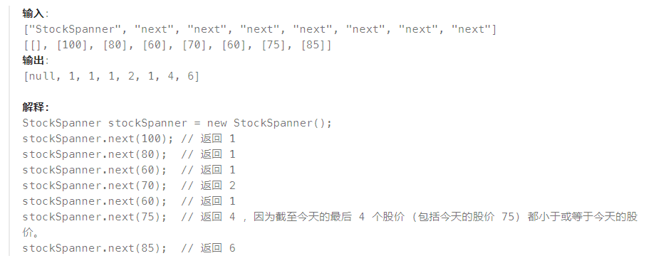
2023-10-07 LeetCode每日一题(股票价格跨度)
2023-10-07每日一题 一、题目编号 901. 股票价格跨度二、题目链接 点击跳转到题目位置 三、题目描述 设计一个算法收集某些股票的每日报价,并返回该股票当日价格的 跨度 。 当日股票价格的 跨度 被定义为股票价格小于或等于今天价格的最大连续日数(…...
聊聊分布式架构04——RPC通信原理
目录 RPC通信的基本原理 RPC结构 手撸简陋版RPC 知识点梳理 1.Socket套接字通信机制 2.通信过程的序列化与反序列化 3.动态代理 4.反射 思维流程梳理 码起来 服务端时序图 服务端—Api与Provider模块 客户端时序图 RPC通信的基本原理 RPC(Remote Proc…...
维吉尼亚密码
维吉尼亚密码属于多表代换密码 其中A<–>0,B<–>1,…,Z<–>25,则每个密钥K相当于一个长度为m的字母串,称为密钥字。维吉尼亚密码一次加密m个明文字母。 示例:设m6,密钥字为…...

ubuntu20.04挂载拓展盘保姆级流程
背景:跑模型玩时,发现机子硬盘太小了,搞个1t固态作为挂载盘。以下为操作全流程记录 1、开始root权限操作 sudo su若进不去,考虑是否给root设置过密码,新系统第一次进入需要设置密码。 进入成功: rooty:…...
)
顶顶通电话机器人接口对接开源ASR(语音识别)
前景介绍 目前大部分用户使用的都是在线ASR按照分钟或者按次付费,之前开源ASR效果太差不具备商用的条件,随着 阿里达摩院发布了大量开源数据集或者海量工业数据训练的模型,识别效果已经和商用ASR差距非常小,完全具备了很多场景代…...

windows消息机制
windows开发比较简单,首先要理解的就是消息机制。 Windows消息机制是指Windows操作系统中的消息传递机制。在Windows中,应用程序通过消息进行通信和交互。消息是一种轻量级的通信方式,用于在不同的窗口、线程或进程之间传递信息。 在Windows…...
)
进程地址空间(比特课总结)
一、进程地址空间 1. 环境变量 1 )⽤户级环境变量与系统级环境变量 全局属性:环境变量具有全局属性,会被⼦进程继承。例如当bash启动⼦进程时,环 境变量会⾃动传递给⼦进程。 本地变量限制:本地变量只在当前进程(ba…...
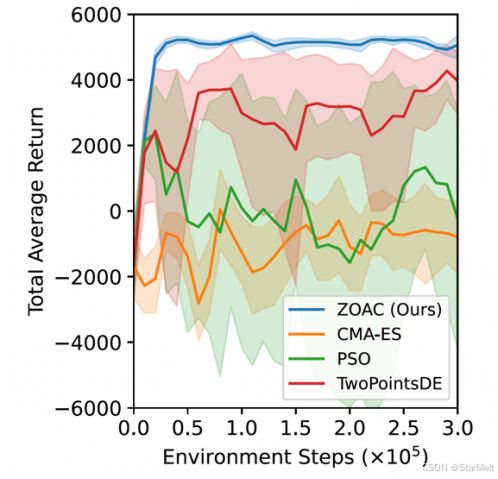
突破不可导策略的训练难题:零阶优化与强化学习的深度嵌合
强化学习(Reinforcement Learning, RL)是工业领域智能控制的重要方法。它的基本原理是将最优控制问题建模为马尔可夫决策过程,然后使用强化学习的Actor-Critic机制(中文译作“知行互动”机制),逐步迭代求解…...

java 实现excel文件转pdf | 无水印 | 无限制
文章目录 目录 文章目录 前言 1.项目远程仓库配置 2.pom文件引入相关依赖 3.代码破解 二、Excel转PDF 1.代码实现 2.Aspose.License.xml 授权文件 总结 前言 java处理excel转pdf一直没找到什么好用的免费jar包工具,自己手写的难度,恐怕高级程序员花费一年的事件,也…...

可靠性+灵活性:电力载波技术在楼宇自控中的核心价值
可靠性灵活性:电力载波技术在楼宇自控中的核心价值 在智能楼宇的自动化控制中,电力载波技术(PLC)凭借其独特的优势,正成为构建高效、稳定、灵活系统的核心解决方案。它利用现有电力线路传输数据,无需额外布…...

vue3 字体颜色设置的多种方式
在Vue 3中设置字体颜色可以通过多种方式实现,这取决于你是想在组件内部直接设置,还是在CSS/SCSS/LESS等样式文件中定义。以下是几种常见的方法: 1. 内联样式 你可以直接在模板中使用style绑定来设置字体颜色。 <template><div :s…...
剑指offer20_链表中环的入口节点
链表中环的入口节点 给定一个链表,若其中包含环,则输出环的入口节点。 若其中不包含环,则输出null。 数据范围 节点 val 值取值范围 [ 1 , 1000 ] [1,1000] [1,1000]。 节点 val 值各不相同。 链表长度 [ 0 , 500 ] [0,500] [0,500]。 …...

Android15默认授权浮窗权限
我们经常有那种需求,客户需要定制的apk集成在ROM中,并且默认授予其【显示在其他应用的上层】权限,也就是我们常说的浮窗权限,那么我们就可以通过以下方法在wms、ams等系统服务的systemReady()方法中调用即可实现预置应用默认授权浮…...
)
Typeerror: cannot read properties of undefined (reading ‘XXX‘)
最近需要在离线机器上运行软件,所以得把软件用docker打包起来,大部分功能都没问题,出了一个奇怪的事情。同样的代码,在本机上用vscode可以运行起来,但是打包之后在docker里出现了问题。使用的是dialog组件,…...
回溯算法学习
一、电话号码的字母组合 import java.util.ArrayList; import java.util.List;import javax.management.loading.PrivateClassLoader;public class letterCombinations {private static final String[] KEYPAD {"", //0"", //1"abc", //2"…...
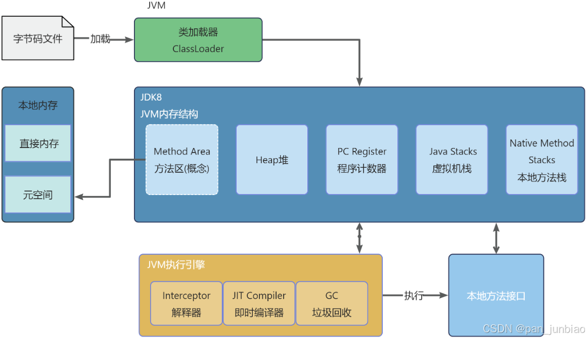
JVM虚拟机:内存结构、垃圾回收、性能优化
1、JVM虚拟机的简介 Java 虚拟机(Java Virtual Machine 简称:JVM)是运行所有 Java 程序的抽象计算机,是 Java 语言的运行环境,实现了 Java 程序的跨平台特性。JVM 屏蔽了与具体操作系统平台相关的信息,使得 Java 程序只需生成在 JVM 上运行的目标代码(字节码),就可以…...