Python私教张大鹏 Vue3整合AntDesignVue之按钮组件
何时使用
标记了一个(或封装一组)操作命令,响应用户点击行为,触发相应的业务逻辑。
在 Ant Design Vue 中我们提供了五种按钮。
- 主按钮:用于主行动点,一个操作区域只能有一个主按钮。
- 默认按钮:用于没有主次之分的一组行动点。
- 虚线按钮:常用于添加操作。
- 文本按钮:用于最次级的行动点。
- 链接按钮:一般用于链接,即导航至某位置。
以及四种状态属性与上面配合使用。
- 危险:删除/移动/修改权限等危险操作,一般需要二次确认。
- 幽灵:用于背景色比较复杂的地方,常用在首页/产品页等展示场景。
- 禁用:行动点不可用的时候,一般需要文案解释。
- 加载中:用于异步操作等待反馈的时候,也可以避免多次提交。
按钮类型
按钮有五种类型:主按钮、次按钮、虚线按钮、文本按钮和链接按钮。主按钮在同一个操作区域最多出现一次。
核心代码:
<template><a-space wrap><a-button type="primary">Primary Button</a-button><a-button>Default Button</a-button><a-button type="dashed">Dashed Button</a-button><a-button type="text">Text Button</a-button><a-button type="link">Link Button</a-button></a-space>
</template>
vue3案例:
<template><div class="flex bg-indigo-50 p-8 gap-3"><div class="flex-1 h-12 bg-purple-200 flex items-center justify-center"><a-button type="primary">主按钮</a-button></div><div class="flex-1 h-12 bg-purple-200 flex items-center justify-center"><a-button>次按钮</a-button></div><div class="flex-1 h-12 bg-purple-200 flex items-center justify-center"><a-button type="dashed">虚线按钮</a-button></div><div class="flex-1 h-12 bg-purple-200 flex items-center justify-center"><a-button type="text">文本按钮</a-button></div><div class="flex-1 h-12 bg-purple-200 flex items-center justify-center"><a-button type="link">链接按钮</a-button></div></div>
</template>
<script setup lang="ts">
</script>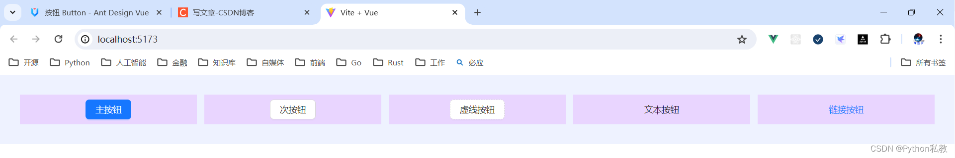
不可用状态
添加 disabled 属性即可让按钮处于不可用状态,同时按钮样式也会改变。
核心代码:
<template><a-space direction="vertical"><a-space><a-button type="primary">Primary</a-button><a-button type="primary" disabled>Primary(disabled)</a-button></a-space><a-space><a-button>Default</a-button><a-button disabled>Default(disabled)</a-button></a-space><a-space><a-button type="dashed">Dashed</a-button><a-button type="dashed" disabled>Dashed(disabled)</a-button></a-space><a-space><a-button type="text">Text</a-button><a-button type="text" disabled>Text(disabled)</a-button></a-space><a-space><a-button type="link">Link</a-button><a-button type="link" disabled>Link(disabled)</a-button></a-space><a-space><a-button danger>Danger Default</a-button><a-button danger disabled>Danger Default(disabled)</a-button></a-space><a-space><a-button danger type="text">Danger Text</a-button><a-button danger type="text" disabled>Danger Text(disabled)</a-button></a-space><a-space><a-button danger type="link">Danger Link</a-button><a-button danger type="link" disabled>Danger Link(disabled)</a-button></a-space><div :style="{ padding: '8px', background: 'rgb(190, 200, 200)' }"><a-space><a-button ghost>Ghost</a-button><a-button ghost disabled>Ghost(disabled)</a-button></a-space></div></a-space>
</template>
vue3示例:
<script setup>
</script><template><div class="flex p-8 bg-indigo-50 gap-3"><div class="flex-1 h-12 bg-purple-200 flex items-center justify-center"><a-button type="primary">主要按钮</a-button><a-button type="primary" disabled>主要按钮(禁用)</a-button></div><div class="flex-1 h-12 bg-purple-200 flex items-center justify-center"><a-button>次要按钮</a-button><a-button disabled>次要按钮(禁用)</a-button></div><div class="flex-1 h-12 bg-purple-200 flex items-center justify-center"><a-button type="dashed">虚线按钮</a-button><a-button type="dashed" disabled>虚线按钮(禁用)</a-button></div><div class="flex-1 h-12 bg-purple-200 flex items-center justify-center"><a-button type="text">虚线按钮</a-button><a-button type="text" disabled>虚线按钮(禁用)</a-button></div><div class="flex-1 h-12 bg-purple-200 flex items-center justify-center"><a-button type="link">链接按钮</a-button><a-button type="link" disabled>链接按钮(禁用)</a-button></div></div>
</template>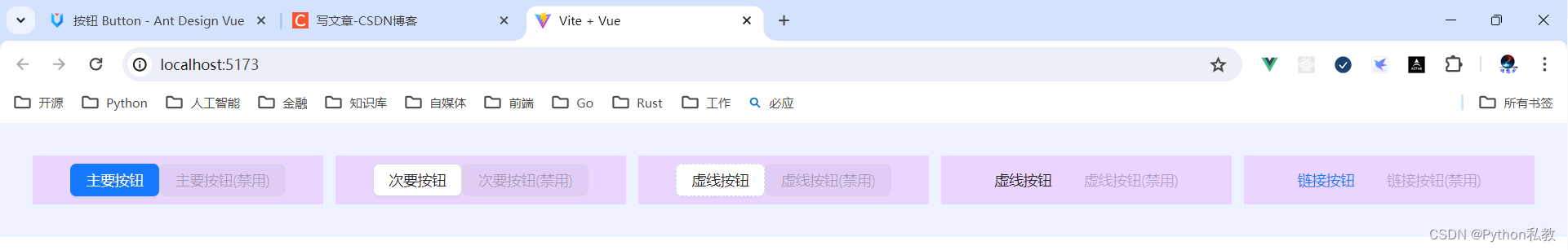
幽灵按钮
幽灵按钮将按钮的内容反色,背景变为透明,常用在有色背景上。
通过添加 ghost 关键字,能够让一个按钮变成幽灵按钮。
核心代码:
<template><div :style="{ background: 'rgb(190, 200, 200)', padding: '16px 16px' }"><a-space><a-button type="primary" ghost>Primary</a-button><a-button ghost>Default</a-button><a-button type="dashed" ghost>Dashed</a-button><a-button type="primary" danger ghost>Danger</a-button></a-space></div>
</template>
vue3示例:
<script setup>
</script><template><div class="grid grid-cols-3 gap-3 bg-indigo-50 p-8"><div class="h-32 bg-red-300 rounded flex space-x-3 justify-center items-center"><a-button type="primary">主要按钮</a-button><a-button type="primary" ghost>主要按钮(幽灵)</a-button><a-button type="primary" disabled>主要按钮(禁用)</a-button></div><div class="h-32 bg-red-300 rounded flex space-x-3 justify-center items-center"><a-button>次要按钮</a-button><a-button ghost>次要按钮(幽灵)</a-button><a-button disabled>次要按钮(禁用)</a-button></div><div class="h-32 bg-red-300 rounded flex space-x-3 justify-center items-center"><a-button type="dashed">虚线按钮</a-button><a-button type="dashed" ghost>虚线按钮(幽灵)</a-button><a-button type="dashed" disabled>虚线按钮(禁用)</a-button></div><div class="h-32 bg-red-300 rounded flex space-x-3 justify-center items-center"><a-button type="text">文本按钮</a-button><a-button type="text" ghost>文本按钮(幽灵)</a-button><a-button type="text" disabled>文本按钮(禁用)</a-button></div><div class="h-32 bg-red-300 rounded flex space-x-3 justify-center items-center"><a-button type="link">链接按钮</a-button><a-button type="link" ghost>链接按钮(幽灵)</a-button><a-button type="link" disabled>链接按钮(禁用)</a-button></div></div>
</template>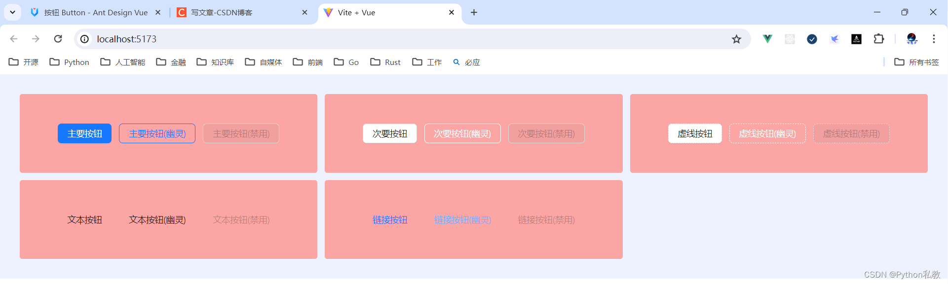
加载中状态
添加 loading 属性即可让按钮处于加载状态,最后两个按钮演示点击后进入加载状态。
核心代码:
<template><a-space direction="vertical"><a-space><a-button type="primary" loading>Loading</a-button><a-button type="primary" size="small" loading>Loading</a-button></a-space><a-space><a-button type="primary" :loading="loading" @mouseenter="loading = true">mouseenter me!</a-button><a-button type="primary" :loading="iconLoading" @click="enterIconLoading"><template #icon><PoweroffOutlined /></template>延迟1s</a-button></a-space><a-space><a-button type="primary" loading /><a-button type="primary" shape="circle" loading /><a-button danger shape="round" loading /></a-space></a-space>
</template>
<script lang="ts" setup>
import { ref } from 'vue';
import { PoweroffOutlined } from '@ant-design/icons-vue';interface DelayLoading {delay: number;
}
const loading = ref<boolean>(false);
const iconLoading = ref<boolean | DelayLoading>(false);
const enterIconLoading = () => {iconLoading.value = { delay: 1000 };setTimeout(() => {iconLoading.value = false;}, 6000);
};
</script>
vue3示例:
<script setup>
</script><template><div class="flex p-8 bg-indigo-50 gap-3"><div class="h-32 bg-red-300 flex items-center justify-center flex-1"><a-button loading>按钮</a-button></div></div>
</template>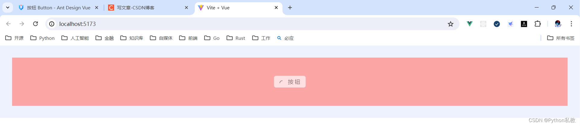
案例:鼠标移入按钮变加载状态
核心代码:
<a-button type="primary" :loading="loading" @mouseenter="loading = true">mouseenter me!
</a-button>
vue3示例:
<script setup>
import {ref} from "vue";const loading = ref(false)
</script><template><div class="flex p-8 bg-indigo-50 gap-3"><div class="h-32 bg-red-300 flex items-center justify-center flex-1"><a-button loading>按钮</a-button></div><div class="h-32 bg-red-300 flex items-center justify-center flex-1"><a-button :loading="loading" @mouseenter="loading=true" @mouseleave="loading=false">鼠标移入变加载</a-button></div></div>
</template>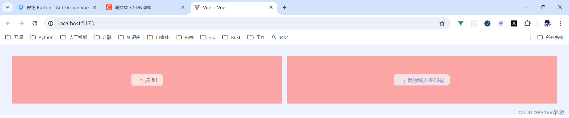
案例:点击按钮变加载状态
核心代码:
<a-button type="primary" :loading="iconLoading" @click="enterIconLoading"><template #icon><PoweroffOutlined /></template>延迟1s
</a-button>
vue3示例:
<script setup>
import {PoweroffOutlined} from "@ant-design/icons-vue";
import {ref} from "vue";const iconLoading = ref(false)
const onClickIconButton = () => {iconLoading.value = true
}
</script><template><div class="h-32 bg-indigo-50 w-screen flex items-center justify-center space-x-3"><a-button type="primary"class="flex items-center":loading="iconLoading"@click="onClickIconButton"><template #icon><PoweroffOutlined/></template>按钮</a-button><a-button @click="iconLoading=false">取消加载状态</a-button></div>
</template>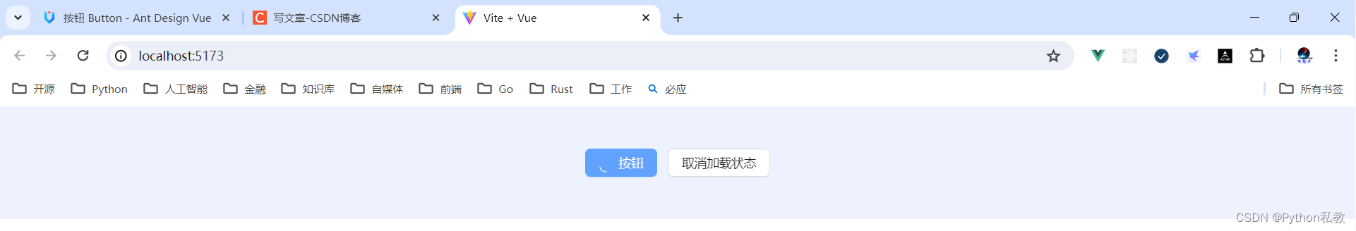
按钮尺寸
按钮有大、中、小三种尺寸。
通过设置 size 为 large small 分别把按钮设为大、小尺寸。若不设置 size,则尺寸为中。
核心代码:
<template><a-space direction="vertical"><a-radio-group v-model:value="size"><a-radio-button value="large">Large</a-radio-button><a-radio-button value="default">Default</a-radio-button><a-radio-button value="small">Small</a-radio-button></a-radio-group><a-space><a-button type="primary" :size="size">Primary</a-button><a-button :size="size">Normal</a-button><a-button type="dashed" :size="size">Dashed</a-button><a-button danger :size="size">Danger</a-button><a-button type="link" :size="size">Link</a-button></a-space><a-space><a-button type="primary" :size="size"><template #icon><DownloadOutlined /></template></a-button><a-button type="primary" shape="circle" :size="size"><template #icon><DownloadOutlined /></template></a-button><a-button type="primary" shape="round" :size="size"><template #icon><DownloadOutlined /></template>Download</a-button><a-button type="primary" shape="round" :size="size"><template #icon><DownloadOutlined /></template></a-button><a-button type="primary" :size="size"><template #icon><DownloadOutlined /></template>Download</a-button></a-space></a-space>
</template>
<script lang="ts" setup>
import { DownloadOutlined } from '@ant-design/icons-vue';
import type { SizeType } from 'ant-design-vue/es/config-provider';
import { ref } from 'vue';
const size = ref<SizeType>('large');
</script>
vue3示例:
<script setup>
</script><template><div class="flex justify-center items-center space-x-3 p-8 bg-indigo-50"><a-button size="small">按钮</a-button><a-button size="middle">按钮</a-button><a-button size="large">按钮</a-button></div>
</template>
案例:展示一行按钮
核心代码:
<a-radio-group v-model:value="size"><a-radio-button value="large">Large</a-radio-button><a-radio-button value="default">Default</a-radio-button><a-radio-button value="small">Small</a-radio-button>
</a-radio-group>
vue3示例:
<script setup>
import {ref} from "vue";const size = ref("middle")
</script><template><a-radio-group v-model:value="size"><a-radio-button value="small">小</a-radio-button><a-radio-button value="middle">中</a-radio-button><a-radio-button value="large">大</a-radio-button></a-radio-group><hr><p>{{ size}}</p>
</template>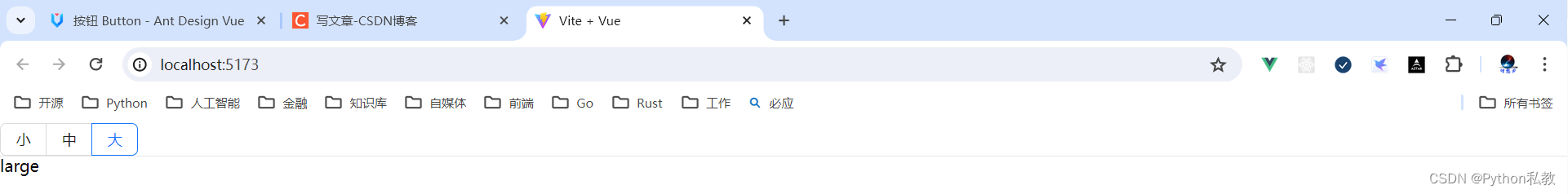
案例:展示多行多列按钮
核心代码:
<a-space direction="vertical"><a-radio-group v-model:value="size"><a-radio-button value="large">Large</a-radio-button><a-radio-button value="default">Default</a-radio-button><a-radio-button value="small">Small</a-radio-button></a-radio-group><a-space><a-button type="primary" :size="size">Primary</a-button><a-button :size="size">Normal</a-button><a-button type="dashed" :size="size">Dashed</a-button><a-button danger :size="size">Danger</a-button><a-button type="link" :size="size">Link</a-button></a-space>
</a-space>
vue3示例:
<script setup>
import {ref} from "vue";const size = ref("middle")
</script>
<template><a-space direction="vertical"><a-radio-group v-model:value="size"><a-radio-button value="small">小</a-radio-button><a-radio-button value="middle">中</a-radio-button><a-radio-button value="large">大</a-radio-button></a-radio-group><a-space><a-button :size="size">次要按钮</a-button><a-button type="primary" :size="size">主要按钮</a-button><a-button type="dashed" :size="size">虚线按钮</a-button><a-button type="text" :size="size">文本按钮</a-button><a-button type="link" :size="size">链接按钮</a-button></a-space></a-space>
</template>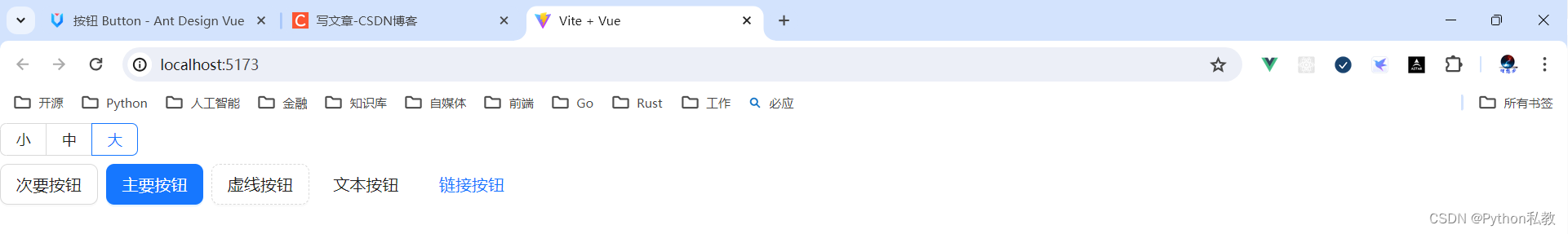
危险按钮
在 2.2.0 之后,危险成为一种按钮属性而不是按钮类型。
核心代码:
<template><a-space warp><a-button type="primary" danger>Primary</a-button><a-button danger>Default</a-button><a-button type="dashed" danger>Dashed</a-button><a-button type="text" danger>Text</a-button><a-button type="link" danger>Link</a-button></a-space>
</template>
vue3示例:
<script setup>
</script>
<template><a-space><a-button danger type="primary">主要按钮</a-button><a-button danger type="default">次要按钮</a-button><a-button danger type="dashed">虚线按钮</a-button><a-button danger type="text">文本按钮</a-button><a-button danger type="link">链接按钮</a-button></a-space>
</template>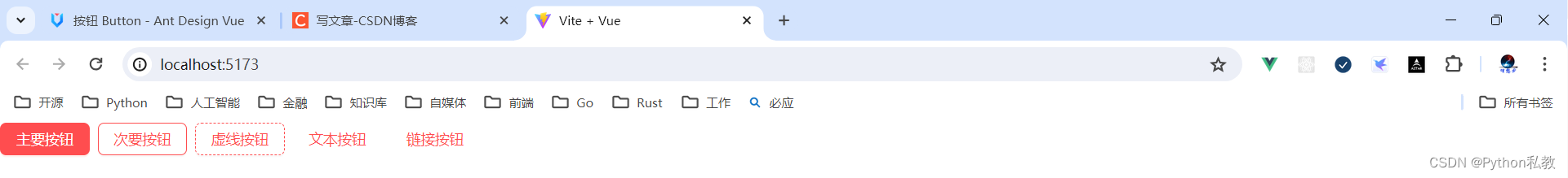
图标按钮
当需要在 Button 内嵌入 Icon 时,可以设置 icon 属性,或者直接在 Button 内使用 Icon 组件。
如果想控制 Icon 具体的位置,只能直接使用 Icon 组件,而非 icon 属性。
核心代码:
<template><a-space direction="vertical"><a-space warp><a-tooltip title="search"><a-button type="primary" shape="circle" :icon="h(SearchOutlined)" /></a-tooltip><a-button type="primary" shape="circle">A</a-button><a-button type="primary" :icon="h(SearchOutlined)">Search</a-button><a-tooltip title="search"><a-button shape="circle" :icon="h(SearchOutlined)" /></a-tooltip><a-button :icon="h(SearchOutlined)">Search</a-button></a-space><a-space warp><a-tooltip title="search"><a-button shape="circle" :icon="h(SearchOutlined)" /></a-tooltip><a-button :icon="h(SearchOutlined)">Search</a-button><a-tooltip title="search"><a-button type="dashed" shape="circle" :icon="h(SearchOutlined)" /></a-tooltip><a-button type="dashed" :icon="h(SearchOutlined)">Search</a-button><a-button :icon="h(SearchOutlined)" href="https://www.google.com" /></a-space></a-space>
</template>
<script lang="ts" setup>
import { h } from 'vue';
import { SearchOutlined } from '@ant-design/icons-vue';
</script>
vue3示例:
<script setup>
import {h} from "vue"
import {SearchOutlined} from "@ant-design/icons-vue"
</script>
<template><a-button :icon="h(SearchOutlined)" class="flex items-center">按钮</a-button>
</template>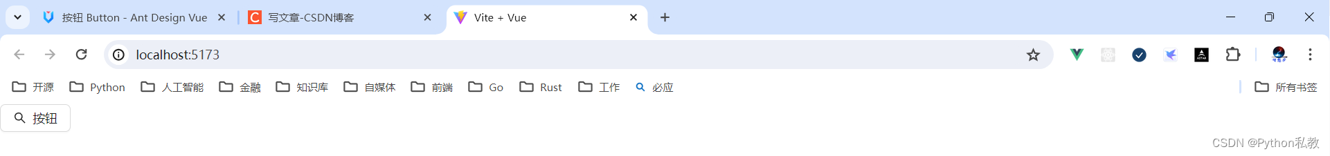
案例:按钮提示
核心代码:
<a-tooltip title="search"><a-button type="primary" shape="circle" :icon="h(SearchOutlined)" />
</a-tooltip>
vue3示例:
<script setup>
import {h} from "vue"
import {SearchOutlined} from "@ant-design/icons-vue"
</script>
<template><a-tooltip title="这是一个图标按钮"><a-button :icon="h(SearchOutlined)" class="flex items-center">按钮</a-button></a-tooltip>
</template>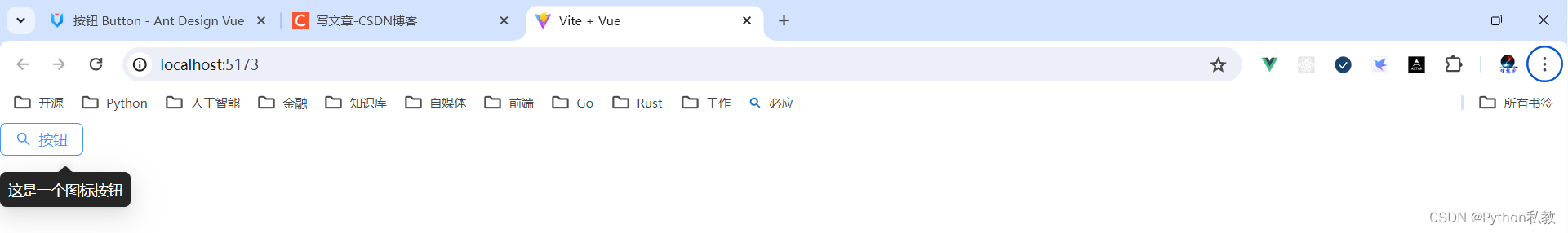
下拉按钮
按钮组合使用时,推荐使用 1 个主操作 + n 个次操作,3 个以上操作时把更多操作放到 Dropdown.Button 中组合使用。
核心代码:
<template><a-space><a-button type="primary">Primary</a-button><a-button>secondary</a-button><a-dropdown><template #overlay><a-menu @click="handleMenuClick"><a-menu-item key="1">1st item</a-menu-item><a-menu-item key="2">2nd item</a-menu-item><a-menu-item key="3">3rd item</a-menu-item></a-menu></template><a-button>Actions<DownOutlined /></a-button></a-dropdown></a-space>
</template>
<script lang="ts" setup>
import { DownOutlined } from '@ant-design/icons-vue';
import type { MenuProps } from 'ant-design-vue';
const handleMenuClick: MenuProps['onClick'] = e => {console.log('click', e);
};
</script>
vue3示例:
<script setup>
import {DownOutlined} from "@ant-design/icons-vue"const handleDropdownMenuClick = (e) => {console.log(e)console.log("key=", e.key)
}
</script>
<template><a-dropdown><template #overlay><a-menu @click="handleDropdownMenuClick"><a-menu-item key="1">选项1</a-menu-item><a-menu-item key="2">选项2</a-menu-item><a-menu-item key="3">选项3</a-menu-item></a-menu></template><a-button>下拉按钮<DownOutlined/></a-button></a-dropdown>
</template>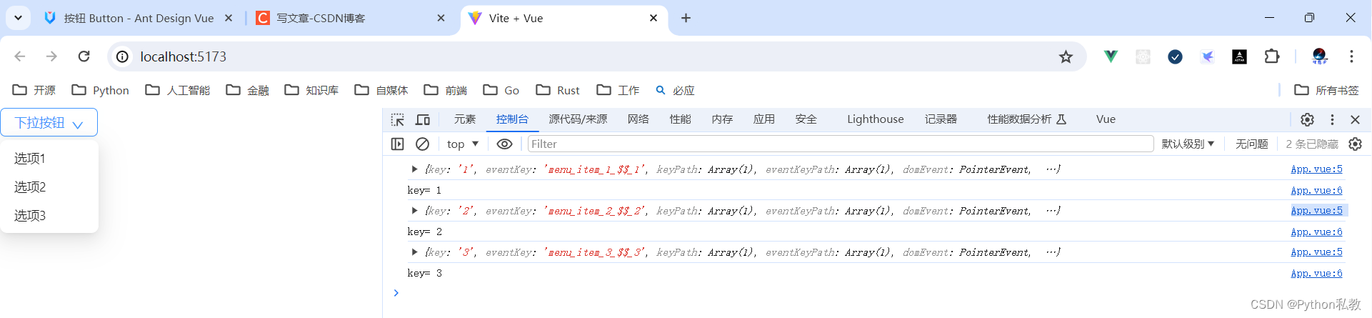
Block 按钮
block 属性将使按钮适合其父宽度。
核心代码:
<template><a-space wrap><a-button type="primary" block>Primary</a-button><a-button block>Default</a-button><a-button type="dashed" block>Dashed</a-button><a-button danger block>Danger</a-button><a-button type="link" block>Link</a-button></a-space>
</template>
vue3示例:
<template><div class="flex p-8 items-center justify-center bg-indigo-50 gap-3"><div class="w-96 h-32 bg-red-300 flex justify-center items-center"><a-button>按钮</a-button></div><div class="w-96 h-32 bg-red-300 flex justify-center items-center"><a-button block>block 按钮</a-button></div></div>
</template>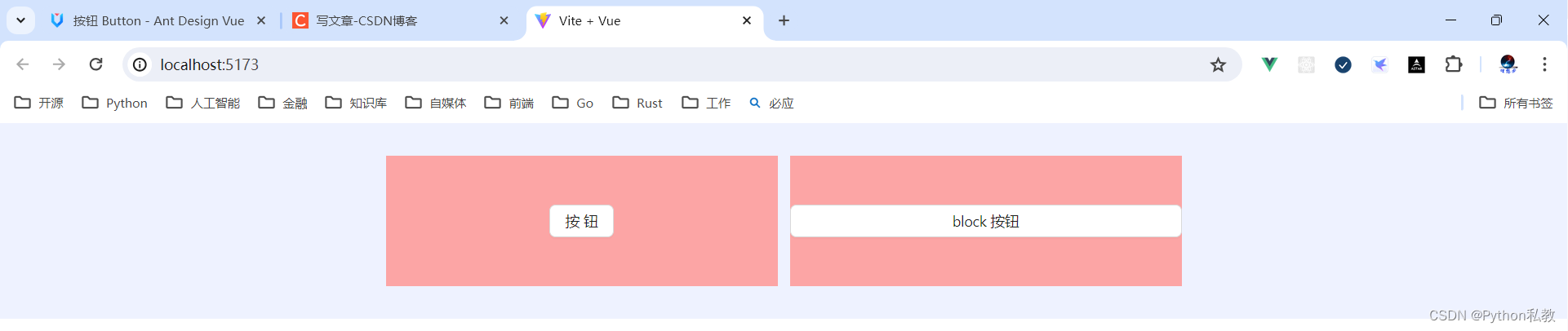
案例:按钮形状
核心代码:
<a-button type="primary" shape="circle" :icon="h(SearchOutlined)" />
按钮形状支持的值有:default | circle | round
vue3示例:
<template><div class="flex p-8 bg-indigo-50 gap-3"><div class="h-32 flex-1 bg-purple-200 flex justify-center items-center"><a-button shape="default">default</a-button></div><div class="h-32 flex-1 bg-purple-200 flex justify-center items-center"><a-button shape="circle">circle</a-button></div><div class="h-32 flex-1 bg-purple-200 flex justify-center items-center"><a-button shape="round">round</a-button></div></div>
</template>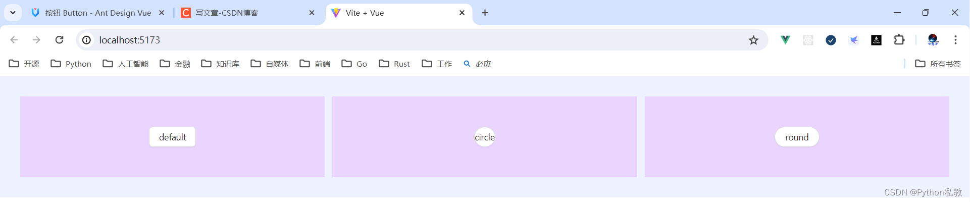
案例:点击按钮跳转网页
按钮有两个属性:
-
href:点击跳转的地址,指定此属性 button 的行为和 a 链接一致
-
target:相当于 a 链接的 target 属性,href 存在时生效
vue3示例:
<template><a-button href="http://www.baidu.com" target="_blank">百度</a-button>
</template>
API
通过设置 Button 的属性来产生不同的按钮样式,推荐顺序为:type -> shape -> size -> loading -> disabled。
按钮的属性说明如下:
| 属性 | 说明 | 类型 | 默认值 | 版本 |
| block | 将按钮宽度调整为其父宽度的选项 | boolean | false | |
| danger | 设置危险按钮 | boolean | false | 2.2.0 |
| disabled | 按钮失效状态 | boolean | false | |
| ghost | 幽灵属性,使按钮背景透明 | boolean | false | |
| href | 点击跳转的地址,指定此属性 button 的行为和 a 链接一致 | string | - | |
| htmlType | 设置 button 原生的 type 值,可选值请参考 HTML 标准 | string | button | |
| icon | 设置按钮的图标类型 | v-slot | - | |
| loading | 设置按钮载入状态 | boolean | { delay: number } | false | |
| shape | 设置按钮形状 | default | circle | round |
| size | 设置按钮大小 | large | middle | small |
| target | 相当于 a 链接的 target 属性,href 存在时生效 | string | - | |
| type | 设置按钮类型 | primary | ghost | dashed |
事件
支持原生 button 的其他所有属性。
| 事件名称 | 说明 | 回调参数 | 版本 |
| click | 点击按钮时的回调 | (event) => void |
方法
| 名称 | 描述 | 版本 |
| blur() | 移除焦点 | |
| focus() | 获取焦点 |
相关文章:
Python私教张大鹏 Vue3整合AntDesignVue之按钮组件
何时使用 标记了一个(或封装一组)操作命令,响应用户点击行为,触发相应的业务逻辑。 在 Ant Design Vue 中我们提供了五种按钮。 主按钮:用于主行动点,一个操作区域只能有一个主按钮。默认按钮࿱…...

【小海实习日记】PHP安装
## PHP环境搭建(Mac) ### php安装 使用brew需要安装homebrew >brew tap shivammathur/php >brew install shivammathur/php/php7.3 >brew link php7.3 这里可以需要homebrew使用代理进行下载,如果代理下载速度还是太慢,建议直接更该国内镜像…...

C++ Primer Chapter 4 Expressions
Chapter 4 Expressions 4.11 类型转换 4.11.2 其他隐式类型转换 数组转换成指针: 在大多数用到数组的表达式中,数组自动转换成指向数组首元素的指针: int ia[10]; int* ipa;♜ 当数组被用作decltype关键字的参数,或者作为取地…...
[leetcode hot 150]第一百三十七题,只出现一次的数字Ⅱ
题目: 给你一个整数数组 nums ,除某个元素仅出现 一次 外,其余每个元素都恰出现 三次 。请你找出并返回那个只出现了一次的元素。 你必须设计并实现线性时间复杂度的算法且使用常数级空间来解决此问题。 由于需要常数级空间和线性时间复杂度…...
wpf工程中加入Hardcodet.NotifyIcon.Wpf生成托盘
1、在项目中用nuget引入Hardcodet.NotifyIcon.Wpf。如下图所示。 2、在App.xaml中创建托盘界面,代码是写在 App.xaml 里面 注意在application中一定要加入这一行代码: xmlns:tb"http://www.hardcodet.net/taskbar" 然后在<Application.R…...
keil下载及安装(社区版本)
知不足而奋进 望远山而前行 目录 文章目录 前言 Keil有官方版本和社区版本,此文章为社区版本安装,仅供参考。 1.keil MDK 2.keil社区版介绍 3.keil下载 (1)打开进入登录界面 (2)点击下载,跳转到信息页面 (3)填写个人信息,点击提交 (4)点击下载…...
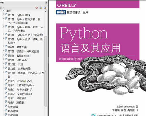
python书上的动物是啥
Python的创始人为Guido van Rossum。1989年圣诞节期间,在阿姆斯特丹,Guido为了打发圣诞节的无趣,决心开发一个新的脚本解释程序,做为ABC语言的一种继承。之所以选中Python作为程序的名字,是因为他是一个叫Monty Python…...
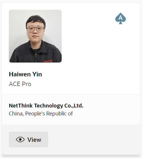
数据库管理-第198期 升级Oracle ACE Pro,新赛季继续努力(20240605)
数据库管理198期 2024-06-05 数据库管理-第198期 升级ACE Pro,新赛季继续努力(20240605)1 惊喜2 变化3 Oracle ACE总结 数据库管理-第198期 升级ACE Pro,新赛季继续努力(20240605) 作者:胖头鱼的…...
华为坤灵交换机S300, S500, S210,S220, S200, S310 如何WEB抓包
通过S系列交换机配置端口镜像实现抓包 1、应用场景 端口镜像是指将经过指定端口(源端口或者镜像端口)的报文复制一份到另一个指定端口(目的端口或者观察端口)。 在网络运营与维护的过程中,为了便于业务监测和故障定位,网络管理员时常要获取设备上的业务…...

【亚马逊云科技 CSDN 联合巨献】 「对话AI 构建者:从基础到应用的 LLM 全景培训」 限时免费!
🚀🌟【亚马逊云科技 & CSDN 联合巨献】 📚「对话AI 构建者:从基础到应用的 LLM 全景培训」🔥 限时免费! 📆 抓紧时间!6月7日前注册,原价 399,现在仅需 0…...
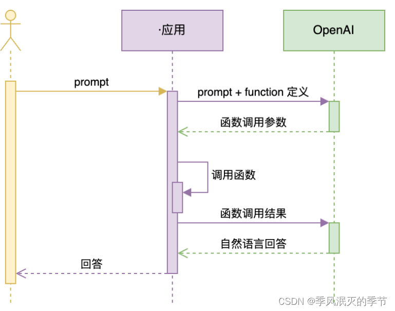
【AI大模型】Function Calling
目录 什么是Function Calling 示例 1:调用本地函数 Function Calling 的注意事项 支持 Function Calling 的国产大模型 百度文心大模型 MiniMax ChatGLM3-6B 讯飞星火 3.0 通义千问 几条经验总结 什么是Function Calling Function Calling 是一种函数调用机…...

零钱兑换 - LeetCode 热题 85
大家好!我是曾续缘🤪 今天是《LeetCode 热题 100》系列 发车第 85 天 动态规划第 5 题 ❤️点赞 👍 收藏 ⭐再看,养成习惯 零钱兑换 给你一个整数数组 coins ,表示不同面额的硬币;以及一个整数 amount &…...

基于web的垃圾分类回收系统的设计
管理员账户功能包括:系统首页,个人中心,管理员管理,用户管理,公告管理,运输管理,基础数据管理 用户账户功能包括:系统首页,个人中心,运输管理,公告…...

优化你的WordPress网站:内链建设与Link Whisper Pro插件的利用
文章目录 内链的重要性WordPress SEO插件:Link Whisper Pro主要功能使用指南下载与安装 结语 在数字营销和网站管理领域,SEO内部优化是提升网站排名、增加流量和提高用户参与度的核心策略。在众多SEO技巧中,内链建设是构建良好网站结构和提升…...

spring中那些地方使用了反射
1、依赖注入(Dependency Injection) Spring Boot通过反射机制将bean注入到相应的属性或构造函数中。当我们在Spring Boot中使用如Autowired这样的注解时,Spring容器会利用反射机制找到相应的bean并注入到对应的属性或构造函数中。 2、Bean的…...

1 机器人软件开发学习所需通用技术栈(一)
机器人软件工程师技术路线(如有缺失,欢迎补充) 1. 机器人软件开发工程师技术路线 1.1 基础知识 C/C编程:掌握C/C语言基础,包括数据结构、算法、内存管理等。操作系统:了解Linux或Windows等操作系统的基本…...
Java(十二)——Comparable接口与Comparator接口
文章目录 Comparable与Comparator接口Comparable接口Comparator接口 Comparable与Comparator接口 我们可能会遇到这样的问题:怎么对一个对象数组进行排序? 比如对一个狗类对象数组进行排序,而想到这,我们又会有一个问题ÿ…...

Nvidia Jetson/Orin +FPGA+AI大算力边缘计算盒子:轨道交通监控系统
株洲中车时代电气股份有限公司(下称中车时代电气)是中国中车旗下股份制企业,其前身及母公司——中车株洲电力机车研究所有限公司创立于1959年。中车时代电气扎根株洲,走好两条钢轨,走出两条钢轨。中车时代电气秉承“双…...
笔记 | 软件工程01:从程序到软件
1 软件工程知识域 2 程序 2.1 何为程序及程序的质量要求 何为程序: 理解:软件工程可能就是在弥补OOP语言与自然语言之间还存在的鸿沟 2.1.1 程序质量的内在和外在体现 2.1.2 程序质量的语法和语义体现 2.2 编写代码的基本原则 2.3 程序质量保证方法 …...

废品回收小程序开发,助力商家拓展回收市场
随着互联网的快速发展,废品回收行业也走向了数字化发展,废品回收小程序成为了拓展市场的重要方式。在当下万亿元下的回收市场中,废品回收小程序的发展也能够发挥重要作用,提高市场回收效率,提高大众的回收意识…...

DockerHub与私有镜像仓库在容器化中的应用与管理
哈喽,大家好,我是左手python! Docker Hub的应用与管理 Docker Hub的基本概念与使用方法 Docker Hub是Docker官方提供的一个公共镜像仓库,用户可以在其中找到各种操作系统、软件和应用的镜像。开发者可以通过Docker Hub轻松获取所…...

【ROS】Nav2源码之nav2_behavior_tree-行为树节点列表
1、行为树节点分类 在 Nav2(Navigation2)的行为树框架中,行为树节点插件按照功能分为 Action(动作节点)、Condition(条件节点)、Control(控制节点) 和 Decorator(装饰节点) 四类。 1.1 动作节点 Action 执行具体的机器人操作或任务,直接与硬件、传感器或外部系统…...

Qwen3-Embedding-0.6B深度解析:多语言语义检索的轻量级利器
第一章 引言:语义表示的新时代挑战与Qwen3的破局之路 1.1 文本嵌入的核心价值与技术演进 在人工智能领域,文本嵌入技术如同连接自然语言与机器理解的“神经突触”——它将人类语言转化为计算机可计算的语义向量,支撑着搜索引擎、推荐系统、…...

C++中string流知识详解和示例
一、概览与类体系 C 提供三种基于内存字符串的流,定义在 <sstream> 中: std::istringstream:输入流,从已有字符串中读取并解析。std::ostringstream:输出流,向内部缓冲区写入内容,最终取…...
)
OpenLayers 分屏对比(地图联动)
注:当前使用的是 ol 5.3.0 版本,天地图使用的key请到天地图官网申请,并替换为自己的key 地图分屏对比在WebGIS开发中是很常见的功能,和卷帘图层不一样的是,分屏对比是在各个地图中添加相同或者不同的图层进行对比查看。…...

使用Matplotlib创建炫酷的3D散点图:数据可视化的新维度
文章目录 基础实现代码代码解析进阶技巧1. 自定义点的大小和颜色2. 添加图例和样式美化3. 真实数据应用示例实用技巧与注意事项完整示例(带样式)应用场景在数据科学和可视化领域,三维图形能为我们提供更丰富的数据洞察。本文将手把手教你如何使用Python的Matplotlib库创建引…...
: 一刀斩断视频片头广告)
快刀集(1): 一刀斩断视频片头广告
一刀流:用一个简单脚本,秒杀视频片头广告,还你清爽观影体验。 1. 引子 作为一个爱生活、爱学习、爱收藏高清资源的老码农,平时写代码之余看看电影、补补片,是再正常不过的事。 电影嘛,要沉浸,…...

4. TypeScript 类型推断与类型组合
一、类型推断 (一) 什么是类型推断 TypeScript 的类型推断会根据变量、函数返回值、对象和数组的赋值和使用方式,自动确定它们的类型。 这一特性减少了显式类型注解的需要,在保持类型安全的同时简化了代码。通过分析上下文和初始值,TypeSc…...
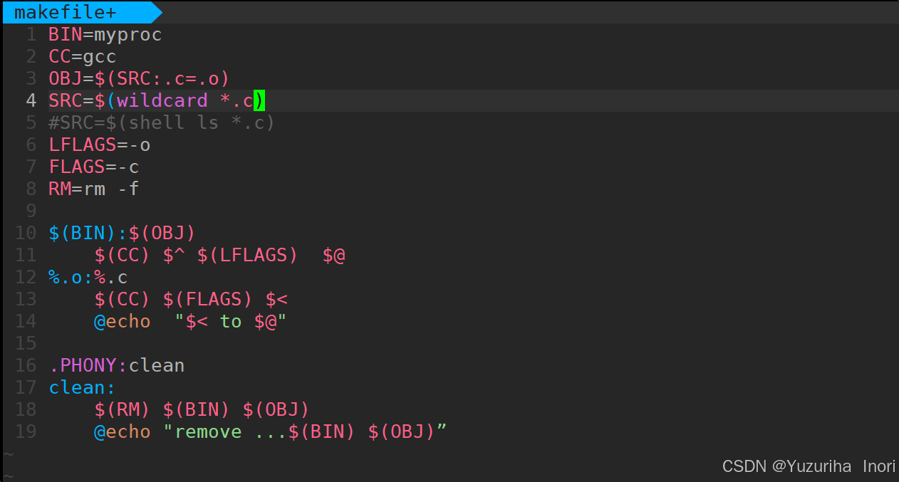
【Linux】自动化构建-Make/Makefile
前言 上文我们讲到了Linux中的编译器gcc/g 【Linux】编译器gcc/g及其库的详细介绍-CSDN博客 本来我们将一个对于编译来说很重要的工具:make/makfile 1.背景 在一个工程中源文件不计其数,其按类型、功能、模块分别放在若干个目录中,mak…...

tomcat指定使用的jdk版本
说明 有时候需要对tomcat配置指定的jdk版本号,此时,我们可以通过以下方式进行配置 设置方式 找到tomcat的bin目录中的setclasspath.bat。如果是linux系统则是setclasspath.sh set JAVA_HOMEC:\Program Files\Java\jdk8 set JRE_HOMEC:\Program Files…...