seaborn从入门到精通03-绘图功能实现02-分类绘图Categorical plots
seaborn从入门到精通03-绘图功能实现02-分类绘图Categorical plots
- 总结
- 参考
- 关系-分布-分类
- 分类绘图-Visualizing categorical data
- 图形级接口catplot--figure-level interface
- 导入库与查看tips和diamonds 数据
- 分类散点图
- 参考
- 分布散点图stripplot
- 分布密度散点图-swarmplot()
- 案例1-默认分类散点图-jitter抖动
- 案例2-分类散点图kind="swarm"
- 案例3-hue参数
- 案例4-横向分布
- 分类分布图
- 参考:
- 案例1-箱线图-Boxplots
- 案例2-箱线图boxplot带hue参数
- 案例3-箱线图boxplot带
- 案例4-更大的箱型图boxenplot
- 案例5-小提琴图Violinplots
- 案例6-小提琴图Violinplots参数bw和cut
- 案例7-小提琴图Violinplots参数splits
- 案例/-小提琴图Violinplots参数inner
- 案例8-小提琴图Violinplots参数整合swarmplot()或stripplot()
- 分类估计图
- 参考
- 案例1-条形图barplot
- 案例2-条形图barplot的置信区间
- 案例3-计数统计图countplot
- 案例4-计数统计图countplot参数edgecolor
- 案例5-点图pointplot
- 案例6-点图pointplot参数markers和linestyles
- 显示其他维度-Showing additional dimensions
总结
本文主要是seaborn从入门到精通系列第3篇,本文介绍了seaborn的绘图功能实现,本文是分类绘图,同时介绍了较好的参考文档置于博客前面,读者可以重点查看参考链接。本系列的目的是可以完整的完成seaborn从入门到精通。重点参考连接

参考
seaborn官方
seaborn官方介绍
seaborn可视化入门
【宝藏级】全网最全的Seaborn详细教程-数据分析必备手册(2万字总结)
Seaborn常见绘图总结
关系-分布-分类
relational “关系型”
distributional “分布型”
categorical “分类型”
分类绘图-Visualizing categorical data
In the relational plot tutorial we saw how to use different visual representations to show the relationship between multiple variables in a dataset. In the examples, we focused on cases where the main relationship was between two numerical variables. If one of the main variables is “categorical” (divided into discrete groups) it may be helpful to use a more specialized approach to visualization.
在关系图教程中,我们看到了如何使用不同的可视化表示来显示数据集中多个变量之间的关系。在示例中,我们关注的主要关系是两个数值变量之间的情况。如果其中一个主要变量是“分类的”(分为离散的组),那么使用更专业的可视化方法可能会有所帮助。
In seaborn, there are several different ways to visualize a relationship involving categorical data. Similar to the relationship between relplot() and either scatterplot() or lineplot(), there are two ways to make these plots. There are a number of axes-level functions for plotting categorical data in different ways and a figure-level interface, catplot(), that gives unified higher-level access to them.
在seaborn中,有几种不同的方法来可视化涉及分类数据的关系。类似于relplot()和scatterplot()或lineplot()之间的关系,有两种方法来创建这些图。有许多轴级函数用于以不同的方式绘制分类数据,还有一个图形级接口catplot(),用于提供对分类数据的统一高级访问。
It’s helpful to think of the different categorical plot kinds as belonging to three different families, which we’ll discuss in detail below. They are:
将不同的分类情节类型视为属于三个不同的家族是有帮助的,我们将在下面详细讨论。它们是:
Categorical scatterplots:(分类散点图)stripplot() (with kind="strip"; the default) (分布散点图)swarmplot() (with kind="swarm") (分布密度散点图)Categorical distribution plots: (分类分布图)boxplot() (with kind="box") (箱线图)violinplot() (with kind="violin") (小提琴图)boxenplot() (with kind="boxen") (为更大的数据集绘制增强的箱形图。)Categorical estimate plots: (分类估计图)pointplot() (with kind="point") (点图)barplot() (with kind="bar") (条形图)countplot() (with kind="count") (计数统计图)
These families represent the data using different levels of granularity. When deciding which to use, you’ll have to think about the question that you want to answer. The unified API makes it easy to switch between different kinds and see your data from several perspectives.
这些族表示使用不同粒度级别的数据。在决定使用哪种方法时,你必须考虑你想要回答的问题。统一的API可以方便地在不同类型之间切换,并从多个角度查看数据。
In this tutorial, we’ll mostly focus on the figure-level interface, catplot(). Remember that this function is a higher-level interface each of the functions above, so we’ll reference them when we show each kind of plot, keeping the more verbose kind-specific API documentation at hand.
在本教程中,我们将主要关注图形级接口catplot()。请记住,这个函数是上面每个函数的高级接口,因此我们将在显示每种类型的图表时引用它们,并保留更详细的特定于类型的API文档。
图形级接口catplot–figure-level interface
参考:http://seaborn.pydata.org/generated/seaborn.catplot.html#seaborn.catplot
seaborn.catplot(data=None, *, x=None, y=None, hue=None, row=None, col=None, col_wrap=None, estimator='mean', errorbar=('ci', 95),
n_boot=1000, units=None, seed=None, order=None, hue_order=None, row_order=None, col_order=None, height=5, aspect=1, kind='strip',
native_scale=False, formatter=None, orient=None, color=None, palette=None, hue_norm=None, legend='auto', legend_out=True,
sharex=True, sharey=True, margin_titles=False, facet_kws=None, ci='deprecated', **kwargs)
data:用于绘图的数据集。
x, y:指定分类变量和数值变量。
hue:指定另一个分类变量,相当于给绘图加上一维,不同颜色表示不同的分类。
row, col:指定用哪个变量分行或分列展示。
col_wrap:分列时展示的最大列数。
estimator:设定如何计算均值以及置信区间。
errorbar:设定误差线风格及置信水平。
n_boot:设定计算置信区间使用的bootstrap次数。
units:指定用于聚合的观测单位。
seed:设置随机数生成的种子。
order, hue_order, row_order, col_order:指定排序顺序。
height, aspect:设置图像的大小和比例。
kind:指定绘图类型,如’strip’, ‘swarm’, ‘box’, 'violin’等。
native_scale:设定原始数据是否进行标准化。
formatter:设定文本标签的格式。
orient:设置图像的方向。
color:指定所有元素的颜色。
palette:指定颜色调色板。
hue_norm:指定颜色标准化。
legend:设定是否显示图例。
legend_out:设定图例是否放在绘图外。
sharex, sharey:设定是否使用相同的x、y轴范围。
margin_titles:设定上边缘的标题是否显示。
facet_kws:可选的传递给 FacetGrid 的其他参数。
ci:设定计算置信区间的方法。
**kwargs:其他可选参数。
导入库与查看tips和diamonds 数据
import numpy as np
import pandas as pd
import matplotlib.pyplot as plt
import matplotlib as  mpl
import seaborn as sns
sns.set_theme(style="darkgrid")mpl.rcParams['font.sans-serif']=['SimHei']
mpl.rcParams['axes.unicode_minus']=Falsetips = sns.load_dataset("tips",cache=True,data_home=r"./seaborn-data")
tips.head()
diamonds = sns.load_dataset("diamonds",cache=True,data_home=r"./seaborn-data")
print(diamonds.head())
titanic = sns.load_dataset("titanic",cache=True,data_home=r"./seaborn-data")
print(titanic.info())
print(titanic.head())
输出:
<class 'pandas.core.frame.DataFrame'>
RangeIndex: 891 entries, 0 to 890
Data columns (total 15 columns):#   Column       Non-Null Count  Dtype
---  ------       --------------  -----0   survived     891 non-null    int641   pclass       891 non-null    int642   sex          891 non-null    object3   age          714 non-null    float644   sibsp        891 non-null    int645   parch        891 non-null    int646   fare         891 non-null    float647   embarked     889 non-null    object8   class        891 non-null    category9   who          891 non-null    object10  adult_male   891 non-null    bool11  deck         203 non-null    category12  embark_town  889 non-null    object13  alive        891 non-null    object14  alone        891 non-null    bool
dtypes: bool(2), category(2), float64(2), int64(4), object(5)
memory usage: 80.7+ KB
Nonesurvived  pclass     sex   age  sibsp  parch  ...    who adult_male deck  embark_town  alive  alone
0         0       3    male  22.0      1      0  ...    man       True  NaN  Southampton     no  False
1         1       1  female  38.0      1      0  ...  woman      False    C    Cherbourg    yes  False
2         1       3  female  26.0      0      0  ...  woman      False  NaN  Southampton    yes   True
3         1       1  female  35.0      1      0  ...  woman      False    C  Southampton    yes  False
4         0       3    male  35.0      0      0  ...    man       True  NaN  Southampton     no   True
分类散点图
Categorical scatterplots:(分类散点图)stripplot() (with kind="strip"; the default) (分布散点图)swarmplot() (with kind="swarm") (分布密度散点图)
参考
stripplot
swarmplot
分布散点图stripplot
参考:http://seaborn.pydata.org/generated/seaborn.stripplot.html#seaborn.stripplot
seaborn.stripplot(data=None, *, x=None, y=None, hue=None, order=None, hue_order=None, jitter=True, dodge=False, orient=None,
color=None, palette=None, size=5, edgecolor='gray', linewidth=0, hue_norm=None, native_scale=False, formatter=None, legend='auto',
ax=None, **kwargs)
data:用于绘图的数据集。
x, y:指定分类变量和数值变量。
hue:指定另一个分类变量,相当于给绘图加上一维,不同颜色表示不同的分类。
row, col:指定用哪个变量分行或分列展示。
col_wrap:分列时展示的最大列数。
estimator:设定如何计算均值以及置信区间。
errorbar:设定误差线风格及置信水平。
n_boot:设定计算置信区间使用的bootstrap次数。
units:指定用于聚合的观测单位。
seed:设置随机数生成的种子。
order, hue_order, row_order, col_order:指定排序顺序。
height, aspect:设置图像的大小和比例。
kind:指定绘图类型,如’strip’, ‘swarm’, ‘box’, 'violin’等。
native_scale:设定原始数据是否进行标准化。
formatter:设定文本标签的格式。
orient:设置图像的方向。
color:指定所有元素的颜色。
palette:指定颜色调色板。
hue_norm:指定颜色标准化。
legend:设定是否显示图例。
legend_out:设定图例是否放在绘图外。
sharex, sharey:设定是否使用相同的x、y轴范围。
margin_titles:设定上边缘的标题是否显示。
facet_kws:可选的传递给 FacetGrid 的其他参数。
ci:设定计算置信区间的方法。
**kwargs:其他可选参数。
分布密度散点图-swarmplot()
这个函数类似于stripplot(),但是对点进行了调整(只沿着分类轴),这样它们就不会重叠。这更好地表示了值的分布,但它不能很好地扩展到大量的观测。
seaborn.swarmplot(data=None, *, x=None, y=None, hue=None, order=None, hue_order=None, dodge=False, orient=None, color=None,
palette=None, size=5, edgecolor='gray', linewidth=0, hue_norm=None, native_scale=False, formatter=None, legend='auto',warn_thresh=0.05, ax=None, **kwargs)
这个函数类似于stripplot(),但是调整了点(仅沿分类轴),使它们不重叠。这可以更好地表示值的分布,但它不能很好地扩展到大量的观测。这种类型的情节有时被称为“蜂群”。
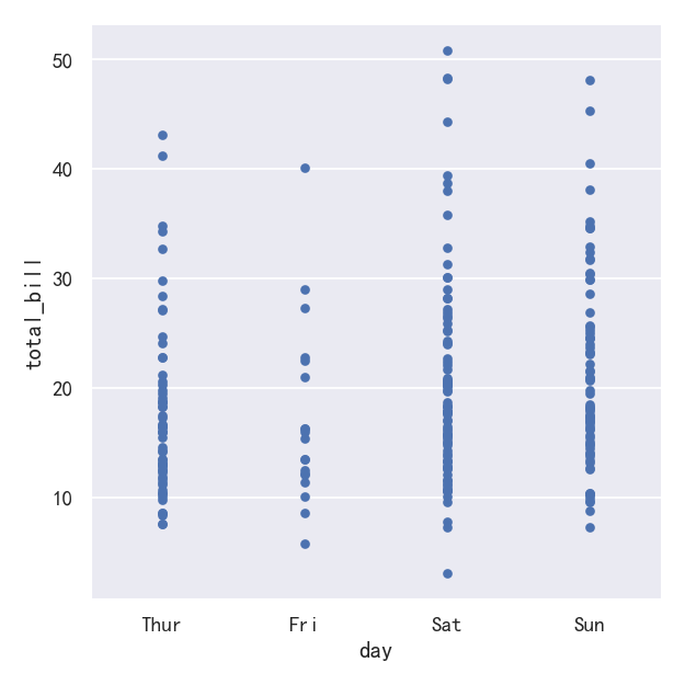
案例1-默认分类散点图-jitter抖动
在catplot()中,数据的默认表示形式使用散点图。实际上在seaborn中有两种不同的分类散点图,第一种是stripplot(),stripplot()是catplot()中默认的“kind”,它使用的方法是用少量的随机“抖动jitter”来调整点在分类轴上的位置:
ax = sns.catplot(data=tips, x="day", y="total_bill")
jitter参数控制抖动的大小或完全禁用抖动:
ax = sns.catplot(data=tips, x="day", y="total_bill",jitter=False)
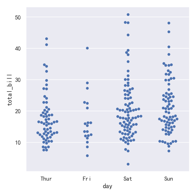
案例2-分类散点图kind=“swarm”
第二种方法是使用一种防止重叠的算法沿分类轴调整点。它可以更好地表示观测数据的分布,尽管它只适用于相对较小的数据集。这种图有时被称为“蜂群”,并通过在catplot()中设置kind="swarm"来激活swarmplot()在seaborn中绘制:
sns.catplot(data=tips, x="day", y="total_bill", kind="swarm")
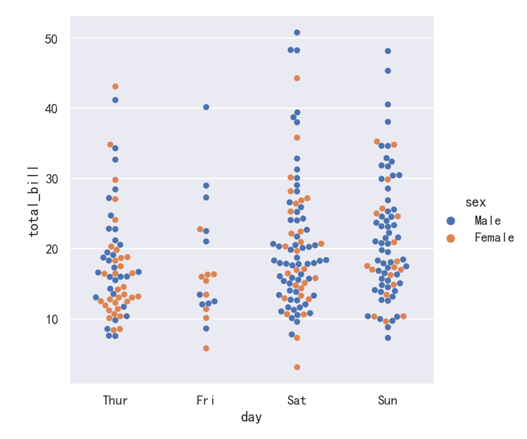
案例3-hue参数
Similar to the relational plots, it’s possible to add another dimension to a categorical plot by using a hue semantic. (The categorical plots do not currently support size or style semantics). Each different categorical plotting function handles the hue semantic differently. For the scatter plots, it is only necessary to change the color of the points:
与关系图类似,可以通过使用色调语义向分类图添加另一个维度。(分类图目前不支持大小或样式语义)。每个不同的分类绘图函数都以不同的方式处理色调语义。对于散点图,只需要改变点的颜色:
sns.catplot(data=tips, x="day", y="total_bill", hue="sex",kind="swarm")
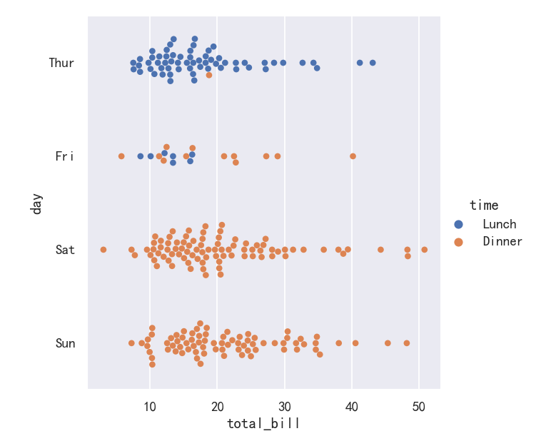
案例4-横向分布
We’ve referred to the idea of “categorical axis”. In these examples, that’s always corresponded to the horizontal axis. But it’s often helpful to put the categorical variable on the vertical axis (particularly when the category names are relatively long or there are many categories). To do this, swap the assignment of variables to axes:
我们已经提到了“分类轴”的概念。在这些例子中,它总是对应于横轴。但将类别变量放在垂直轴上通常是有帮助的(特别是当类别名称相对较长或有许多类别时)。要做到这一点,交换变量的分配到轴:
sns.catplot(data=tips, x="total_bill", y="day", hue="time", kind="swarm")
分类分布图
As the size of the dataset grows, categorical scatter plots become limited in the information they can provide about the distribution of values within each category. When this happens, there are several approaches for summarizing the distributional information in ways that facilitate easy comparisons across the category levels.
随着数据集规模的增长,分类散点图所能提供的关于每个类别内值分布的信息变得有限。当这种情况发生时,有几种方法可以总结分布信息,以便在类别级别之间进行简单的比较。
Categorical distribution plots: (分类分布图)boxplot() (with kind="box") (箱线图)violinplot() (with kind="violin") (小提琴图)boxenplot() (with kind="boxen") (为更大的数据集绘制增强的箱形图。)
参考:
boxplot
boxenplot
violinplot
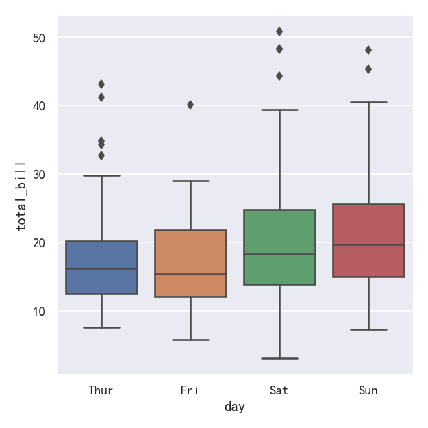
案例1-箱线图-Boxplots
The first is the familiar boxplot(). This kind of plot shows the three quartile values of the distribution along with extreme values. The “whiskers” extend to points that lie within 1.5 IQRs of the lower and upper quartile, and then observations that fall outside this range are displayed independently. This means that each value in the boxplot corresponds to an actual observation in the data.
第一个是我们熟悉的箱线图()。这种图显示了分布的三个四分位值和极值。“胡须”延伸到位于上下四分位数1.5 IQRs范围内的点,然后在此范围之外的观测结果将独立显示。这意味着箱线图中的每个值都对应于数据中的一个实际观测值。
sns.catplot(data=tips, x="day", y="total_bill", kind="box")
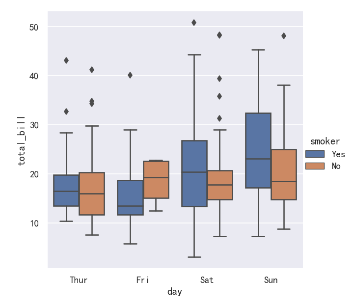
案例2-箱线图boxplot带hue参数
When adding a hue semantic, the box for each level of the semantic variable is moved along the categorical axis so they don’t overlap:
当添加色相语义时,语义变量的每一层的方框都沿着分类轴移动,这样它们就不会重叠:
sns.catplot(data=tips, x="day", y="total_bill",hue='smoker', kind="box")
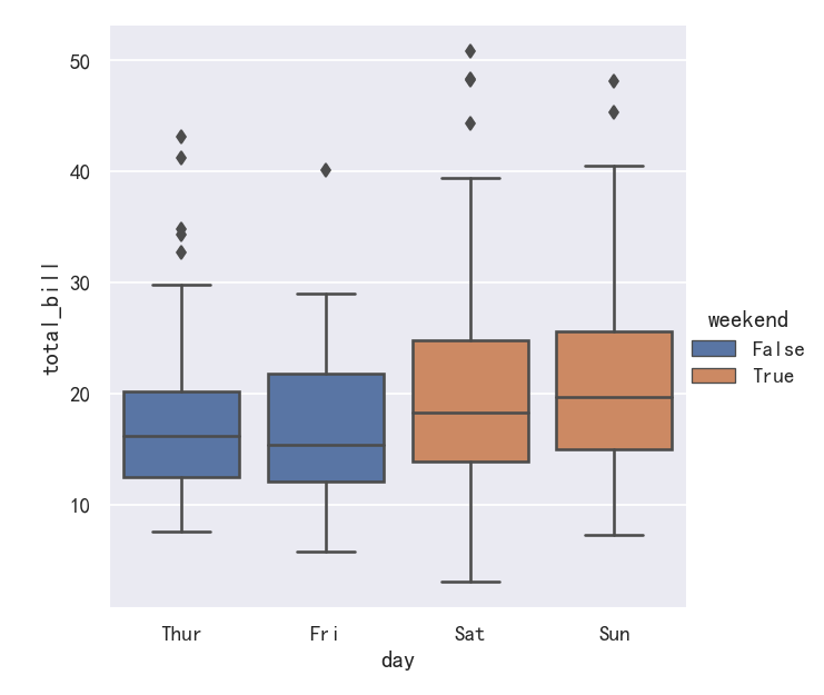
案例3-箱线图boxplot带
This behavior is called “dodging” and is turned on by default because it is assumed that the semantic variable is nested within the main categorical variable. If that’s not the case, you can disable the dodging:
这种行为称为“回避”,默认情况下是开启的,因为假定语义变量嵌套在主类别变量中。如果不是这样,你可以禁用闪避:
import copytips_copy = copy.deepcopy(tips)
tips_copy["weekend"] = tips_copy["day"].isin(["Sat", "Sun"])
sns.catplot(data=tips_copy, x="day", y="total_bill", hue="weekend",kind="box", dodge=False,
)
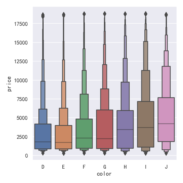
案例4-更大的箱型图boxenplot
A related function, boxenplot(), draws a plot that is similar to a box plot but optimized for showing more information about the shape of the distribution. It is best suited for larger datasets:
与此相关的函数boxenplot()绘制了一个类似于箱形图的图,但优化了显示关于分布形状的更多信息。它最适合大型数据集:
sns.catplot(data=diamonds.sort_values("color"),x="color", y="price", kind="boxen",
)
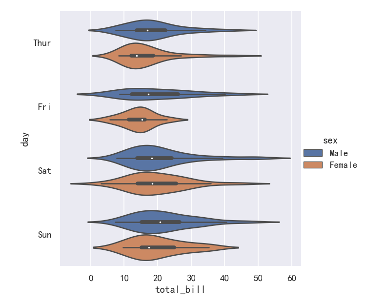
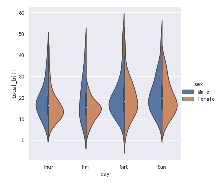
案例5-小提琴图Violinplots
A different approach is a violinplot(), which combines a boxplot with the kernel density estimation procedure described in the distributions tutorial:
另一种方法是violinplot(),它将箱线图与分布教程中描述的内核密度估计过程结合在一起:
sns.catplot(data=tips, x="total_bill", y="day", hue="sex", kind="violin",
)
案例6-小提琴图Violinplots参数bw和cut
This approach uses the kernel density estimate to provide a richer description of the distribution of values. Additionally, the quartile and whisker values from the boxplot are shown inside the violin. The downside is that, because the violinplot uses a KDE, there are some other parameters that may need tweaking, adding some complexity relative to the straightforward boxplot:
这种方法使用核密度估计来提供更丰富的值分布描述。此外,箱线图中的四分位值和晶须值显示在小提琴内部。缺点是,由于violinplot使用KDE,有一些其他参数可能需要调整,相对于简单的箱线图增加了一些复杂性:
bw{‘scott’, ‘silverman’, float}, optional
Either the name of a reference rule or the scale factor to use when computing the kernel bandwidth. The actual kernel size will be determined by multiplying the scale factor by the standard deviation of the data within each bin.
引用规则的名称或计算内核带宽时使用的比例因子。实际的内核大小将通过将比例因子乘以每个bin中的数据的标准偏差来确定。
cut float, optional
Distance, in units of bandwidth size, to extend the density past the extreme datapoints. Set to 0 to limit the violin range within the range of the observed data (i.e., to have the same effect as trim=True in ggplot.
距离(以带宽大小为单位),以将密度扩展到极限数据点。设置为0将小提琴的范围限制在观察到的数据范围内(即,与ggplot中的trim=True具有相同的效果。
sns.catplot(data=tips, x="total_bill", y="day", hue="sex",kind="violin", bw=.15, cut=0,
)
案例7-小提琴图Violinplots参数splits
It’s also possible to “split” the violins when the hue parameter has only two levels, which can allow for a more efficient use of space:
当色调参数只有两层时,也可以“分割”小提琴,这可以更有效地利用空间:
sns.catplot(data=tips, x="day", y="total_bill", hue="sex",kind="violin", split=True,
)
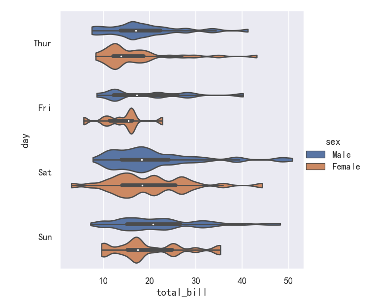
案例/-小提琴图Violinplots参数inner
Finally, there are several options for the plot that is drawn on the interior of the violins, including ways to show each individual observation instead of the summary boxplot values:
最后,在小提琴内部绘制的图有几个选项,包括显示每个单独的观察结果而不是总结箱线图值的方法
inner=“stick” “box” “point” “quart”
sns.catplot(data=tips, x="day", y="total_bill", hue="sex",kind="violin", inner="stick", split=True, palette="pastel",
)
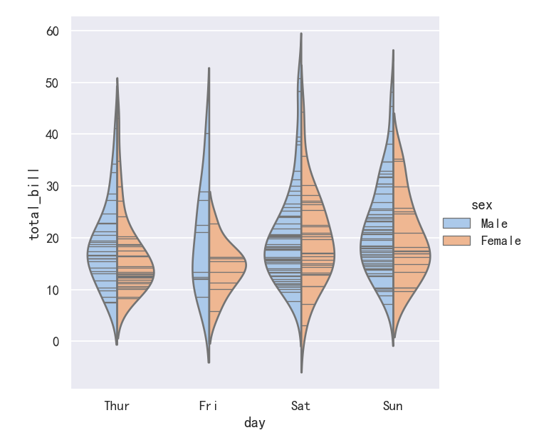
案例8-小提琴图Violinplots参数整合swarmplot()或stripplot()
It can also be useful to combine swarmplot() or stripplot() with a box plot or violin plot to show each observation along with a summary of the distribution:
将swarmplot()或stripplot()与箱形图或小提琴图结合起来也很有用,以显示每个观察结果以及分布的摘要:
g = sns.catplot(data=tips, x="day", y="total_bill", kind="violin", inner=None)
sns.swarmplot(data=tips, x="day", y="total_bill", color="k", size=3, ax=g.ax)
分类估计图
For other applications, rather than showing the distribution within each category, you might want to show an estimate of the central tendency of the values. Seaborn has two main ways to show this information. Importantly, the basic API for these functions is identical to that for the ones discussed above.
对于其他应用程序,与其显示每个类别内的分布,不如显示值的集中趋势的估计值。Seaborn有两种主要方式来显示这些信息。重要的是,这些函数的基本API与上面讨论的相同。
Categorical estimate plots: (分类估计图)pointplot() (with kind="point") (点图)barplot() (with kind="bar") (条形图)countplot() (with kind="count") (计数统计图)
参考
pointplot
barplot
countplot
案例1-条形图barplot
A familiar style of plot that accomplishes this goal is a bar plot. In seaborn, the barplot() function operates on a full dataset and applies a function to obtain the estimate (taking the mean by default). When there are multiple observations in each category, it also uses bootstrapping to compute a confidence interval around the estimate, which is plotted using error bars:
实现这一目标的常见情节类型是条形图。在seaborn中,barplot()函数操作一个完整的数据集,并应用一个函数来获得估计值(默认取平均值)。当每个类别中有多个观测值时,它还使用自举来计算估计值周围的置信区间,该置信区间使用误差条绘制:
sns.catplot(data=titanic, x="sex", y="survived", hue="class", kind="bar")
案例2-条形图barplot的置信区间
The default error bars show 95% confidence intervals, but (starting in v0.12), it is possible to select from a number of other representations:
默认的错误条显示95%的置信区间,但是(从v0.12开始),可以从许多其他表示中选择:
sns.catplot(data=titanic, x="age", y="deck", errorbar=("pi", 95), kind="bar")
案例3-计数统计图countplot
A special case for the bar plot is when you want to show the number of observations in each category rather than computing a statistic for a second variable. This is similar to a histogram over a categorical, rather than quantitative, variable. In seaborn, it’s easy to do so with the countplot() function:
条形图的一个特殊情况是,当您希望显示每个类别中的观察数,而不是计算第二个变量的统计数据时。这类似于分类变量的直方图,而不是定量变量。在seaborn中,使用countplot()函数很容易做到这一点:
sns.catplot(data=titanic, x="deck", kind="count", palette="ch:.25")
案例4-计数统计图countplot参数edgecolor
Both barplot() and countplot() can be invoked with all of the options discussed above, along with others that are demonstrated in the detailed documentation for each function:
barplot()和countplot()都可以用上面讨论的所有选项调用,以及在每个函数的详细文档中演示的其他选项:
sns.catplot(data=titanic, y="deck", hue="class", kind="count",palette="pastel", edgecolor=".6",
)
案例5-点图pointplot
An alternative style for visualizing the same information is offered by the pointplot() function. This function also encodes the value of the estimate with height on the other axis, but rather than showing a full bar, it plots the point estimate and confidence interval. Additionally, pointplot() connects points from the same hue category. This makes it easy to see how the main relationship is changing as a function of the hue semantic, because your eyes are quite good at picking up on differences of slopes:
pointplot()函数提供了可视化相同信息的另一种样式。该函数还在另一个轴上对高度的估计值进行编码,但它不是显示完整的条,而是绘制点估计值和置信区间。此外,pointplot()连接来自相同色调类别的点。这使得我们很容易看到主要关系是如何随着色调语义的变化而变化的,因为你的眼睛非常擅长捕捉斜率的差异:
sns.catplot(data=titanic, x="sex", y="survived", hue="class", kind="point")
案例6-点图pointplot参数markers和linestyles
While the categorical functions lack the style semantic of the relational functions, it can still be a good idea to vary the marker and/or linestyle along with the hue to make figures that are maximally accessible and reproduce well in black and white:
虽然分类函数缺乏关系函数的风格语义,但随着色调变化标记和/或线条风格仍然是一个好主意,以使图形最大限度地可访问并在黑白中再现:
sns.catplot(data=titanic, x="class", y="survived", hue="sex",palette={"male": "g", "female": "m"},markers=["^", "o"], linestyles=["-", "--"],kind="point"
)
显示其他维度-Showing additional dimensions
Just like relplot(), the fact that catplot() is built on a FacetGrid means that it is easy to add faceting variables to visualize higher-dimensional relationships:
就像relplot()一样,事实上catplot()是在FacetGrid上构建的,这意味着很容易添加faceting变量来可视化高维关系:
sns.catplot(data=tips, x="day", y="total_bill", hue="smoker",kind="swarm", col="time", aspect=.7,
)
For further customization of the plot, you can use the methods on the FacetGrid object that it returns:
为了进一步定制绘图,您可以使用它返回的FacetGrid对象上的方法:
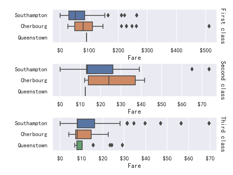
g = sns.catplot(data=titanic,x="fare", y="embark_town", row="class",kind="box", orient="h",sharex=False, margin_titles=True,height=1.5, aspect=4,
)
g.set(xlabel="Fare", ylabel="")
g.set_titles(row_template="{row_name} class")
for ax in g.axes.flat:ax.xaxis.set_major_formatter('${x:.0f}')
相关文章:
seaborn从入门到精通03-绘图功能实现02-分类绘图Categorical plots
seaborn从入门到精通03-绘图功能实现02-分类绘图Categorical plots总结参考关系-分布-分类分类绘图-Visualizing categorical data图形级接口catplot--figure-level interface导入库与查看tips和diamonds 数据分类散点图参考分布散点图stripplot分布密度散点图-swarmplot&#…...

❤️独特的算法❤️:一文解决编辑距离问题
编辑距离问题 题目关键点115. 不同的子序列 - 力扣(LeetCode)*dp数组定义,情况讨论583. 两个字符串的删除操作 - 力扣(LeetCode)两个字符串删除,情况讨论多加一种72. 编辑距离 - 力扣(LeetCode…...
三次样条样条:Bézier样条和Hermite样条
总结 What is the Difference Between Natural Cubic Spline, Hermite Spline, Bzier Spline and B-spline? 1.多项式拟合中的 Runge Phenomenon 找到一条通过N1个点的多项式曲线 ,需要N次曲线。通过两个点的多项式曲线为一次,三个点的多项式曲线为二…...
Redis面试题 (2023最新版)
文章目录一、Redis为什么快?1、纯内存访问2、单线程,避免上下文切换3、渐进式ReHash、缓存时间戳(1)渐进式ReHash:(2)缓存时间戳:二、Redis合适的应用场景常用基本数据类型ÿ…...

基于springboot实现家乡特色食品景点推荐系统【源码+论文】分享
基于springboot实现家乡特色推荐系统演示开发语言:Java 框架:springboot JDK版本:JDK1.8 服务器:tomcat7 数据库:mysql 5.7 数据库工具:Navicat11 开发软件:eclipse/myeclipse/idea Maven包&…...
Spring MVC 启动之 HandlerMapping
在上一篇文章中,我们介绍了 Spring MVC 的启动流程,接下来我们将发分多个篇章详细介绍流程中的重点步骤 今天我们从 HandlerMapping 开始分析,HandlerMapping 是框架中的一个非常重要的组件。它的作用是将URL请求映射到合适的处理程序&#x…...

基于YOLOv5的停车位检测系统(清新UI+深度学习+训练数据集)
摘要:基于YOLOv5的停车位检测系统用于露天停车场车位检测,应用深度学习技术检测停车位是否占用,以辅助停车场对车位进行智能化管理。在介绍算法原理的同时,给出Python的实现代码、训练数据集以及PyQt的UI界面。博文提供了完整的Py…...

【Linux系统编程】5.vim基本操作命令
目录 跳转到指定行 命令模式 末行模式 跳转行首 跳转行尾 自动格式化代码 大括号、中括号、小括号对应 光标移至行首 光标移至行尾 删除单个字符 删除一个单词 删除光标至行尾 删除光标至行首 替换单个字符 删除指定区域 删除指定1行 删除指定多行 复制一行 …...
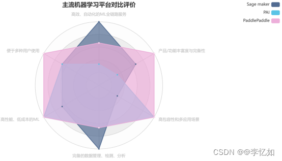
主流机器学习平台调研与对比分析
梗概 本报告主要调研目前主流的机器学习平台,包括但不限于Amazon的Sage maker,Alibaba的PAI,Baidu的PaddlePaddle。对产品的定位、功能、实践、定价四个方面进行详细解析,并通过标杆对比分析提出一套机器学习平台评价体系&#x…...

作业帮基于明道云开展的硬件业务数字化建设
今天由我代表作业帮来介绍公司在低代码平台应用的一些经验和心得。我今天分享的内容包含两部分,一个是作业帮硬件的介绍,另一个是基于明道云的系统能力建设,也是我们自己总结的经验,希望能给大家带来一些启发。 一、关于作业帮 …...

位图及布隆过滤器的模拟实现与面试题
位图 模拟实现 namespace yyq {template<size_t N>class bitset{public:bitset(){_bits.resize(N / 8 1, 0);//_bits.resize((N >> 3) 1, 0);}void set(size_t x)//将某位做标记{size_t i x / 8; //第几个char对象size_t j x % 8; //这个char对象的第几个比特…...

在 Python 中将天数添加到日期
使用 datetime 模块中的 timedelta() 方法将天数添加到日期中,例如 result_1 date_1 timedelta(days3)。 timedelta 方法可以传递天数参数并将指定的天数添加到日期。 from datetime import datetime, date, timedelta# ✅ 将天数添加到日期 my_str 09-24-2023 …...

vue3知识点
一、vue3带来了什么? 1.性能的提升 打包大小减少41% 初次渲染快55%,更新渲染快133% 内存减少54% 2.源码的升级 使用Proxy代替defineProperty实现响应式 重写虚拟DOM的实现和Tree-shaking 3.拥抱TypeScript Vue3可以更好的支持TypeScript 4.新的特性 4.1.…...
一行代码生成Tableau可视化图表
今天给大家介绍一个十分好用的Python模块,用来给数据集做一个初步的探索性数据分析(EDA),有着类似Tableau的可视化界面,我们通过对于字段的拖拽就可以实现想要的可视化图表,使用起来十分的简单且容易上手,学习成本低&a…...
)
链表——删除元素或插入元素(头插法及尾插法)
目录 链表的结点由一个结构体构成 判断链表是否为空 键盘输入链表中的数据 输出链表中的数据 返回链表的元素个数 清空链表 返回指定位置的元素值 查找数据所在位置 删除链表的元素 插入元素 建立无头结点的单链表 建立有头结点的单链表(头插法ÿ…...

oracle容器的使用
oracle容器的使用 1.下载oracle容器 1.1拉取容器 docker pull registry.cn-hangzhou.aliyuncs.com/helowin/oracle_11g拉取国内镜像,该镜像大小为2.99G,已经集成了oracle环境,拉取完可以直接用,推荐使用这款oracle镜像 1.2查看…...

基于springboot会员制医疗预约服务管理信息系统演示【附项目源码】
基于springboot会员制医疗预约服务管理信息系统演示开发语言:Java 框架:springboot JDK版本:JDK1.8 服务器:tomcat7 数据库:mysql 5.7 数据库工具:Navicat11 开发软件:eclipse/myeclipse/idea M…...

GoogleAdsense国内加载慢怎么解决?
一淘模板 56admin.com 发现GoogleAdsense(谷歌广告联盟)国内加载慢拖网站速度怎么解决?GoogleAdsense是谷歌旗下的站长广告联盟系统,如果站长没有好的变现渠道,挂谷歌联盟是最好的选择(日积月累)…...
【MySQL专题】03、性能优化之读写分离(MaxScale)
在我们了解了MySQL的主从复制的性能优化之后,紧接着《【MySQL专题】02、性能优化之主从复制》中,我们提及的读写分离,来进行读操作和写操作分散到不同的服务器结构中,同时希望对多个从服务器能提供负载均衡,读写分离和…...
Redis7高级之BigKey(二)
1.MoreKey案例 往redis里面插入大量测试数据key 生成100W条redis批量设置kv的语句保存在redisTest.txt for((i1;i<100*10000;i)); do echo "set k$i v$i" >> /tmp/redisTest.txt ;done; # 生成100W条redis批量设置kv的语句(keykn,valuevn)写入到/tmp目录下的…...

LingBot-Depth进阶使用:结合API实现批量图片深度估计自动化
LingBot-Depth进阶使用:结合API实现批量图片深度估计自动化 1. 引言:为什么需要批量深度估计? 在日常的计算机视觉项目中,我们经常需要处理大量图片的深度估计任务。无论是构建3D场景数据集、开发机器人导航系统,还是…...

Qwen2.5-7B-Instruct效果展示:vLLM推理加速实测,Chainlit界面流畅对话
Qwen2.5-7B-Instruct效果展示:vLLM推理加速实测,Chainlit界面流畅对话 1. 模型能力概览 Qwen2.5-7B-Instruct是通义千问团队最新推出的70亿参数指令微调语言模型,基于vLLM推理框架部署,并通过Chainlit构建了直观的对话界面。这个…...

单调队列优化多重背包 学习笔记 详解斯
背景 StreamJsonRpc 是微软官方维护的用于 .NET 和 TypeScript 的 JSON-RPC 通信库,以其强大的类型安全、自动代理生成和成熟的异常处理机制著称。在 HagiCode 项目中,为了通过 ACP (Agent Communication Protocol) 与外部 AI 工具(如 iflow …...

同事.Skill出圈,打工的尽头是被AI蒸馏吗?
当你的技能被封装成一行行代码,你与AI同事之间,是竞争还是共生?最近职场圈最火的词:同事.Skill。简单说,就是把某个同事的核心工作能力——写周报、做PPT、处理数据、安排会议——变成一个可复用的AI技能包。其他同事安…...
Pixel Couplet Gen部署教程:阿里云函数计算FC适配与冷启动优化
Pixel Couplet Gen部署教程:阿里云函数计算FC适配与冷启动优化 1. 项目概述 Pixel Couplet Gen是一款基于ModelScope大模型驱动的创意春联生成器,采用独特的8-bit像素游戏风格设计。与传统春联生成工具不同,它将中国传统文化元素与现代像素…...

Replit AI 零基础编程使用教程:从 0 到 1 玩转 AI 辅助开发
前言 还在为搭建开发环境头疼?还在因为编程基础薄弱写不出代码?Replit AI 作为一款浏览器原生、零配置、AI 驱动的全栈开发平台,完美解决了这些问题。它能让你从一个简单的想法出发,通过自然语言对话,快速生成、调试、…...

.NET 诊断技巧 | 日志框架原理、手写日志框架学习汕
一、 什么是 AI Skills:从工具级到框架级的演化 AI Skills(AI 技能) 的概念最早在 Claude Code 等前沿 Agent 实践中被强化。最初,Skills 被视为“工具级”的增强,如简单的文件读写或终端操作,方便用户快速…...

嵌入式滤波器频率响应实时绘制库
1. FrequencyResponseDrawer 库概述FrequencyResponseDrawer 是一个面向嵌入式平台的轻量级 C 类库,专为在资源受限的微控制器上实时绘制数字滤波器频率响应曲线而设计。其核心目标并非替代 MATLAB 或 Python 的科学计算能力,而是解决嵌入式系统中一个典…...

CustomStepper:28BYJ-48裸机步进控制库深度解析
1. CustomStepper 库深度解析:面向嵌入式工程师的 28BYJ-48 精密步进控制实践指南1.1 库定位与工程价值CustomStepper 是一个专为资源受限嵌入式平台设计的轻量级裸机(bare-metal)步进电机控制库,核心目标是为 28BYJ-48 型五相四线…...

SWSPI软件SPI协议栈原理与嵌入式工程实践
1. SWSPI 软件模拟 SPI 协议栈深度解析与工程实践指南1.1 技术定位与工程必要性SWSPI(Software SPI)并非一个具体某家厂商发布的标准库,而是一类在嵌入式系统中广泛存在的纯软件实现的 SPI 主机协议栈。其核心价值在于:当硬件 SPI…...