趋势(一)利用python绘制折线图
趋势(一)利用python绘制折线图
折线图( Line Chart)简介
折线图用于在连续间隔或时间跨度上显示定量数值,最常用来显示趋势和关系(与其他折线组合起来)。折线图既能直观地显示数量随时间的变化趋势,也能展示两个变量的关系。
快速绘制
-
基于matplotlib
import matplotlib.pyplot as plt
import numpy as np# 自定义数据
values = np.cumsum(np.random.randn(1000,1))# 绘制折线图
plt.plot(values)
plt.show()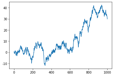
-
基于seaborn
import seaborn as sns
import matplotlib.pyplot as plt
import numpy as np# 自定义数据
values = np.cumsum(np.random.randn(1000,1))# 绘制折线图
sns.lineplot(x=np.array(range(1, 1001)), y=values.ravel())  # 使用 ravel() 将 values 转化为一维
plt.show()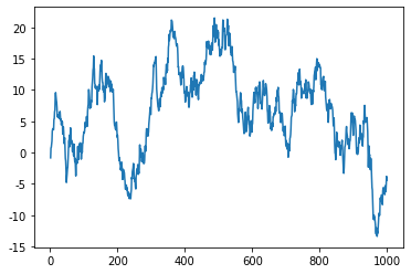
-
基于plotly
import plotly.graph_objects as go
import numpy as np# 自定义数据
values = np.cumsum(np.random.randn(1000,1))# 绘制折线图
fig = go.Figure(data=go.Scatter(x=list(range(1, 1001)), y=values.ravel(), mode='lines'))
fig.show()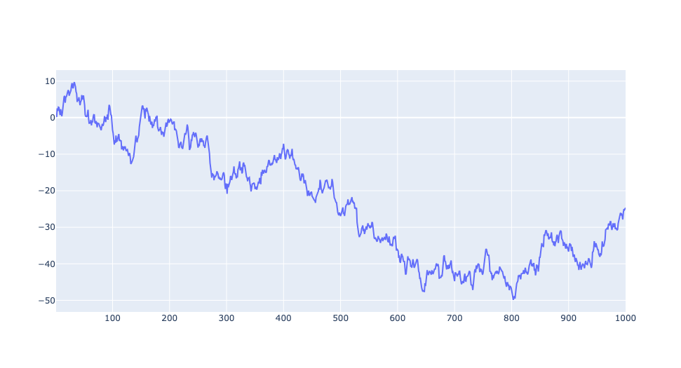
-
基于pandas
import numpy as np
import matplotlib.pyplot as plt
import pandas as pd# 自定义数据
values = np.cumsum(np.random.randn(1000,1))
df = pd.DataFrame(values, columns=['Values'])# 绘制折线图
df.plot()
plt.show()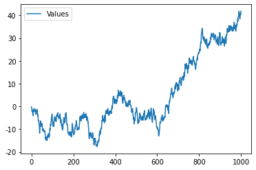
定制多样化的折线图
自定义折线图一般是结合使用场景对相关参数进行修改,并辅以其他的绘图知识。参数信息可以通过官网进行查看,其他的绘图知识则更多来源于实战经验,大家不妨将接下来的绘图作为一种学习经验,以便于日后总结。
通过matplotlib绘制多样化的折线图
matplotlib主要利用plot绘制折线图,可以通过matplotlib.pyplot.plot了解更多用法
-
修改参数
import matplotlib as mpl
import matplotlib.pyplot as plt
import numpy as np
import pandas as pdplt.rcParams['font.sans-serif'] = ['SimHei'] # 用来正常显示中文标签# 自定义数据
df=pd.DataFrame({'x_values': range(1,11), 'y_values': np.random.randn(10) })# 初始化布局
fig = plt.figure(figsize=(12,3))# 自定义颜色
plt.subplot(1, 3, 1)
plt.plot( 'x_values', 'y_values', data=df, color='skyblue')
plt.title('自定义颜色')# 自定义透明度
plt.subplot(1, 3, 2)
plt.plot( 'x_values', 'y_values', data=df, color='skyblue', alpha=0.3)
plt.title('自定义透明度')# 自定义线条
plt.subplot(1, 3, 3)
plt.plot( 'x_values', 'y_values', data=df, linestyle='dashed', linewidth=5)
plt.title('自定义线条')plt.show()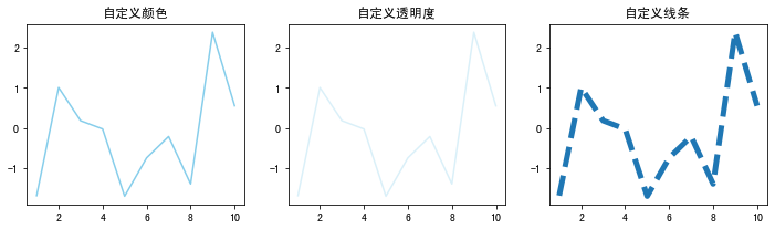
-
带注释的折线图
import matplotlib.pyplot as plt
import numpy as np
import pandas as pdplt.rcParams['font.sans-serif'] = ['SimHei'] # 用来正常显示中文标签# 自定义数据
dates = []for date in range(1970,2023):dates.append(str(date))sample_size = 2023-1970
variable = np.random.normal(100,15,sample_size,)df = pd.DataFrame({'date': dates,'value': variable})# 初始化布局
fig = plt.figure(figsize=(12,8))# 1-基本折线图
plt.subplot(2, 1, 1)
plt.plot(df['date'], df['value'])# 轴标签
plt.xlabel('X-axis')
plt.ylabel('Y-axis')
plt.title('基本折线图')# 刻度
plt.xticks(rotation=45)# 2-带注释的折线图
plt.subplot(2, 1, 2)
plt.plot(df['date'], df['value'])# 轴标签
plt.xlabel('X-axis')
plt.ylabel('Y-axis')
plt.title('带注释的折线图')# 刻度
plt.xticks(rotation=45)# 添加文本注释
plt.text(df['date'].iloc[38], # x位置df['value'].iloc[1], # y位置'What a nice chart!', # 文本注释fontsize=13,color='red')# 找到最大值索引
highest_index = df['value'].idxmax()# 最高值标记
plt.scatter(df['date'].iloc[highest_index],df['value'].iloc[highest_index],color='blue',marker='o', # 标记特殊的店s=100,)# 计算均值
median_value = df['value'].median()# 添加均值线
plt.axhline(y=median_value, color='green', linestyle='--', label='Reference Line (Median)')fig.tight_layout() # 自动调整间距
plt.show()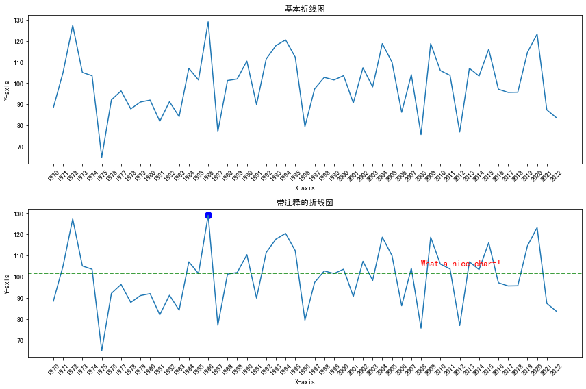
-
对数变换的折线图
import matplotlib.pyplot as plt
from matplotlib.ticker import MultipleLocator
import numpy as np
import pandas as pdplt.rcParams['font.sans-serif'] = ['SimHei'] # 用来正常显示中文标签# 自定义数据
x = np.linspace(1, 10, 100)
y = np.exp(x)
df = pd.DataFrame({'x': x, 'y': y})# 初始化布局
fig = plt.figure(figsize=(12,4))# 1-基本折线图
plt.subplot(1, 2, 1)
plt.plot(df['x'], df['y'])# 轴标签
plt.xlabel('X-axis')
plt.ylabel('Y-axis')
plt.title('基本折线图')# 添加网格线
plt.grid(True, linestyle='--', alpha=0.6)# 2-对数转化折线图
plt.subplot(1, 2, 2)
plt.plot(df['x'], df['y'])# y轴对数化
plt.yscale('log')# 轴标签
plt.xlabel('X-axis')
plt.ylabel('Y-axis')
plt.title('对数化的折线图')# 对数刻度的网格
y_major_locator = MultipleLocator(3000)
plt.gca().yaxis.set_major_locator(y_major_locator)# 添加网格线
plt.grid(True, linestyle='--', alpha=0.6)plt.show()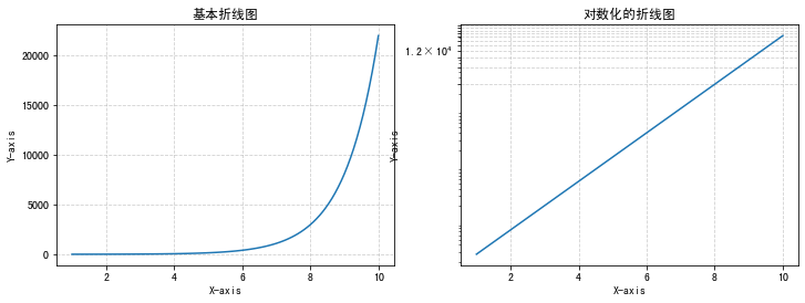
-
双轴折线图
import matplotlib.pyplot as plt
import numpy as np
from datetime import datetime, timedelta
from matplotlib import colorsplt.rcParams['font.sans-serif'] = ['SimHei'] # 用来正常显示中文标签rng = np.random.default_rng(1234)date = [datetime(2019, 1, 1) + timedelta(i) for i in range(100)]
temperature = np.arange(100) ** 2.5 / 10000 + rng.uniform(size=100)
price = np.arange(120, 20, -1) ** 1.5 / 10 + rng.uniform(size=100)# 设置多子图
fig, axarr = plt.subplots(2, 2, figsize=(12, 8))# 1-基础的双轴折线图
ax1 = axarr[0, 0]
ax2 = ax1.twinx()
ax1.plot(date, temperature)
ax2.plot(date, price)
ax1.set_title('基础的双轴折线图')# 2-自定义颜色双轴
COLOR_TEMPERATURE = "#69b3a2"
COLOR_PRICE = "#3399e6"ax1 = axarr[0, 1]
ax2 = ax1.twinx()
ax1.plot(date, temperature, color=COLOR_TEMPERATURE, lw=3)
ax2.plot(date, price, color=COLOR_PRICE, lw=4)ax1.set_xlabel("Date")
ax1.set_ylabel("Temperature (Celsius °)", color=COLOR_TEMPERATURE, fontsize=14)
ax1.tick_params(axis="y", labelcolor=COLOR_TEMPERATURE)
ax2.set_ylabel("Price ($)", color=COLOR_PRICE, fontsize=14)
ax2.tick_params(axis="y", labelcolor=COLOR_PRICE)
ax1.set_title('自定义颜色双轴')# 3-折线与条形图组合
ax1 = axarr[1, 0]
ax2 = ax1.twinx()
ax1.bar(date, temperature, color=COLOR_TEMPERATURE, edgecolor="black", alpha=0.4, width=1.0)
ax2.plot(date, price, color=COLOR_PRICE, lw=4)ax1.set_xlabel("Date")
ax1.set_ylabel("Temperature (Celsius °)", color=COLOR_TEMPERATURE, fontsize=14)
ax1.tick_params(axis="y", labelcolor=COLOR_TEMPERATURE)ax2.set_ylabel("Price ($)", color=COLOR_PRICE, fontsize=14)
ax2.tick_params(axis="y", labelcolor=COLOR_PRICE)fig.autofmt_xdate()
ax1.set_title("折线与条形图组合")# 4-自定义组合图样式
color = list(colors.to_rgba(COLOR_TEMPERATURE))
color[3] = 0.4ax1 = axarr[1, 1]
ax2 = ax1.twinx()
ax1.bar(date, temperature, color=color, edgecolor="black", width=1.0)
ax2.plot(date, price, color=COLOR_PRICE, lw=4)ax1.set_xlabel("Date")
ax1.set_ylabel("Temperature (Celsius °)", color=COLOR_TEMPERATURE, fontsize=14)
ax1.tick_params(axis="y", labelcolor=COLOR_TEMPERATURE)ax2.set_ylabel("Price ($)", color=COLOR_PRICE, fontsize=14)
ax2.tick_params(axis="y", labelcolor=COLOR_PRICE)fig.autofmt_xdate()
ax1.set_title("自定义组合图样式")fig.tight_layout() # 自动调整间距
plt.show()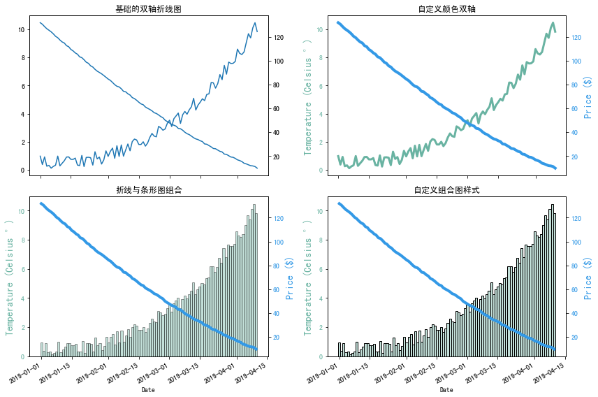
-
多个折线图
import matplotlib.pyplot as plt
import numpy as np
from datetime import datetime, timedelta
from matplotlib import colors
import matplotlib.gridspec as gridspecplt.rcParams['font.sans-serif'] = ['SimHei'] # 用来正常显示中文标签# 创建 2x3 的大布局
fig = plt.figure(figsize=(18, 8))
gs = gridspec.GridSpec(2, 3, figure=fig)
# 获得每个子图的位置
ax1 = fig.add_subplot(gs[0, 0])
ax2 = fig.add_subplot(gs[0, 1])
ax3 = fig.add_subplot(gs[0, 2])
# ax4 = fig.add_subplot(gs[1, 0])
# ax5 = fig.add_subplot(gs[1, 1])
ax6 = fig.add_subplot(gs[1, 2])# 1-基础的多折线图
df=pd.DataFrame({'x_values': range(1,11), 'y1_values': np.random.randn(10), 'y2_values': np.random.randn(10)+range(1,11), 'y3_values': np.random.randn(10)+range(11,21) })ax1.plot( 'x_values', 'y1_values', data=df, marker='o', markerfacecolor='blue', markersize=12, color='skyblue', linewidth=4)
ax1.plot( 'x_values', 'y2_values', data=df, marker='', color='olive', linewidth=2)
ax1.plot( 'x_values', 'y3_values', data=df, marker='', color='olive', linewidth=2, linestyle='dashed', label="toto")
ax1.legend()
ax1.set_title('基础的多折线图')# 2-高亮显示一组
df=pd.DataFrame({'x': range(1,11), 'y1': np.random.randn(10), 'y2': np.random.randn(10)+range(1,11), 'y3': np.random.randn(10)+range(11,21), 'y4': np.random.randn(10)+range(6,16), 'y5': np.random.randn(10)+range(4,14)+(0,0,0,0,0,0,0,-3,-8,-6), 'y6': np.random.randn(10)+range(2,12), 'y7': np.random.randn(10)+range(5,15), 'y8': np.random.randn(10)+range(4,14) })for column in df.drop('x', axis=1):ax2.plot(df['x'], df[column], marker='', color='grey', linewidth=1, alpha=0.4)
ax2.plot(df['x'], df['y5'], marker='', color='orange', linewidth=4, alpha=0.7) # 高亮y5
ax2.set_xlim(0,12)
# 增加注释
num=0
for i in df.values[9][1:]:num+=1name=list(df)[num]if name != 'y5':ax2.text(10.2, i, name, horizontalalignment='left', size='small', color='grey')else:ax2.text(10.2, i, 'Mr Orange', horizontalalignment='left', size='small', color='orange') # 高亮组的文本注释
ax2.set_title("高亮显示一组")# 3-多折线模式(Spaghetti Plot)
df=pd.DataFrame({'x': range(1,11), 'y1': np.random.randn(10), 'y2': np.random.randn(10)+range(1,11), 'y3': np.random.randn(10)+range(11,21), 'y4': np.random.randn(10)+range(6,16), 'y5': np.random.randn(10)+range(4,14)+(0,0,0,0,0,0,0,-3,-8,-6), 'y6': np.random.randn(10)+range(2,12), 'y7': np.random.randn(10)+range(5,15), 'y8': np.random.randn(10)+range(4,14), 'y9': np.random.randn(10)+range(4,14), 'y10': np.random.randn(10)+range(2,12) })palette = plt.get_cmap('Set1')
num=0
for column in df.drop('x', axis=1):num+=1ax3.plot(df['x'], df[column], marker='', color=palette(num), linewidth=1, alpha=0.9, label=column)ax3.legend(loc=2, ncol=2)
ax3.set_title("多折线模式(Spaghetti Plot)")# 4-多折线小图
df=pd.DataFrame({'x': range(1,11), 'y1': np.random.randn(10), 'y2': np.random.randn(10)+range(1,11), 'y3': np.random.randn(10)+range(11,21), 'y4': np.random.randn(10)+range(6,16), 'y5': np.random.randn(10)+range(4,14)+(0,0,0,0,0,0,0,-3,-8,-6), 'y6': np.random.randn(10)+range(2,12), 'y7': np.random.randn(10)+range(5,15), 'y8': np.random.randn(10)+range(4,14), 'y9': np.random.randn(10)+range(4,14) })
# 在第一行第一列的位置创建3*3的子布局
ax4 = gridspec.GridSpecFromSubplotSpec(3, 3, subplot_spec=gs[1, 0])
# 在 3x3 的小布局中添加子图
axes = []
for i in range(3):for j in range(3):ax = fig.add_subplot(ax4[i, j])axes.append(ax)  # 将子图句柄添加到列表中
num = 0
for column in df.drop('x', axis=1):num += 1ax = axes[num - 1]ax.plot(df['x'], df[column], marker='', color=palette(num), linewidth=1.9, alpha=0.9, label=column)ax.set_xlim(0,10)ax.set_ylim(-2,22)# 如果当前子图不在最左边,就不显示y轴的刻度标签if num not in [1,4,7] :ax.tick_params(labelleft=False)# 如果当前子图不在最下边,就不显示x轴的刻度标签if num not in [7,8,9] :ax.tick_params(labelbottom=False)ax.annotate(column, xy=(0, 1), xycoords='axes fraction', fontsize=12, fontweight=0, color=palette(num),xytext=(5, -5), textcoords='offset points', ha='left', va='top')axes[1].set_title('多折线小图') # 通过设置3*3图的第二个子图的标题替代2*3图中的第4个图的子标题# 5-多折线小图细节处理
df=pd.DataFrame({'x': range(1,11), 'y1': np.random.randn(10), 'y2': np.random.randn(10)+range(1,11), 'y3': np.random.randn(10)+range(11,21), 'y4': np.random.randn(10)+range(6,16), 'y5': np.random.randn(10)+range(4,14)+(0,0,0,0,0,0,0,-3,-8,-6), 'y6': np.random.randn(10)+range(2,12), 'y7': np.random.randn(10)+range(5,15), 'y8': np.random.randn(10)+range(4,14), 'y9': np.random.randn(10)+range(4,14) })
# 在第一行第一列的位置创建3*3的子布局
ax5 = gridspec.GridSpecFromSubplotSpec(3, 3, subplot_spec=gs[1, 1])
# 在 3x3 的小布局中添加子图
axes = []
for i in range(3):for j in range(3):ax = fig.add_subplot(ax5[i, j])axes.append(ax)  # 将子图句柄添加到列表中
num=0
for column in df.drop('x', axis=1):num+=1ax = axes[num - 1]for v in df.drop('x', axis=1):ax.plot(df['x'], df[v], marker='', color='grey', linewidth=0.6, alpha=0.3)ax.plot(df['x'], df[column], marker='', color=palette(num), linewidth=2.4, alpha=0.9, label=column)ax.set_xlim(0,10)ax.set_ylim(-2,22)# 如果当前子图不在最左边,就不显示y轴的刻度标签if num not in [1,4,7] :ax.tick_params(labelleft=False)# 如果当前子图不在最下边,就不显示x轴的刻度标签if num not in [7,8,9] :ax.tick_params(labelbottom=False)ax.annotate(column, xy=(0, 1), xycoords='axes fraction', fontsize=12, fontweight=0, color=palette(num),xytext=(5, -5), textcoords='offset points', ha='left', va='top')axes[1].set_title('多折线小图细节处理') # 通过设置3*3图的第二个子图的标题替代2*3图中的第5个图的子标题# 6-带区域填充的多折线图
time = np.arange(12)
income = np.array([5, 9, 6, 6, 10, 7, 6, 4, 4, 5, 6, 4])
expenses = np.array([6, 6, 8, 3, 6, 9, 7, 8, 6, 6, 4, 8])ax6.plot(time, income, color="green")
ax6.plot(time, expenses, color="red")# 当income > expenses填充绿色
ax6.fill_between(time, income, expenses, where=(income > expenses), interpolate=True, color="green", alpha=0.25, label="Positive"
)# 当income <= expenses填充红色
ax6.fill_between(time, income, expenses, where=(income <= expenses), interpolate=True, color="red", alpha=0.25,label="Negative"
)ax6.set_title('带区域填充的多折线图')
ax6.legend()plt.tight_layout() # 自动调整间距
plt.show()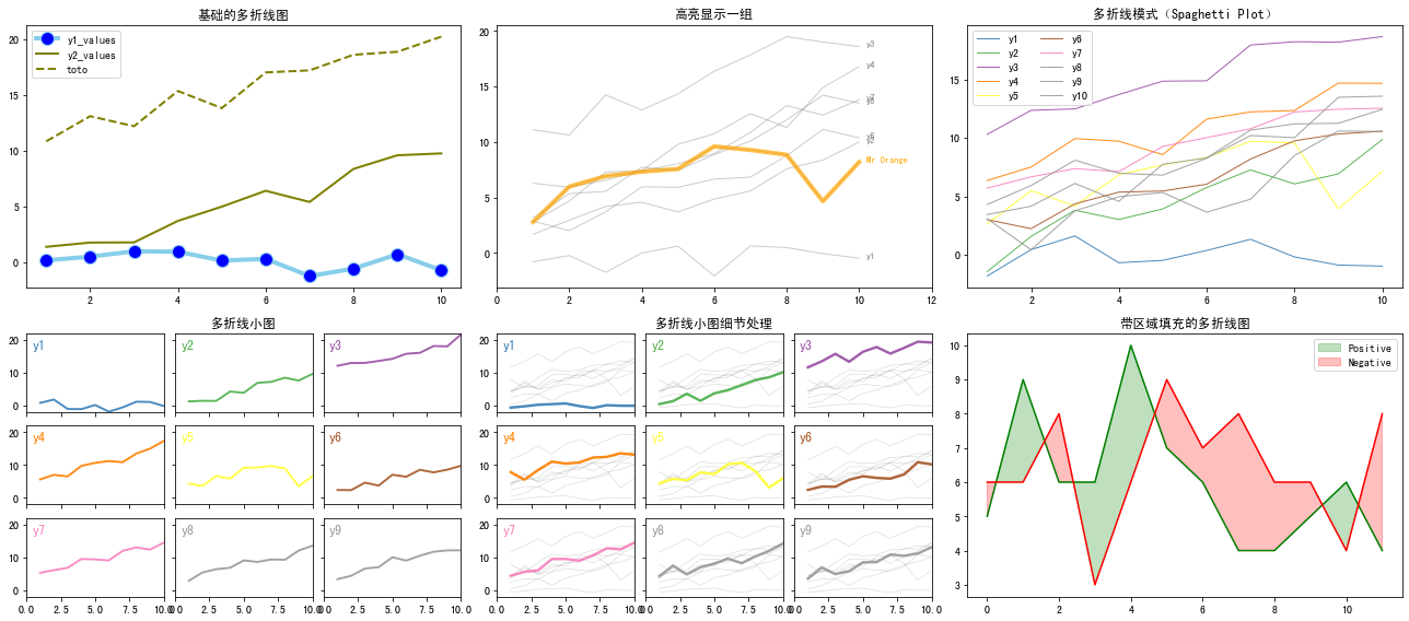
-
绘制时间序列图
import matplotlib.pyplot as plt
import pandas as pd
import matplotlib.dates as mdates# 导入数据
data = pd.read_csv("https://raw.githubusercontent.com/holtzy/data_to_viz/master/Example_dataset/3_TwoNumOrdered.csv", delim_whitespace=True
)# 日期格式
data["date"] = pd.to_datetime(data["date"])date = data["date"]
value = data["value"]# 绘制时间序列图
fig, ax = plt.subplots(figsize=(8, 6))# 设置6个月间隔为一刻度
half_year_locator = mdates.MonthLocator(interval=6) # 半年刻度
monthly_locator = mdates.MonthLocator() # 每月子刻度
year_month_formatter = mdates.DateFormatter("%Y-%m") # 格式化日期yyyy-MMax.xaxis.set_major_locator(half_year_locator)
ax.xaxis.set_minor_locator(monthly_locator)
ax.xaxis.set_major_formatter(year_month_formatter)ax.plot(date, value)fig.autofmt_xdate() # 自动旋转轴标签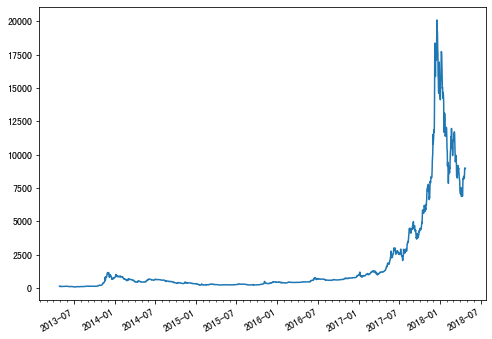
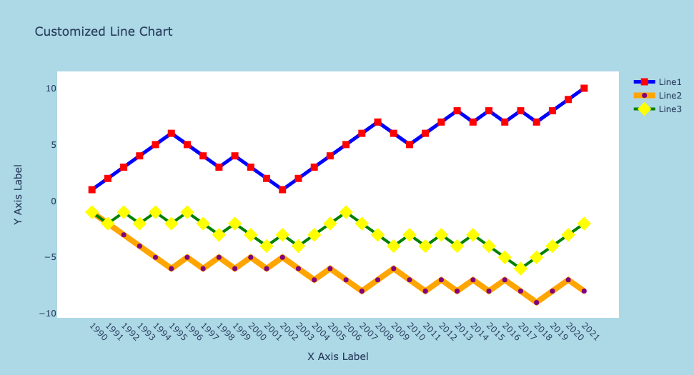
通过plotly绘制多样化的折线图
import plotly.graph_objects as go
import numpy as np
import pandas as pd# 自定义数据dates = []
start = 1990
end = 2022
for date in range(start,end):dates.append(str(date))# 生成随机序列,并计算累计和来生成随机漫步1、2、3
random_steps = np.random.choice([-1, 1], size=end-start, p=[0.5, 0.5])
random_walk1 = np.cumsum(random_steps)random_steps = np.random.choice([-1, 1], size=end-start, p=[0.5, 0.5])
random_walk2 = np.cumsum(random_steps)random_steps = np.random.choice([-1, 1], size=end-start, p=[0.5, 0.5])
random_walk3 = np.cumsum(random_steps)# 具有三个随机漫步的数据
df = pd.DataFrame({'date': dates,'value1': random_walk1,'value2': random_walk2,'value3': random_walk3,})fig = go.Figure()# 自定义变量1
fig.add_trace(go.Scatter(x=df['date'],y=df['value1'],mode='lines+markers', # 点线连接样式name='Line1',marker=dict(symbol='square',    size=10,           color='red'),      line=dict(color='blue',        width=5)
))# 自定义变量2
fig.add_trace(go.Scatter(x=df['date'], y=df['value2'], mode='lines+markers', name='Line2', marker=dict(symbol='circle',   size=7,           color='purple'),      line=dict(color='orange',       width=8)
))# 自定义变量3
fig.add_trace(go.Scatter(x=df['date'], y=df['value3'], mode='lines+markers', name='Line3',marker=dict(symbol='diamond',    size=15,            color='yellow'),       line=dict(color='green',       width=4)
))# 自定义布局
fig.update_layout(title='Customized Line Chart',xaxis_title='X Axis Label', yaxis_title='Y Axis Label',xaxis_tickangle=45,  showlegend=True,    plot_bgcolor='white',  paper_bgcolor='lightblue',
)
通过pandas绘制多样化的折线图
-
修改参数
import pandas as pd
import matplotlib.pyplot as plt# 导入数据
url = 'https://raw.githubusercontent.com/holtzy/The-Python-Graph-Gallery/master/static/data/gapminderData.csv'
df = pd.read_csv(url)
df_france = df[df['country']=='France']# 绘制折线图
ax = df_france.plot(x='year',y='lifeExp',grid=True,linestyle='--',alpha=0.5,color='purple',linewidth=2.0, marker='d',  markersize=8,  markerfacecolor='orange', label='France')# 标题
ax.set_title('Evolution of \nthe life expectancy in France',weight='bold') # 轴标签
ax.set_ylabel('Life Expectancy')
ax.set_xlabel('Time (in year)')plt.show()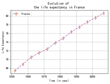
-
多变量折线图
import pandas as pd
import random, numpy as np
import matplotlib.pyplot as plt# 自定义数据
num_time_points = 100
time_values = np.arange(num_time_points)temperature = np.random.uniform(200, 400, num_time_points)
pressure = np.random.uniform(500, 700, num_time_points)
humidity = np.random.uniform(800, 1000, num_time_points) data = {'Time': time_values,'Temperature': temperature,'Pressure': pressure,'Humidity': humidity
}
df = pd.DataFrame(data)# 绘制多变量折线图
df.plot(x='Time',kind='line', grid=True, )
plt.legend(loc='upper right',bbox_to_anchor=(1.35, 1), )
plt.show()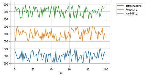
-
分组折线图
import pandas as pd
import random, numpy as np
import matplotlib.pyplot as plt# 自定义数据
num_data_points_per_country = 20# 设置多个国家的温度
france_temperatures = np.random.uniform(10, 20, num_data_points_per_country)
germany_temperatures = np.random.uniform(0, 10, num_data_points_per_country)
italy_temperatures = np.random.uniform(25, 30, num_data_points_per_country) # 对应的国家数据
countries = ['France', 'Germany', 'Italy']
country_labels = np.repeat(countries, num_data_points_per_country)# 时间数据
time_values = np.tile(np.arange(num_data_points_per_country), len(countries))data = {'Country': country_labels,'Temperature': np.concatenate([france_temperatures, germany_temperatures, italy_temperatures]),'Time': time_values
}df = pd.DataFrame(data)# 绘制折线图
for name, group in df.groupby('Country'):plt.plot(group['Time'], group['Temperature'], label=name)# 设置图表的标题和坐标轴标签,并显示图例
plt.title('Temperature Trend over Time by Country')
plt.xlabel('Time')
plt.ylabel('Temperature')
plt.legend(bbox_to_anchor=(1.05, 1), loc='upper left')# 显示图表
plt.show()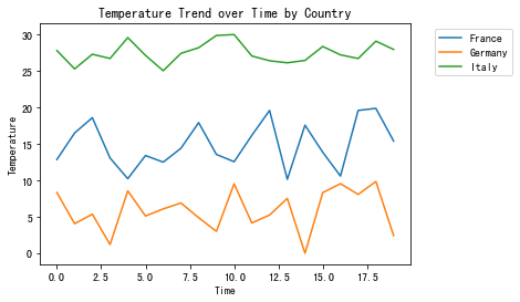
总结
以上通过matplotlib、seaborn、plotly和pandas快速绘制折线图。并通过修改参数或者辅以其他绘图知识自定义各种各样的折线图来适应相关使用场景。
共勉~
相关文章:
趋势(一)利用python绘制折线图
趋势(一)利用python绘制折线图 折线图( Line Chart)简介 折线图用于在连续间隔或时间跨度上显示定量数值,最常用来显示趋势和关系(与其他折线组合起来)。折线图既能直观地显示数量随时间的变化…...

【含文档】基于Springboot+Vue的采购管理系统(含源码+数据库+lw)
1.开发环境 开发系统:Windows10/11 架构模式:MVC/前后端分离 JDK版本: Java JDK1.8 开发工具:IDEA 数据库版本: mysql5.7或8.0 数据库可视化工具: navicat 服务器: SpringBoot自带 apache tomcat 主要技术: Java,Springboot,mybatis,mysql,vue 2.视频演示地址 3.功能 系统定…...
【C++11入门基础】
我没有那么想你,那只是偶尔醉意会催人提起.......................................................................... 目录 前言 一、【C11的介绍】 二、【C11引入的一些实用语法】 2.1、【统一的列表初始化({ }的初始化)】 2.2、【initi…...
Pytest中fixture的scope详解
pytest作为Python技术栈下最主流的测试框架,功能极为强大和灵活。其中Fixture夹具是它的核心。而且pytest中对Fixture的作用范围也做了不同区分,能为我们利用fixture带来很好地灵活性。 下面我们就来了解下这里不同scope的作用 fixture的scope定义 首…...

Springboot 接入 WebSocket 实战
Springboot 接入 WebSocket 实战 前言: WebSocket协议是基于TCP的一种新的网络协议。它实现了浏览器与服务器全双工(full-duplex)通信——允许服务器主动发送信息给客户端。 简单理解: 1,常见开发过程中我们知道 Http协议,客户端…...
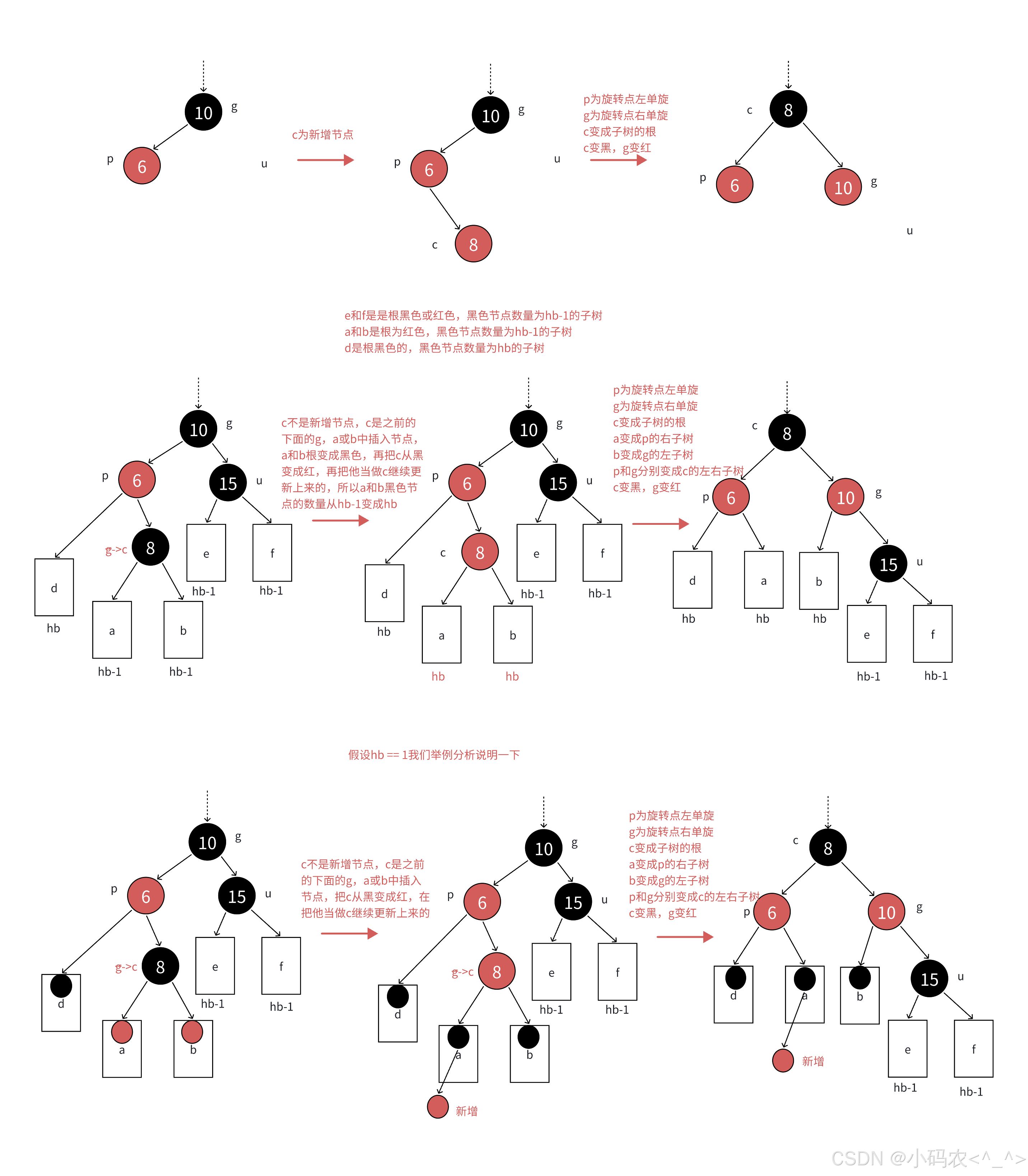
数据结构之红黑树的实现
红黑树的实现 1. 红⿊树的概念1.1 红⿊树的规则:1.2 思考⼀下,红⿊树如何确保最⻓路径不超过最短路径的2倍的?1.3 红⿊树的效率: 2. 红⿊树的实现2.1 红⿊树的结构2.2 红⿊树的插⼊2.2.1 红⿊树树插⼊⼀个值的⼤概过程2.2.2 情况1…...
构建的“能力成熟度-时间规模”平面)
智能工厂的设计软件 中的AI操作系统的“三维时间”(历时/共时/等时)构建的“能力成熟度-时间规模”平面
本文要点 “智能工厂的设计软件提出 “三维时间”的一个时间立方体(cube)。 “三维时间”的概念--历时diachronic(一维的)、共时synchronic(二维的)和等时isochronic(三维的)。 即…...

Spring Boot常见错误与解决方法
White graces:个人主页 🙉专栏推荐:Java入门知识🙉 ⛳️点赞 ☀️收藏⭐️关注💬卑微小博主🙏 ⛳️点赞 ☀️收藏⭐️关注💬卑微小博主🙏 目录 创建第一个SpringBoot项目 SpringBoot项目各个…...
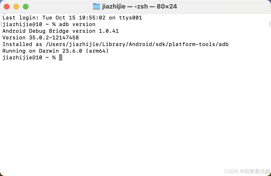
Mac中安装以及配置adb环境
一、adb介绍 Android 调试桥 (Android Debug Bridge) 是一种功能多样的命令行工具,可让您与设备进行通信。adb 命令可用于执行各种设备操作,例如安装和调试应用。adb 提供对 Unix shell(可用来在设备上运行各种命令)的访问权限。…...

WebGL着色器语言中各个变量的作用
1、attribute变量 用于接收顶点数据,只能在顶点着色器中声明和使用。 attribute vec3 a_position; 2、uniform变量 用于在JavaScript代码中设置并在着色器程序中保持不变的值,可以在顶点着色器和片元着色器中声明和使用。但是要保证变量名唯一&#…...

Canmv k230 C++案例1——image classify学习笔记 初版
00 简介 用C编写代码的比mircopython要慢很多,需要编译开发环境,同时使用C更接近底层,效率利用率应该也是更高的,就是需要学习更多的内容,因为从零开始因此比较比较耗时。 注:以下为个人角度的理解&#x…...
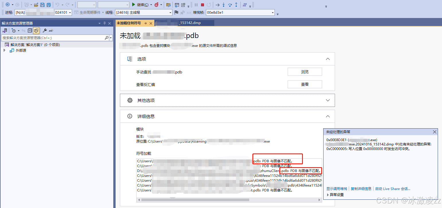
vs2022 dump调试
程序中加入了捕获dump得代码,那么当程序crash时,通常可以捕获到dump文件。当然,也有一些崩溃是捕获不到的。本文就捕获到的dump文件,总结一下调试的流程。 前提:exe,pdb,dump 3者是放在同一目录…...
OpenCV高级图形用户界面(11)检查是否有键盘事件发生而不阻塞当前线程函数pollKey()的使用
操作系统:ubuntu22.04 OpenCV版本:OpenCV4.9 IDE:Visual Studio Code 编程语言:C11 算法描述 轮询已按下的键。 函数 pollKey 无等待地轮询键盘事件。它返回已按下的键的代码或如果没有键自上次调用以来被按下则返回 -1。若要等待按键被按…...
nvm安装,node多版本管理
卸载nodejs win R 输入 appwiz.cpl 删除 node.js查看node.js安装路径是否有残留,有就删除文件夹 删除下列路径文件,一定要检查,没删干净,nvm安装会失败 C:\Program Files (x86)\NodejsC:\Program Files\NodejsC:\Users{User}\…...

ThingsBoard规则链节点:Assign To Customer节点详解
引言 分配给客户节点概述 用法 含义 应用场景 实际项目运用示例 结论 引言 在物联网(IoT)解决方案中,ThingsBoard平台以其高效的数据处理能力和灵活的设备管理功能而著称。其中,规则引擎是该平台的一个核心组件,…...

自监督行为识别-时空线索解耦(论文复现)
自监督行为识别-时空线索解耦(论文复现) 本文所涉及所有资源均在传知代码平台可获取 文章目录 自监督行为识别-时空线索解耦(论文复现)引言论文概述核心创新点双向解耦编码器跨域对比损失的构建结构化数据增强项目部署准备工作数据…...

MyBatisPlus:自定义SQL
由于SQL不能写在业务层,所以可以利用MyBatisPlus的Wrapper来构建复杂的Where条件,然后自己定义SQL语句中剩下的部分 ①基于Wrapper 构建Where条件 Testpublic void test7(){//需求:将id满足ids的数据项的balance字段减200int amount200;List…...

变电站谐波治理设备有哪些
在变电站中,由于非线性负载(如电力电子设备、变频器等)会引入谐波,对电网造成干扰,因此需要进行谐波治理。以下是常见的变电站谐波治理设备及其特点: 1、静止无功发生器(SVG) 工作原…...

Mybatis全局配置介绍
【mybatis全局配置介绍】 mybatis-config.xml,是MyBatis的全局配置文件,包含全局配置信息,如数据库连接参数、插件等。整个框架中只需要一个即可。 1、mybatis全局配置文件是mybatis框架的核心配置,整个框架只需一个;…...

error: cannot find symbol import android.os.SystemProperties;
背景:AS独立编译系统工程应用,使用了hide接口,导致编译不过。 尽管使用了framework.jar依赖。依然编译不过,导致各种类找不到。 例如: /SettingsLib/src/main/java/com/android/settingslib/location/RecentLocatio…...

Linux DRM子系统深度解析:如何为240x240 SPI屏编写自定义KMS驱动?
Linux DRM子系统实战:为240x240 SPI屏构建原子化KMS驱动 当一块小巧的240x240 SPI屏幕遇上Linux DRM显示框架,开发者面临的不仅是硬件接口的适配,更是一场关于现代显示架构的深度对话。本文将带您穿透DRM子系统的抽象层,从KMS核心…...

SignalAcquisition:嵌入式高精度信号采集与二进制串行传输框架
1. SignalAcquisition 库深度解析:面向嵌入式信号采集的高精度时序控制与二进制串行传输框架1.1 库定位与工程价值SignalAcquisition 是一个专为 Arduino IDE 设计的轻量级、高确定性信号采集库,其核心目标并非提供通用传感器驱动,而是构建一…...

Win11Debloat:一键清理Windows 11,让你的电脑重回清爽状态
Win11Debloat:一键清理Windows 11,让你的电脑重回清爽状态 【免费下载链接】Win11Debloat 一个简单的PowerShell脚本,用于从Windows中移除预装的无用软件,禁用遥测,从Windows搜索中移除Bing,以及执行各种其…...

Llama-3.2-3B效果体验:Ollama简单操作,产出专业级文案
Llama-3.2-3B效果体验:Ollama简单操作,产出专业级文案 1. 模型概览:小而精的文本生成专家 Llama-3.2-3B是Meta最新推出的轻量级语言模型,在3B参数规模下实现了接近大模型的文本生成质量。经过指令微调优化后,它在多语…...

3D打印桥接工具:从设计到输出的全流程优化
3D打印桥接工具:从设计到输出的全流程优化 【免费下载链接】sketchup-stl A SketchUp Ruby Extension that adds STL (STereoLithography) file format import and export. 项目地址: https://gitcode.com/gh_mirrors/sk/sketchup-stl SketchUp STL插件是连接…...

ai辅助开发:让快马平台为你的arduino项目注入智能决策与学习能力
AI辅助开发:让快马平台为你的Arduino项目注入智能决策与学习能力 最近在做一个智能垃圾分类的小项目,用Arduino控制各种传感器和舵机来实现自动分类。这个过程中发现,手动编写所有判断逻辑和阈值调整特别耗时,于是尝试用InsCode(…...

猫抓插件:革新性浏览器资源捕获工具,让媒体下载效率倍增
猫抓插件:革新性浏览器资源捕获工具,让媒体下载效率倍增 【免费下载链接】cat-catch 猫抓 chrome资源嗅探扩展 项目地址: https://gitcode.com/GitHub_Trending/ca/cat-catch 在数字内容爆炸的时代,如何高效获取网页中的视频、音频和图…...

Remotery WebSocket通信机制:浏览器端性能数据可视化
Remotery WebSocket通信机制:浏览器端性能数据可视化 【免费下载链接】Remotery Single C file, Realtime CPU/GPU Profiler with Remote Web Viewer 项目地址: https://gitcode.com/gh_mirrors/re/Remotery Remotery作为一款轻量级实时CPU/GPU性能分析工具&…...

驾驭AI引用:Geo优化中的内容评分机制与实战策略深度解析
在生成式人工智能(Generative AI)日益主导信息获取与分发路径的时代,传统搜索引擎优化(SEO)的范式正被生成式引擎优化(Geo)所颠覆。Geo不再仅仅关注关键词排名,而是深入探究内容如何…...
的避坑实操)
PowerBuilder老系统维护指南:PB12.5连接现代数据库(如MySQL 8.0)的避坑实操
PowerBuilder老系统维护实战:PB12.5连接MySQL 8.0的七个关键步骤 当技术栈的代际差异超过十年,每一次数据库连接尝试都可能演变成一场跨越时空的调试马拉松。那些在2006年运行良好的PB12.5应用,今天面对MySQL 8.0的SSL加密要求和UTF8MB4字符集…...