CSS-4
平面转换
整体认识
div {margin: 100px 0;width: 100px;height: 100px;background-color: pink;/* 过渡效果 */transition: all 1s;}/* 当鼠标悬停到div时,进行平面转换 */div:hover {transform: translate(800px) rotate(360deg) scale(2) skew(180deg);}
作用:为元素添加动态效果,一般与过渡配合使用
概念:改变盒子在平面内的形态(位移、旋转、缩放、倾斜)
平移
案例展示:通过平移实现"居中"效果
(原理:利用 transform: translate(); 取值为百分比时候,是参照盒子自身尺寸计算结果的特点)<style>.box {position: absolute;left: 50%;top: 50%;transform: translate(-50%, -50%);width: 100px;height: 100px;background-color: pink;}
</style><body><div class="box"></div>
</body>
属性:transform: translate(X轴移动距离,Y轴移动距离);取值:1.像素单位数值2.百分比(参照盒子自身尺寸计算结果)3.正负均可技巧:1.translate() 只写一个值,表示沿着X轴移动2.单独设置X或者Y轴移动距离:translateX() 或 translateY()
旋转
<style>.box {width: 100px;height: 100px;background-color: pink;transition: all 2s;}.box:hover {transform: rotate(360deg);}
</style><body><div class="box"></div>
</body>
属性:transform: rotate(旋转角度);角度单位:deg技巧:取值为正,顺时针旋转取值为负,逆时针旋转
转换原点
<style>.box {width: 100px;height: 100px;background-color: pink;transition: all 2s;/* 将旋转的原点改为右边+底部 */transform-origin: right bottom;}.box:hover {transform: rotate(360deg);}
</style><body><div class="box"></div>
</body>
默认情况下,转换原点是盒子中心点
转换原点是一个原点,当发生转换时候(包括旋转、缩放、平移等等),以此为原点进行坐标的定位属性:transform-origin: 水平原点位置  垂直原点位置;取值:1.方位名词(left、top、right、bottom、center)2.像素单位数值3.百分比
多重转换
多重转换的实现:先平移再旋转transform: translate(...) rotate(...);
缩放
<style>.box {margin: 100px auto;width: 100px;height: 100px;background-color: pink;transition: all 2s;}.box:hover {transform: scale(2);}
</style><body><div class="box"></div>
</body>
属性:transform: scale( 缩放倍数 );transform: scale( X轴缩放倍数, Y轴缩放倍数);技巧:通常,只为scale设置一个值,表示X轴和Y轴等比例缩放通常大于1表示放大,取值小于1表示缩小
倾斜
<style>.box {margin: 100px auto;width: 100px;height: 100px;background-color: pink;transition: all 0.5s;}.box:hover {transform: skew(-30deg);}
</style><body><div class="box"></div>
</body>
属性:transform: skew(倾斜角度);
渐变
渐变效果
<style>.box {width: 100px;height: 100px;background-color: pink;transition: all 0.5s;}.box:hover {background-image: linear-gradient(to right,red,green);background-image: linear-gradient(45deg,red,green);background-image: linear-gradient(red 80%,green);}
</style>
渐变是多个颜色逐渐变换的效果,一般用于设置盒子背景
分类:1.线性渐变(沿着直线的方向发生渐变)2.径向渐变(沿着圆心向四周发生渐变)属性:background-image: linear-gradient(渐变方向,颜色1 终点位置,颜色2 终点位置,...);取值:1.渐变的方向:可选择不写to 方位名词角度度数2.终点位置:可选择不写百分比
背景颜色渐变的案例
<style>.box {position: relative;width: 100px;height: 100px;background-color: pink;}.mask {position: absolute;left: 0;top: 0;width: 100%;height: 100%;background-image: linear-gradient(transparent,  /*  transparent 它代表着全透明黑色,即一个类似rgba(0,0,0,0)这样的值 */rgba(0,0,0,0.5));/* 将透明度设置为0,起到"关闭显示效果"的作用 */opacity: 0;}.box:hover .mask {/* 将透明度设置为1,起到"开启显示的效果"的作用 */opacity: 1;}
</style><body><div class="box"><span>Hello World</span><div class="mask"></div></div>
</body>
径向渐变
<style>.box {width: 100px;height: 100px;background-color: pink;border-radius: 50%;background-image: radial-gradient(/* 一条半径 */50px at center center,red,pink);}.box:hover {background-image: radial-gradient(/* 两条半径 */50px 20px at center center,pink,red);}
</style><body><div class="box"></div>
</body>
作用:给按钮添加高光效果
取值:1.半径1条则为圆,2条则为椭圆2.圆心位置取值:像素单位数值/百分比/方位名词
空间转换
平移
属性:transform: translate3d(x, y, z);transform: translateX();transform: translateY();transform: translateZ();取值(正负均可)1.像素单位数值2.百分比(参照盒子自身尺寸计算结果)注意事项:电脑屏幕是平面的,z轴的效果无法直接体现,所以可以配合"视距"知识点使用
视距
作用:指定了观察者与 z = 0 平面的距离,为元素添加透视效果透视效果:近大远小属性:添加给直接父级,取值范围一般为 800 ~ 1200perspective: 视距;
平移与视距的综合效果
<style>.father {perspective: 800px;}.son {margin: 100px auto;width: 100px;height: 100px;background-color: orange;transition: all .5s;}.son:hover {transform: translateZ(300px);}</style><body><div class="father"><div class="son"></div></div>
</body>
旋转
<style>.father {/* 旋转时候,使用"视距"所带来的透视效果,会使得旋转更明显(因为"视距"会自动实现"近大远小,近实远虚") */perspective: 800px;}.son {margin: 100px auto;width: 200px;height: 200px;background-color: pink;transition: all 0.5s;}.son:hover {/* transform: rotateZ(60deg); *//* transform: rotateX(60deg); */transform: rotateY(-60deg);}</style><body><div class="father"><div class="son"></div></div>
</body>
属性:transform: rotateX(角度);transform: rotateY(角度);transform: rotateZ(角度);角度单位:deg例子: transform: rotateZ(60deg);拓展:rotate3d(x,y,z,角度度数):用来设置自定义旋转轴的位置及旋转的角度x,y,z 取值为 0-1 之间的数字
左手法则:根据旋转方向确定取值正负操作:左手握住旋转轴,拇指指向正值方向。其他四个手指弯曲方向为旋转正值方向。
立体呈现
立体知识
<style>.cube {position: relative;margin: 100px auto;width: 200px;height: 200px;transition: all 2s;transform-style: preserve-3d;}.cube div {position: absolute;left: 0;top: 0;width: 200px;height: 200px;}.front {background-color: orange;transform: translateZ(100px);}.back {background-color: green;transform: translateZ(-100px);}.cube:hover {transform: rotateY(90deg);}
</style><body><div class="cube"><div class="front">前面</div><div class="back">后面</div></div>
</body>
作用:控制元素的子元素是位于3D空间中还是平面中
属性名:transform-style
属性值:flat: 子级处于平面中preserve-3d: 子级处于3D空间
立方体案例
<style>.cube {width: 300px;height: 300px;font-size: 80px;text-align: center;line-height: 300px;transition: 2s;transform: rotateY(-30deg) rotateX(-35deg);transform-style: preserve-3d;margin: 300px auto;}.cube:hover {transform: rotateY(30deg) rotateX(35deg);}.cube>div {width: 300px;height: 300px;position: absolute;left: 0;top: 0;transition: 2s;opacity: 0.5;border: 1px dashed black;}.cube .flat1 {background-color: red;transform: translateY(-150px) rotateX(90deg);}.cube .flat2 {background-color: orange;transform: translateY(150px) rotateX(90deg);}.cube .flat3 {background-color: yellow;transform: translateX(-150px) rotateY(90deg);}.cube .flat4 {background-color: green;transform: translateX(150px) rotateY(90deg);}.cube .flat5 {background-color: lightgreen;transform: translateZ(150px);}.cube .flat6 {background-color: blue;transform: translateZ(-150px);}
</style><body><div class="cube"><div class="flat1">上</div><div class="flat2">下</div><div class="flat3">左</div><div class="flat4">右</div><div class="flat5">前</div><div class="flat6">后</div></div>
</body>
3D导航案例
<style>* {margin: 0;padding: 0;}ul {margin-top: 100px;margin-left: 36%;}ul li {float: left;margin: 0 5px;width: 120px;height: 35px;list-style: none;/* 一会我们需要给box旋转 也需要透视干脆给li加里面的子盒子都有透视效果 */perspective: 500px;}.box {position: relative;width: 100%;height: 100%;background-color: pink;transform-style: preserve-3d;transition: all .4s;}.box:hover {transform: rotateX(90deg);}.front,.bottom {position: absolute;left: 0;top: 0;width: 100%;height: 100%;}.front {background-color: red;opacity: 0.5;transform: translateZ(17.5px);}.bottom {background-color: green;opacity: 0.5;/* 这个x轴一定是负值 *//* 我们如果有移动 或者其他样式,必须先写我们的移动 */transform: translateY(17.5px) rotateX(90deg);}
</style><body><ul><li><div class="box"><div class="front">导航一</div><div class="bottom">111</div></div></li><li><div class="box"><div class="front">导航二</div><div class="bottom">222</div></div></li><li><div class="box"><div class="front">导航三</div><div class="bottom">333</div></div></li></ul>
</body>
缩放
transform: scale3d(x,y,z);
transform: scaleX();
transform: scaleY();
transform: scaleZ();
动画
认识动画
过渡:实现两个状态间的变换过程
动画:实现多个状态间的变换过程,动画过程可控(重复播放、最终画面、是否暂停)
定义动画
<style>@keyframes 动画名称 {from {}to {}}
</style>
<style>@keyframes 动画名称 {0% {}10% {}...100% {}}
</style>
使用动画
<style>.box {animation: 动画名称 动画花费时长;}
</style>
基本演示
动画一演示:宽度从200变化到800<style>.box {width: 200px;height: 100px;background-color: pink;/* 第二步:使用动画 */animation: change-size 1s;}/* 第一步:定义动画 */@keyframes change-size {from {width: 200px;}to {width: 800px;}}
</style><body><div class="box"></div>
</body>
动画二演示:从 200*100 变化到 300*300 再变化到 800*500<style>.box {width: 200px;height: 100px;background-color: pink;animation: changed 1s;}/* 注意:这里的 0%、20%、100% 表示的意思是动画时常的百分比 */@keyframes changed {0% {width: 200px;height: 100px;}20% {width: 300px;height: 300px;}100% {width: 800px;height: 500px;}}
</style><body><div class="box"></div>
</body>
其他属性值
<style>.box {width: 200px;height: 100px;background-color: pink;/* 速度曲线 */animation: change 2s linear;       /* linear: 匀速运动 */animation: change 2s steps(3);     /* steps(n步): 将动画按照"步骤"分成n步 *//* 延迟时间 */animation: change 2s 4s;           /* 第一个时间是动画时长,第二个时间是延时时间 *//* 重复次数 */animation: change 2s 3;           /* 动画重复播放3次 */animation: change 2s infinite;    /* 动画一直重复播放 *//* 动画方向 */animation: change 2s alternate;    /* alternate:反向 *//* 执行完毕时状态 */animation: change 2s forwards;animation: change 2s backwards;    /* 默认效果 *//* 暂停动画 */animation-play-state: paused;		/* 通常配合:hover使用 */}@keyframes change {from {width: 200px;}to {width: 800px;}}
</style><body><div class="box"></div>
</body>
animation: 动画名称 动画时长 速度曲线 延迟时间 重复次数 动画方向 执行完毕时状态提示:1.动画名称和动画时长必须赋值2.取值不分先后顺序3.如果有两个时间值,第一个时间值表示动画时长,第二个时间值表示延迟时间
走马灯案例
<style>* {margin: 0;padding: 0;box-sizing: border-box;}li {list-style: none;}img {display: block;width: 200px;height: 102px;}.box {margin: 100px auto;width: 600px;height: 112px;border: 5px solid #000;overflow: hidden;}.box ul {display: flex;animation: move 6s infinite linear;}/* 定义位移动画:ul使用动画:鼠标悬停暂停动画 */@keyframes move {0% {transform: translate(0);}100% {/* 向左移动,使用负数;一张图片宽度为200px,4张图片宽度为800px,故而向左移动4张图片的宽度为-800px */transform: translate(-800px);}}.box:hover ul {animation-play-state: paused;}
</style><body><div class="box"><ul><!-- 真正要展示的图片 --><li><img src="./images/img0.png" alt=""></li><li><img src="./images/img1.png" alt=""></li><li><img src="./images/img2.png" alt=""></li><li><img src="./images/img3.png" alt=""></li><!-- 复制前几张图片进行再次展示,只是为了弥补方框中的空白 --><li><img src="./images/img0.png" alt=""></li><li><img src="./images/img1.png" alt=""></li><li><img src="./images/img2.png" alt=""></li></ul></div>
</body>
精灵动画案例

<style>div {width: 140px;height: 140px;border: 1px solid #000;background-image: url(./images/run.png);/* 本张精灵图有12个小图,故而steps(12) */animation: run 1s steps(12) infinite;}@keyframes run {from {background-position: 0 0;}to {background-position: -1680px 0;}}
</style><body><div></div>
</body>
多组动画
<style>div {width: 140px;height: 140px;/* border: 1px solid #000; */background-image: url(./images/run.png);/* 多组动画 */animation:run 1s steps(12) infinite,move 3s forwards}/* 实现原地跑的动画效果 */@keyframes run {from {background-position: 0 0;}to {background-position: -1680px 0;}}/* 实现向前移动的动画效果 */@keyframes move {0% {transform: translate(0);}100% {transform: translate(800px);}}
</style><body><div></div>
</body>
相关文章:
CSS-4
平面转换 整体认识 div {margin: 100px 0;width: 100px;height: 100px;background-color: pink;/* 过渡效果 */transition: all 1s;}/* 当鼠标悬停到div时,进行平面转换 */div:hover {transform: translate(800px) rotate(360deg) scale(2) skew(180deg);}作用&…...

Python为何适合开发AI项目?
Python在人工智能(AI)项目中的流行和广泛应用归因于多个因素,其中一些主要原因包括: 1、易学易用: Python语法简洁清晰,易于学习和理解。这使得新手能够更容易上手,并且对于处理复杂的AI算法和…...

总结心得:各设计模式使用场景
单例模式:创建单个对象 工厂模式:创建对象交给工厂完成,当需要创建的对象是一系列相互关联或相互依赖的产品族时 原型模式:克隆对象,避免创建初始化开销 建造者模式:创建一个复杂对象,该对象…...

详解Vue3中的事件监听方式
本文主要介绍Vue3中的事件监听方式。 目录 一、v-on指令二、使用符号简写三、事件修饰符四、动态事件名五、常见的监听事件六、自定义事件 在Vue3中,事件监听的方式与Vue2有一些不同。 下面是Vue3中事件监听方式的详细介绍: 一、v-on指令 Vue3中仍然使…...

Unity关于easySave2 easySave3保存数据的操作;包含EasySave3运行报错的解决
关于easySave2 easySave3保存数据的操作;包含EasySave3运行报错的解决 /// 数据存储路径(Easy Save的默认储存位置为:Application.persistentDataPath,为了方便我们可以给它指定储存路径) #region 存储数据/*/// /// 存…...
2022年全球软件质量效能大会(QECon上海站)-核心PPT资料下载
一、峰会简介 近年来,以云计算、移动互联网、物联网、工业互联网、人工智能、大数据及区块链等新一代信息技术构建的智能化应用和产品出现爆发式增长,突破了对于软件形态的传统认知,正以各种展现方式诠释着对新型智能软件的定义。这也使得对…...

【python报错】UserWarning: train_labels has been renamed targets
UserWarning: train_labels has been renamed targetswarnings.warn(“train_labels has been renamed targets”) 这是一条 Python 警告信息,它表示 train_labels 这个变量已经被重命名为 targets,在将来的版本中可能会移除 train_labels。因此&#x…...
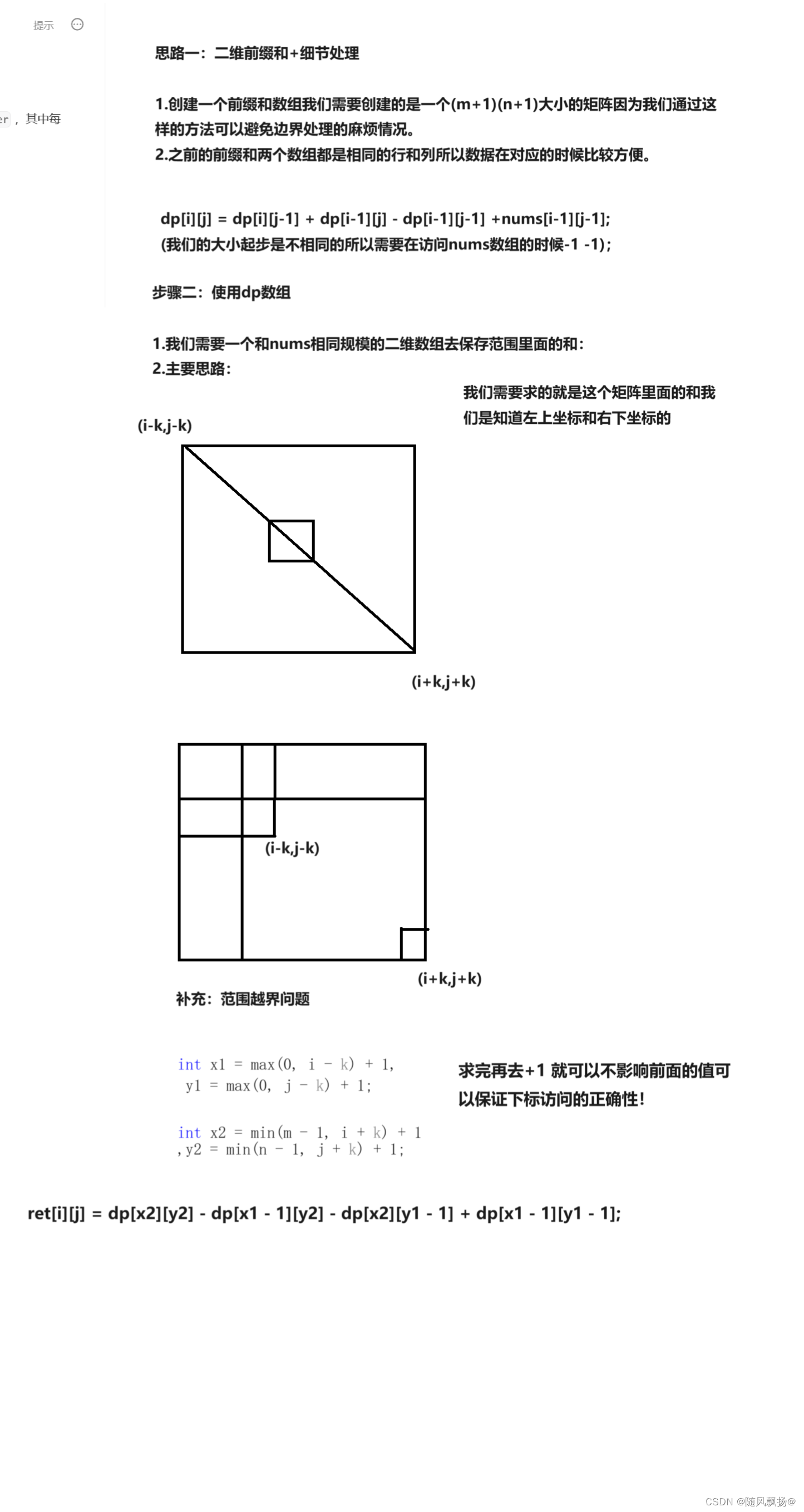
算法专题四:前缀和
前缀和 一.一维前缀和(模板):1.思路一:暴力解法2.思路二:前缀和思路 二. 二维前缀和(模板):1.思路一:构造前缀和数组 三.寻找数组的中心下标:1.思路一:前缀和 四.除自身以外数组的乘积ÿ…...
探索动画之帧动画)
STM32学习笔记十五:WS2812制作像素游戏屏-飞行射击游戏(5)探索动画之帧动画
本章又是个重要的章节——动画。 动画,本质上时一系列静态的画面连续播放,欺骗人眼产生动画效果。这个原理自打十九世纪电影诞生开始,就从来没变过。 我们的游戏中也需要一些动画效果,比如,被击中时的受伤效果&#…...
)
期末复习(程序设计)
根据字符出现频率排序 【问题描述】 给定一个字符串 s ,根据字符出现的 频率 对其进行降序排序。一个字符出现的频率是它出现在字符串中的次数。 返回已排序的字符串。 频率相同的的字符按ascii值降序排序。 s不包含空格、制表符、换行符等特殊字符。 【输入格…...
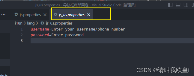
html-css-js移动端导航栏底部固定+i18n国际化全局
需求:要做一个移动端的仿照小程序的导航栏页面操作,但是这边加上了i18n国家化,由于页面切换的时候会导致国际化失效,所以写了这篇文章 1.效果 切换页面的时候中英文也会跟着改变,不会导致切换后回到默认的语言 2.实现…...

Ubuntu Linux 入门指南:面向初学者
目录 1. Ubuntu Linux 简介 Ubuntu 的由来 Ubuntu 与其他 Linux 发行版的比较 Debian: Fedora: openSUSE: Arch Linux: Linux Mint: 第二部分:安装 Ubuntu 1. 准备安装 系统需求 创建 Ubuntu 启…...

常见算法面试题目
前言 总结一些常见的算法题目,每一个题目写一行思路,方便大家复习。具体题目的来源是下面的网站。 剑指offer 剑指offe2 leetcode200题 leetcode 100题 leetcode150题 leetcode 75题 文章目录 前言二叉树非递归遍历牛客JZ31 栈的压入、弹出序列 (…...

PiflowX组件-JDBCWrite
JDBCWrite组件 组件说明 使用JDBC驱动向任意类型的关系型数据库写入数据。 计算引擎 flink 有界性 Sink: Batch Sink: Streaming Append & Upsert Mode 组件分组 Jdbc 端口 Inport:默认端口 outport:默认端口 组件属性 名称展示名称默…...
算法导论复习题目
这题需要考虑什么呢? 一换元,二要使用主方法猜出结果,三是证明的时候添加一个低阶项来消除 LC检索 C(x)是从上帝视角来看的成本 对C(x)的一个估计: 由两个部分组成,就相当于由以往的经验对未来…...
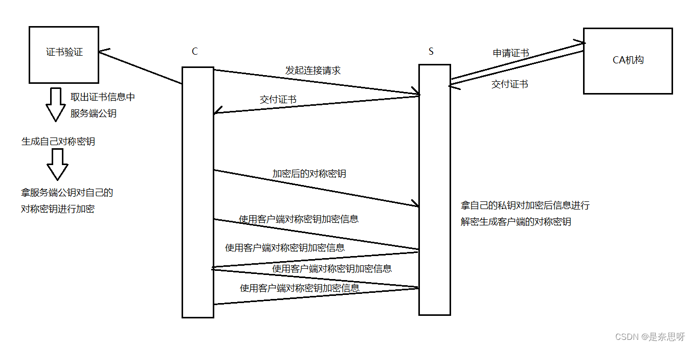
HTTPS协议详解
目录 前言 一、HTTPS协议 1、加密是什么 2、为什么要加密 二、常见加密方式 1、对称加密 2、非对称加密 三、数据摘要与数据指纹 1、数据摘要 2、数据指纹 四、HTTPS加密策略探究 1、只使用对称加密 2、只使用非对称加密 3、双方都使用非对称加密 4、对称加密非…...

菜鸟学习vue3笔记-vue3 router回顾
1、路由router pnpm i vue-router2、创建使用环境 1.src下创建 router文件夹、里面创建index.ts文件 //创建一个路由暴露出去//1.引入createRouter import { createRouter, createWebHistory } from "vue-router";// import Home from ../components/Home.vue//…...
Mybatis枚举类型处理和类型处理器
专栏精选 引入Mybatis Mybatis的快速入门 Mybatis的增删改查扩展功能说明 mapper映射的参数和结果 Mybatis复杂类型的结果映射 Mybatis基于注解的结果映射 Mybatis枚举类型处理和类型处理器 再谈动态SQL Mybatis配置入门 Mybatis行为配置之Ⅰ—缓存 Mybatis行为配置…...
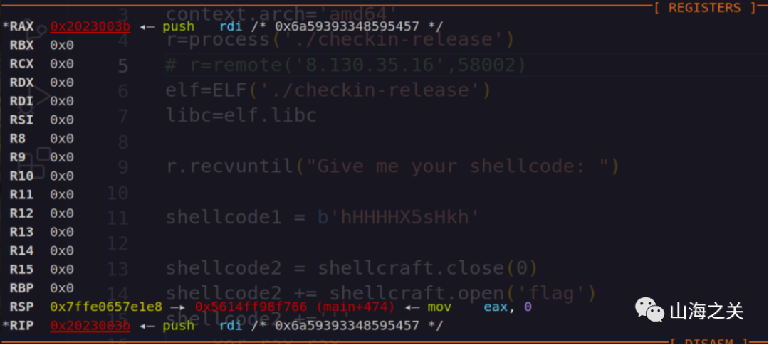
2023 NCTF writeup
CRYPTO Sign 直接给了fx,gx,等于私钥给了,直接套代码,具体可以参考: https://0xffff.one/d/1424 fx [0, 0, 0, 0, 0, 0, 0, 0, 0, 0, 0, 0, 0, 0, 0, 0, 0, 0, 0, 0, 0, 0, 0, 0, 0, 0, 0, 0, 0, 0, 0, 0, 0, 0, 0, 0, 0, 0…...

golang的大杀器协程goroutine
在Golang中,协程(Goroutine)是轻量级的执行单元,用于实现并发编程。它是Golang语言的重要组成部分,提供了简洁、高效的方式来处理并发任务。 特点: 1)轻量级:Go语言的协程是轻量级…...

30岁裸辞后,我用两个月拿下AI应用认证,现在OFFER选择困难症犯了
30岁裸辞那天,我最怕的不是没收入,而是突然发现:过去积累的经验,正在被AI重新定价。以前会写方案、做表格、跟项目,算是职场硬通货;到了2026年,招聘JD里开始频繁出现AI工具应用、智能工作流、Pr…...
损坏诊断全解)
半导体元件(二极管/三极管/MOS管/IC)损坏诊断全解
半导体元件(二极管、三极管、MOS 管、集成电路)是 PCB 的核心功能单元,对过压、过流、ESD、高温极度敏感,损坏后直接导致电路功能失效、短路烧板。很多工程师维修时盲目更换芯片,不仅成本高,还易误判。一…...

论文润色深度测评:GPT-5.5 + Gemini 3.1 Pro:教你学会1+1>2的论文润色方法
各位同仁好,我是七哥。一个在高校里从事人工智能相关领域研究,钻研用大模型AI实操的学术人。可以和七哥交流学术写作或Gemini、GPT、Claude等大模型学术实操相关问题,多多交流,相互成就,共同进步。 2026年的科研圈,AI工具的选择已经从有没有变成了强不强,七哥评测了GPT…...

5A智慧景区建设|对标一流!巨有科技打造数智化标杆景区
5A级景区是中国旅游的最高标准,代表着服务与管理的顶尖水平。随着5A评审标准日益严苛,“智慧化”已成为核心硬性指标。然而,不少景区的智慧化建设陷入“重硬件、轻整合”的误区,系统林立、数据孤岛,投入巨大却效果不佳…...

终极指南:用D2DX让《暗黑破坏神2》在现代电脑上焕发新生
终极指南:用D2DX让《暗黑破坏神2》在现代电脑上焕发新生 【免费下载链接】d2dx D2DX is a complete solution to make Diablo II run well on modern PCs, with high fps and better resolutions. 项目地址: https://gitcode.com/gh_mirrors/d2/d2dx 还在为经…...

手机也能玩转无人机仿真:用安卓QGC App连接同一WiFi下的PX4 JMAVSim模拟器
手机也能玩转无人机仿真:用安卓QGC App连接同一WiFi下的PX4 JMAVSim模拟器 无人机开发者和爱好者们,是否曾想过用手机就能完成整个无人机仿真测试流程?告别笨重的电脑束缚,只需一部安卓设备,就能在沙发上调试飞控算法。…...

如何优化 MySQL 千万级数据分页查询的性能?
它的本质是:**传统 LIMIT offset, size 在大数据量下性能急剧下降,是因为 MySQL 必须 扫描并丢弃 前 offset 行数据。当 offset 很大时(如 LIMIT 1000000, 10),MySQL 需要读取 1,000,010 行记录,执行 1,000…...

为什么你的霓虹总像“塑料灯带”?Midjourney光子散射模拟缺陷曝光:3个被官方隐瞒的--sref调参禁区
更多请点击: https://kaifayun.com 第一章:为什么你的霓虹总像“塑料灯带”? 霓虹效果在现代 UI 设计中无处不在——按钮悬停、加载指示器、焦点高亮……但多数实现却流于表面:生硬的 box-shadow、固定色值的渐变边框、缺乏物理感…...

ESP32搭建TFT_LCD中文字库,附常用字库
(一)简介 在使用ESP32的时候,我们知道OLED屏幕是有中文库的,里面有非常多的常用字,但是LCD屏幕只有取模才能得到中文字体,那我们本期教程就来教大家如何搭建自己的字体库,使用中文字体更加方便快…...

DRG存档编辑器终极指南:如何快速解锁《深岩银河》的全部游戏体验
DRG存档编辑器终极指南:如何快速解锁《深岩银河》的全部游戏体验 【免费下载链接】DRG-Save-Editor Rock and stone! 项目地址: https://gitcode.com/gh_mirrors/dr/DRG-Save-Editor 还在为《深岩银河》中无尽的资源收集和等级提升感到疲惫吗?DRG…...