前端 CSS 经典:grid 栅格布局
前言:Grid 布局是将容器划分成"行"和"列",产生单元格,然后将"项目"分配给划分好的单元格,因为有行和列,可以看作是二维布局。
一 术语
1. 容器
采用网格布局的区域,也就是外层盒子。
2. 项目
容器包裹的一级子元素,不包含二级及其以下的子元素。当容器使用了 grid 布局,项目的 float,display 等设置都将失效。
3. 单元格
通过容器设置行列属性,切割出来的单元格。单元格不等于项目,打个比方,容器相当于一个房子,单元格相当于在房子里划分出的一个个房间,项目相当于房间里的家具等东西。
二 容器属性
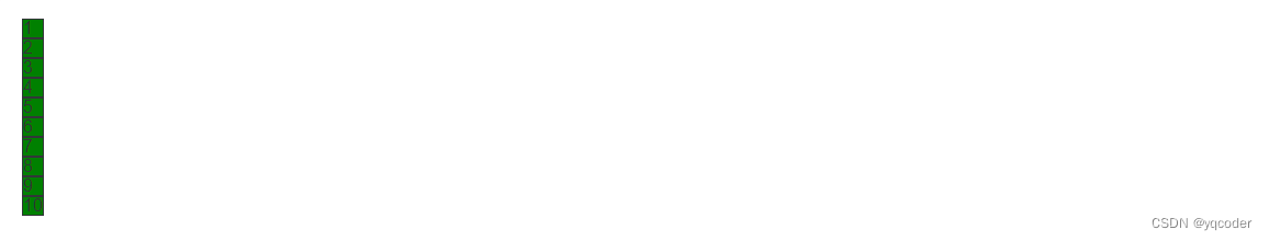
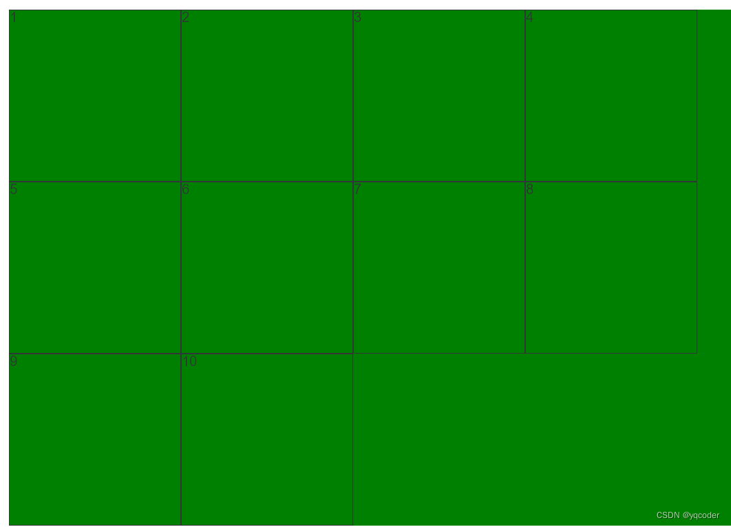
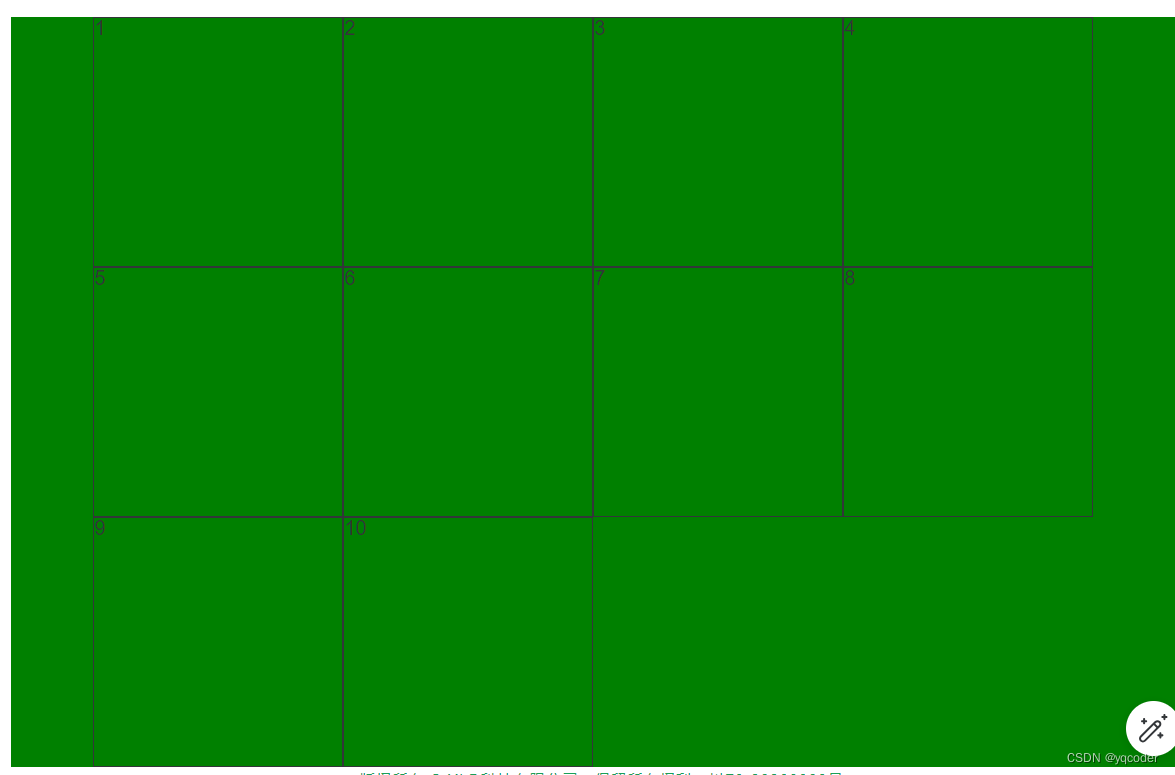
demo 默认样式,未设置 grid 属性。
<template><div class="container"><span v-for="i in 10" :class="`item${i}`">{{ i }}</span></div>
</template><style lang="scss" scoped>.container {background: green;span {border: 1px solid;}}
</style>
1. display
设置网格布局
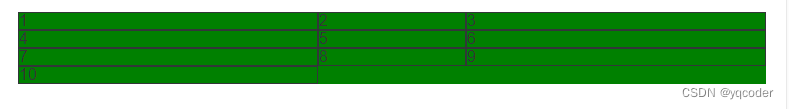
1.1 display: grid
项目宽度填充整行
.container {background: green;display: grid;span {border: 1px solid;}
}
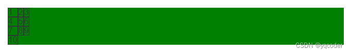
1.2 display: inline-grid
项目宽度根据内容撑宽。
.container {background: green;display: inline-grid;span {border: 1px solid;}
}
2. grid-template-columns
划分容器列和列宽,可以单独或混合使用:绝对值 px,百分比 %,比例 fr,关键字 auto,函数 minmax,函数 repeat,函数 fit-content
2.1 绝对值 px
例:设置 3 列,每列宽 300px
.container {background: green;display: grid;grid-template-columns: 300px 300px 300px;span {border: 1px solid;}
}
2.2 百分比 %
例:设置 3 列,每列宽 33.33 %
.container {background: green;display: grid;grid-template-columns: 33.33% 33.33% 33.33%;span {border: 1px solid;}
}
2.3 比例 fr
总宽度除以总的 fr,得到每份 fr 所占宽度,然后分给设置的列宽,例:设置 3 列,第 2 列是第 1 列的 1 倍,第 3 列是第 1 列的 3 倍
.container {background: green;display: grid;grid-template-columns: 1fr 2fr 3fr;span {border: 1px solid;}
}
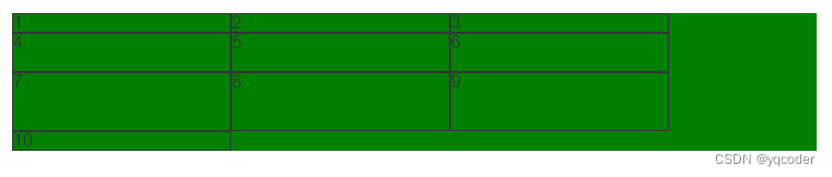
2.4 关键字 auto
宽度自适应,例:设置 3 列,第 1 列 100px,第 3 列 100px,第 2 列宽度自适应
.container {background: green;display: grid;grid-template-columns: 100px auto 100px;span {border: 1px solid;}
}
2.5 函数 minmax
minmax(min, max),用于产生一个长度范围,例:设置 3 列,第 2 列 自适应宽度在 100px 到 300px 之间,第 1 列和第 3 列宽度为 300px。
.container {background: green;display: grid;grid-template-columns: 300px minmax(100px, 300px) 300px;span {border: 1px solid;}
}
2.6 函数 repeat
repeat(n, content),n 代表重复次数,可以是数字代表几次,可以 auto-fill 自动填充满,content 代表重复内容。例:设置 3 列,每列 1fr。
.container {background: green;display: grid;grid-template-columns: repeat(3, 100px);span {border: 1px solid;}
}
例:设置每列 100px,每行自动填充最多的 100px 列
.container {background: green;display: grid;grid-template-columns: repeat(auto-fill, 100px);span {border: 1px solid;}
}
2.7 函数 fit-content
fit-content(length),当内容小于 length,以内容为准,如果大于 length 以 leng 为长度,例:设置 3 列,每列最大宽度 200px,当小于 200px,以内容撑开宽度。
.container {background: green;display: grid;grid-template-columns: repeat(3, fit-content(200px));span {border: 1px solid;}
}
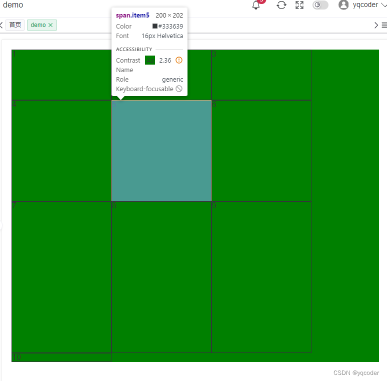
3. grid-template-rows
划分容器行和行高,属性同 grid-template-columns 一致,比例 fr 略有不同。如果不设置项目高度,1fr 代表的高度就是项目高度,如果设置有项目设置了高度,那就以该项目的高度除以该项目所分的 fr 算出 1fr 的大小。例:设置列宽 200px,自动铺满列,不设置项目高度,第 1 行 1fr,第 2 行 2fr,第 3 行 3fr。
.container {background: green;display: grid;grid-template-columns: repeat(auto-fill, 200px);grid-template-rows: 1fr 2fr 3fr;span {border: 1px solid;}
}
例:设置列宽 200px,自动铺满列,设置项目 item5 高度 200 px,第 1 行 2fr,第 2 行 2fr,第 3 行 3fr。
.container {background: green;display: grid;grid-template-columns: repeat(auto-fill, 200px);grid-template-rows: 1fr 2fr 3fr;span {border: 1px solid;}.item5 {height: 200px;}
}

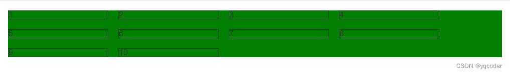
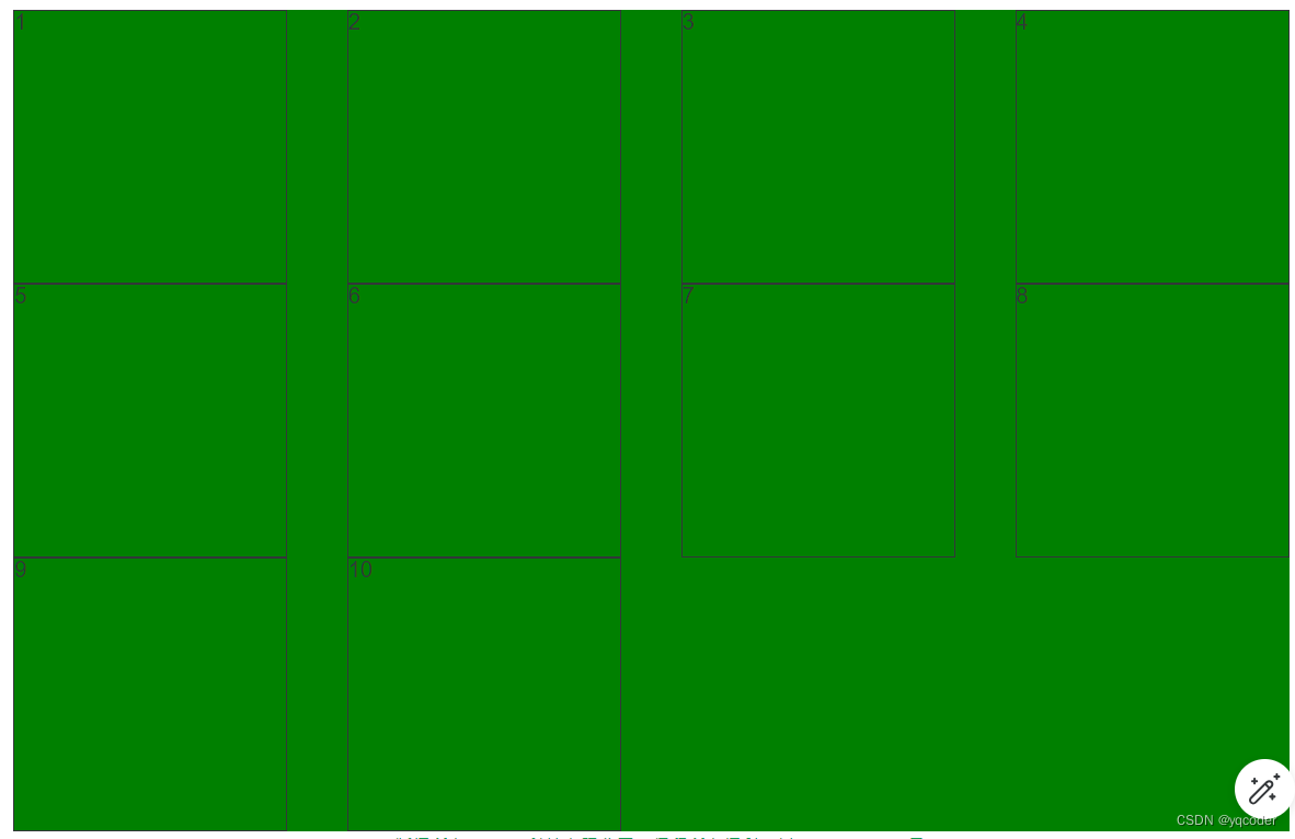
4. grid-template-areas
区域命名,区域命名形成区域一定要是矩形区域,无论是 L,凹,凸都是无效属性值。可以配合 grid-template-rows、grid-template-columns 使用。例:设置 3 列每列 100px,3 行每行 100px,通过区域命名实现如图布局。
.container {background: green;display: grid;grid-template-columns: repeat(3, 100px);grid-template-rows: repeat(3, 100px);grid-template-areas:"left top top""left middle right""bottom bottom right";span {border: 1px solid;}.item1 {grid-area: left;}.item2 {grid-area: top;}.item3 {grid-area: middle;}.item4 {grid-area: right;}.item5 {grid-area: bottom;}
}
5. grid-template
是 grid-template-columns、grid-template-rows 这 2 个属性的合并简写形式。
grid-template-columns: repeat(3, 100px);
grid-template-rows: repeat(3, 100px);// 简写
grid-template: repeat(3, 100px) / repeat(3, 100px);
6. column-gap
列间距,支持数值和百分比。例:设置列间距为 20px。
.container {background: green;display: grid;grid-template-columns: repeat(auto-fill, 200px);column-gap: 20px;span {border: 1px solid;}
}
7. row-gap
行间距,支持数值和百分比。例:设置行间距 10px。
.container {background: green;display: grid;grid-template-columns: repeat(auto-fill, 200px);row-gap: 10px;span {border: 1px solid;}
}
8. grid-gap
行间距和列间距简写,grid-gap: 行间距,列间距,如果第二个值省略,默认两个值相等。例:设置行间距,列间距都为 20px。
.container {background: green;display: grid;grid-template-columns: repeat(auto-fill, 200px);grid-gap: 20px;span {border: 1px solid;}
}
9. grid-auto-flow
定义栅格元素的排列规则:row、column、row dense、column dense。
9.1 row
默认水平顺序排列
.container {background: green;display: grid;grid-template-columns: repeat(auto-fill, 200px);grid-template-rows: repeat(3, 200px);grid-auto-flow: column;span {border: 1px solid;}
}
9.2 column
垂直顺序排序
.container {background: green;display: grid;grid-template-columns: repeat(auto-fill, 200px);grid-template-rows: repeat(3, 200px);grid-auto-flow: column;span {border: 1px solid;}
}
10. justify-items
单元格内容水平位置设置:stretch、start、end、center
10.1 stretch
默认单元格内容水平填充单元格
.container {background: green;display: grid;grid-template-columns: repeat(auto-fill, 200px);grid-template-rows: repeat(3, 200px);justify-items: stretch;span {border: 1px solid;}
}
10.2 start
单元格内容水平靠右
.container {background: green;display: grid;grid-template-columns: repeat(auto-fill, 200px);grid-template-rows: repeat(3, 200px);justify-items: start;span {border: 1px solid;}
}
10.3 end
单元格内容水平靠左
.container {background: green;display: grid;grid-template-columns: repeat(auto-fill, 200px);grid-template-rows: repeat(3, 200px);justify-items: end;span {border: 1px solid;}
}
10.4 center
单元格内容水平居中
.container {background: green;display: grid;grid-template-columns: repeat(auto-fill, 200px);grid-template-rows: repeat(3, 200px);justify-items: center;span {border: 1px solid;}
}
11. align-items
单元格内容垂直位置:stretch、start、end、center
11.1 stretch
单元格内容垂直填充
.container {background: green;display: grid;grid-template-columns: repeat(auto-fill, 200px);grid-template-rows: repeat(3, 200px);align-items: stretch;span {border: 1px solid;}
}
11.2 start
单元格内容垂直靠上
.container {background: green;display: grid;grid-template-columns: repeat(auto-fill, 200px);grid-template-rows: repeat(3, 200px);align-items: start;span {border: 1px solid;}
}
11.3 end
单元格内容垂直靠下
.container {background: green;display: grid;grid-template-columns: repeat(auto-fill, 200px);grid-template-rows: repeat(3, 200px);align-items: end;span {border: 1px solid;}
}
11.4 center
单元格内容垂直居中
.container {background: green;display: grid;grid-template-columns: repeat(auto-fill, 200px);grid-template-rows: repeat(3, 200px);align-items: center;span {border: 1px solid;}
}
12. place-items
是 align-items 属性和 justify-items 属性的合并简写形式。如果省略第二个值,则浏览器认为与第一个值相等。例:设置单元格内容垂直和水平居中
.container {background: green;display: grid;grid-template-columns: repeat(auto-fill, 200px);grid-template-rows: repeat(3, 200px);place-items: center;span {border: 1px solid;}
}
13. justify-content
容器内容水平位置:start、end、center、stretch、space-around、space-between、space-evenly
13.1 start
默认容器内容水平靠左
.container {background: green;display: grid;grid-template-columns: repeat(auto-fill, 200px);grid-template-rows: repeat(3, 200px);justify-content: start;span {border: 1px solid;}
}
13.2 end
例:设置容器内容水平靠右
.container {background: green;display: grid;grid-template-columns: repeat(auto-fill, 200px);grid-template-rows: repeat(3, 200px);justify-content: end;span {border: 1px solid;}
}
13.3 center
例:设置容器内容水平居中
.container {background: green;display: grid;grid-template-columns: repeat(auto-fill, 200px);grid-template-rows: repeat(3, 200px);justify-content: center;span {border: 1px solid;}
}
13.4 space-around
例:设置容器内容水平平均分布,项目间距是项目距离容器边框的两倍
.container {background: green;display: grid;grid-template-columns: repeat(auto-fill, 200px);grid-template-rows: repeat(3, 200px);justify-content: space-around;span {border: 1px solid;}
}
13.5 space-between
例:设置容器内容水平平均分布,靠近容器边框项目紧贴容器,其余水平项目平均间距
.container {background: green;display: grid;grid-template-columns: repeat(auto-fill, 200px);grid-template-rows: repeat(3, 200px);justify-content: space-between;span {border: 1px solid;}
}
13.6 space-evenly
例:设置容器内容水平平均分布,项目间距和项目距离容器边框间距相等
.container {background: green;display: grid;grid-template-columns: repeat(auto-fill, 200px);grid-template-rows: repeat(3, 200px);justify-content: space-evenly;span {border: 1px solid;}
}
14. align-content
容器内容垂直位置:start、end、center、stretch、space-around、space-between、space-evenly,同 justify-content 属性一致。一般需要给容器设置固定高度。align-content 属性才有效。例:设置容器内容垂直居中
.container {height: 500px;background: green;display: grid;grid-template-columns: repeat(auto-fill, 200px);grid-template-rows: repeat(3, 100px);align-content: center;span {border: 1px solid;}
}
15. place-content
是 align-content 属性和 justify-content 属性的合并简写形式。如果省略第二个值,浏览器就会假定第二个值等于第一个值。例:设置容器内容水平居中,垂直居中。
.container {height: 500px;background: green;display: grid;grid-template-columns: repeat(auto-fill, 200px);grid-template-rows: repeat(3, 100px);place-content: center;span {border: 1px solid;}
}
三 项目属性
1. grid-column-start、grid-column-end、grid-column、grid-row-start、grid-row-end、grid-row、grid-area
grid-column-start: number; 左边框垂直网格线
grid-column-end: number; 右边框垂直网格线
grid-column: grid-column-start / grid-column-end; 左、右边框垂直网格线简写
grid-row-start: number; 上边框垂直网格线
grid-row-end: number; 下边框垂直网格线
grid-row: grid-column-start / grid-column-end; 左、右边框垂直网格线简写
grid-area: grid-row-start / grid-column-start / grid-row-end / grid-column-end; 上、左、下、右边框垂直网格线简写
number 值默认从 1 开始依次递增。
例:设置一个 3 列每列宽 200px,3 行每行高 200px,让内容为 1 的项目居中。
.container {background: green;display: grid;grid-template-columns: repeat(3, 200px);grid-template-rows: repeat(3, 200px);span {border: 1px solid;}.item1 {grid-column-start: 2;grid-column-end: 3;grid-row-start: 2;grid-row-end: 3;background: red;}
}// grid-column、grid-row 简写
.container {background: green;display: grid;grid-template-columns: repeat(3, 200px);grid-template-rows: repeat(3, 200px);span {border: 1px solid;}.item1 {grid-column: 2 / 3;grid-row: 2 / 3;background: red;}
}// grid-area 简写
.container {background: green;display: grid;grid-template-columns: repeat(3, 200px);grid-template-rows: repeat(3, 200px);span {border: 1px solid;}.item1 {grid-area: 2 / 2 / 3 / 3;background: red;}
}
2. justify-self
单元格内容的水平位置,同 justify-items 但只作用于单个项目。赋值:start、end、center、stretch。
3. align-self
单元格内容的垂直位置,同 align-items 但只作用于单个项目。赋值:start、end、center、stretch。
4. place-self
justify-self 和 align-self 简写,同 place-items 但只作用于单个项目。只有一个值时,第二个值默认与第一个值相同。
相关文章:
前端 CSS 经典:grid 栅格布局
前言:Grid 布局是将容器划分成"行"和"列",产生单元格,然后将"项目"分配给划分好的单元格,因为有行和列,可以看作是二维布局。 一 术语 1. 容器 采用网格布局的区域,也就是…...
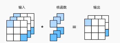
多输入多输出通道
文章目录 图像卷积填充和步幅填充步幅 多输入多输出通道1x1卷积层 图像卷积 卷积原理: 就是将之前的大的图片,定义一个核函数,然后经过移动并运算将图片变小了.也就是将图像压缩提取整合特征值. 这里利用的时乘法. 填充和步幅 填充 在应用多层卷积时,我们常常…...
http响应练习—在服务器端渲染html(SSR)
一、什么是服务器端渲染(SSR) 简单说,就是在服务器上把网页生成好,整个的HTML页面生成出来,生成出的页面已经包含了所有必要的数据和结构信息,然后直接发给浏览器进行展现。 二、例题 要求搭建http服务&a…...
: std::deque的使用)
C++(8): std::deque的使用
1. std::deque std::deque 是 C 标准库中的一个双端队列容器。这个容器支持在序列的两端进行快速的插入和删除操作,其时间复杂度为常数时间 O(1)。同时,std::deque 也提供了对序列中任意元素的随机访问。 2. 特点 (1)双端操作&…...
openwrt开发包含路由器基本功能的web问题记录
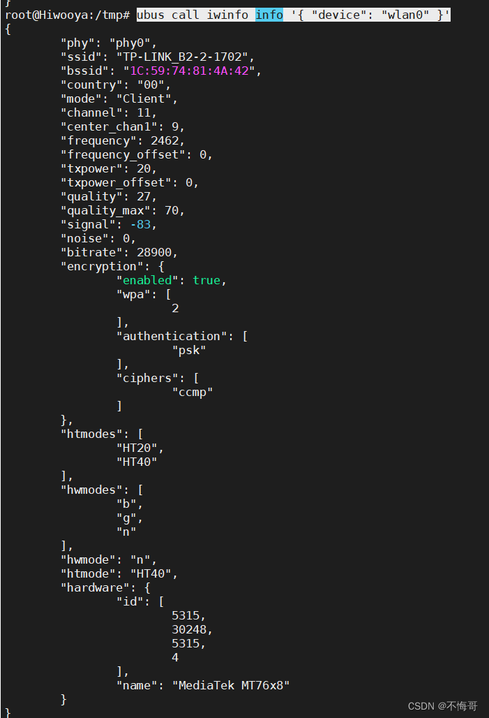
1.这里的扫描怎么实现的先找一些luci代码,在openwrt21版本后,luci用js替换了lua写后台,先找一些代码路径 在openrwt15这部分代码是在这个目录下 feeds/luci/modules/luci-mod-admin-full/luasrc/view/admin_network/wifi_join.htm 里面包含…...
HarmonyOS ArkTS 骨架屏加载显示(二十五)
目录 前言1、骨架屏代码显示2、代码中引用3、效果图展示 前言 所谓骨架屏,就是在页面进行耗时加载时,先展示的等待 UI, 以告知用户程序目前正在运行,稍等即可。 等待的UI大部分是 loading 转圈的弹窗,有的是自己风格的小动画。其实…...
Ruoyi-Cloud-Plus_使用Docker部署分布式微服务系统_环境准备_001---SpringCloud工作笔记200
1.首先安装docker: 如果以前安装过首先执行: yum remove docker docker-client docker-client-latest docker-common docker-latest docker-latest-logrotate docker-logrotate docker-selinux docker-engine-selinux docker-engine 去卸载docker 2.安装dokcer需要的工具包…...
RN封装的底部向上弹出的弹出层组件
组件代码 import React from react; import { View, StyleSheet, Modal, TouchableOpacity, Text, TouchableWithoutFeedback } from react-native;const BottomPopup ({ visible, onClose, children, leftButtonTitle, rightButtonTitle, onLeftButtonPress, onRightButtonP…...

基于深度学习YOLOv8+PyQt5的水底海底垃圾生物探测器检测识别系统(源码+数据集+配置说明)
wx供重浩:创享日记 对话框发送:323海底 获取完整源码7000张数据集配置说明文件说明远程操作配置环境跑通程序 效果展示 基于深度学习YOLOv8PyQt5的水底海底垃圾生物探测器检测识别系统设计(源码数据集配置文件) 各文件说明 程序运…...
SpringBoot集成WebSocket实现简单的多人聊天室
上代码—gitee下载地址: https://gitee.com/bestwater/Spring-websocket.git下载代码,连上数据库执行SQL,就可以运行,最终效果...
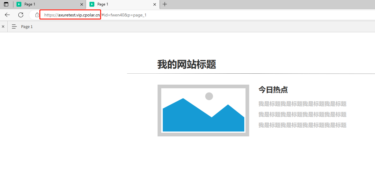
如何使用固定公网地址远程访问内网Axure RP生成的网站原型web页面
文章目录 前言1.在AxureRP中生成HTML文件2.配置IIS服务3.添加防火墙安全策略4.使用cpolar内网穿透实现公网访问4.1 登录cpolar web ui管理界面4.2 启动website隧道4.3 获取公网URL地址4.4. 公网远程访问内网web站点4.5 配置固定二级子域名公网访问内网web站点4.5.1创建一条固定…...
蓝桥杯习题
https://www.lanqiao.cn/problems/1265/learning/ 第一题---排序 给定一个长度为N的数组A,请你先从小到大输出它的每个元素,再从大到小输出他的每个元素。 输入描述: 第一行包含一个整数N 第二行包含N个整数a1,a2,a3,...an,表…...

AMS概念以及面试相关整理
1、ActivityManagerService是什么?什么时候初始化的?有什么作用? ActivityManagerService(AMS)是什么? ActivityManagerService(简称AMS)是Android操作系统中的一个核心服务&#…...
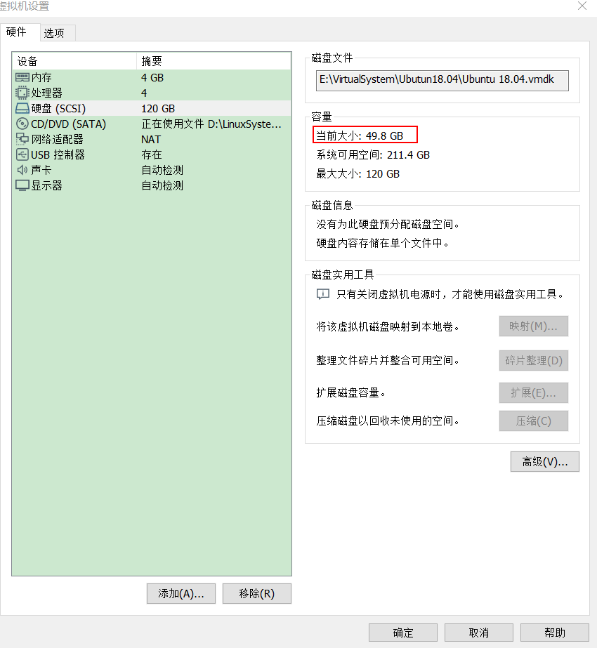
Vmware下减小Ubuntu系统占用系统盘大小
1、虚拟机设置下占用空间 如图,给虚拟机分配了120GB,已经占用116.9GB,开机会提示空间不足。 2、实际使用空间 ubuntu系统下使用“df -h”命令查看实际使用空间大小50GB左右 造成这个原因是,虚拟机的bug:在虚拟机的ub…...

面试题-Elasticsearch集群架构和调优手段(超全面)
对于Elasticsearch(ES),我了解并有经验。在我之前的公司,我们有一个相对大型的ES集群,以下是该集群的架构和一些调优手段的概述: 1. 集群架构 集群规模:我们的ES集群由15个节点组成,…...

python基础练习题6
1、找出10000以内能被5或6整除,但不能被两者同时整除的数(函数) def find_numbers(m,n):result []for num in range(m,n):if (num % 5 0 or num % 6 0) and not (num % 5 0 and num % 6 0):result.append(num)return resultprint(find_…...
Chrome 插件各模块使用 Fetch 进行接口请求
Chrome 插件各模块使用 Fetch 进行接口请求 常规网页可以使用 fetch() 或 XMLHttpRequest API 从远程服务器发送和接收数据,但受到同源政策的限制。 内容脚本会代表已注入内容脚本的网页源发起请求,因此内容脚本也受同源政策的约束,插件的来…...

内存可见性
内存可见性 一:内存可见性1.2: 二:解决内存可见性问题2.1 volatile关键字2.2:synchronized关键字解决内存可见性问题 一:内存可见性 public class Demo1 {public static int count 0;public static void main(String[] args) throws InterruptedException {Thread t1new Thre…...
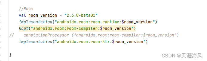
Android room 在dao中不能使用挂起suspend 否则会报错
错误: Type of the parameter must be a class annotated with Entity or a collection/array of it. kotlin.coroutines.Continuation<? super kotlin.Unit> $completion); 首先大家检查一下几个点 一、kotlin-kapt 二、 是否引入了 room-ktx 我是2024年…...
【stable diffusion扩散模型】一篇文章讲透
目录 一、引言 二、Stable Diffusion的基本原理 1 扩散模型 2 Stable Diffusion模型架构 3 训练过程与算法细节 三、Stable Diffusion的应用领域 1 图像生成与艺术创作 2 图像补全与修复 3 其他领域 四、Stable Diffusion的优势与挑战 👉优势 …...
业务系统对接大模型的基础方案:架构设计与关键步骤
业务系统对接大模型:架构设计与关键步骤 在当今数字化转型的浪潮中,大语言模型(LLM)已成为企业提升业务效率和创新能力的关键技术之一。将大模型集成到业务系统中,不仅可以优化用户体验,还能为业务决策提供…...
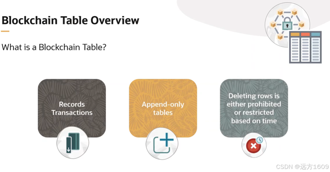
23-Oracle 23 ai 区块链表(Blockchain Table)
小伙伴有没有在金融强合规的领域中遇见,必须要保持数据不可变,管理员都无法修改和留痕的要求。比如医疗的电子病历中,影像检查检验结果不可篡改行的,药品追溯过程中数据只可插入无法删除的特性需求;登录日志、修改日志…...

《Playwright:微软的自动化测试工具详解》
Playwright 简介:声明内容来自网络,将内容拼接整理出来的文档 Playwright 是微软开发的自动化测试工具,支持 Chrome、Firefox、Safari 等主流浏览器,提供多语言 API(Python、JavaScript、Java、.NET)。它的特点包括&a…...

PL0语法,分析器实现!
简介 PL/0 是一种简单的编程语言,通常用于教学编译原理。它的语法结构清晰,功能包括常量定义、变量声明、过程(子程序)定义以及基本的控制结构(如条件语句和循环语句)。 PL/0 语法规范 PL/0 是一种教学用的小型编程语言,由 Niklaus Wirth 设计,用于展示编译原理的核…...

MySQL账号权限管理指南:安全创建账户与精细授权技巧
在MySQL数据库管理中,合理创建用户账号并分配精确权限是保障数据安全的核心环节。直接使用root账号进行所有操作不仅危险且难以审计操作行为。今天我们来全面解析MySQL账号创建与权限分配的专业方法。 一、为何需要创建独立账号? 最小权限原则…...
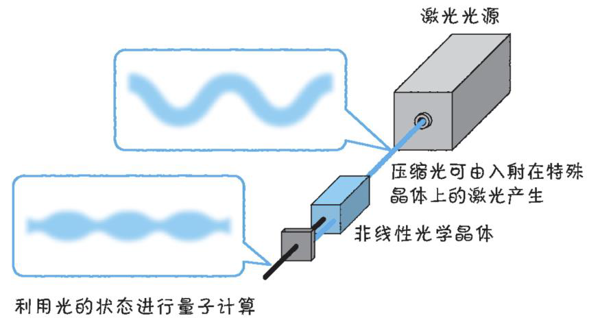
以光量子为例,详解量子获取方式
光量子技术获取量子比特可在室温下进行。该方式有望通过与名为硅光子学(silicon photonics)的光波导(optical waveguide)芯片制造技术和光纤等光通信技术相结合来实现量子计算机。量子力学中,光既是波又是粒子。光子本…...

Spring AI Chat Memory 实战指南:Local 与 JDBC 存储集成
一个面向 Java 开发者的 Sring-Ai 示例工程项目,该项目是一个 Spring AI 快速入门的样例工程项目,旨在通过一些小的案例展示 Spring AI 框架的核心功能和使用方法。 项目采用模块化设计,每个模块都专注于特定的功能领域,便于学习和…...

SQL Server 触发器调用存储过程实现发送 HTTP 请求
文章目录 需求分析解决第 1 步:前置条件,启用 OLE 自动化方式 1:使用 SQL 实现启用 OLE 自动化方式 2:Sql Server 2005启动OLE自动化方式 3:Sql Server 2008启动OLE自动化第 2 步:创建存储过程第 3 步:创建触发器扩展 - 如何调试?第 1 步:登录 SQL Server 2008第 2 步…...
渗透实战PortSwigger靶场:lab13存储型DOM XSS详解
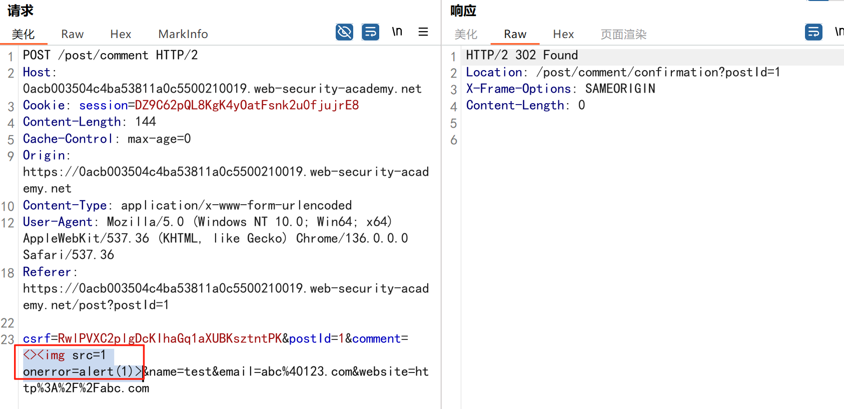
进来是需要留言的,先用做简单的 html 标签测试 发现面的</h1>不见了 数据包中找到了一个loadCommentsWithVulnerableEscapeHtml.js 他是把用户输入的<>进行 html 编码,输入的<>当成字符串处理回显到页面中,看来只是把用户输…...

拟合问题处理
在机器学习中,核心任务通常围绕模型训练和性能提升展开,但你提到的 “优化训练数据解决过拟合” 和 “提升泛化性能解决欠拟合” 需要结合更准确的概念进行梳理。以下是对机器学习核心任务的系统复习和修正: 一、机器学习的核心任务框架 机…...