纯css实现loading加载中(多种展现形式)
前言
现如今网页越来越趋近于动画,相信大家平时浏览网页或多或少都能看到一些动画效果,今天我们来做一个有意思的动画效果,纯 css 实现 loading 加载中(多种展现形式),下面一起看看吧。
1. 常规 loading
实现效果

代码如下
<template><div class="parentBox"><div class="loadBox"><div class="loaderContantBox"></div></div></div>
</template>
<style lang="less" scoped>
.parentBox {height: 100%;background: rgb(31, 31, 31);padding: 100px;.loadBox .loaderContantBox {color: white;font-size: 40px;overflow: hidden;width: 40px;height: 40px;border-radius: 50%;transform: translateZ(0);/* animation:规定完成动画所花费的时间,该属性必须规定,否则动画时长为0,无法播放 */animation: loadBox 1.7s infinite ease, round 1.7s infinite ease;}@keyframes loadBox {0% {box-shadow: 0 -0.83em 0 -0.4em, 0 -0.83em 0 -0.42em, 0 -0.83em 0 -0.44em,0 -0.83em 0 -0.46em, 0 -0.83em 0 -0.477em;}5%,95% {box-shadow: 0 -0.83em 0 -0.4em, 0 -0.83em 0 -0.42em, 0 -0.83em 0 -0.44em,0 -0.83em 0 -0.46em, 0 -0.83em 0 -0.477em;}10%,59% {box-shadow: 0 -0.83em 0 -0.4em, -0.087em -0.825em 0 -0.42em,-0.173em -0.812em 0 -0.44em, -0.256em -0.789em 0 -0.46em,-0.297em -0.775em 0 -0.477em;}20% {box-shadow: 0 -0.83em 0 -0.4em, -0.338em -0.758em 0 -0.42em,-0.555em -0.617em 0 -0.44em, -0.671em -0.488em 0 -0.46em,-0.749em -0.34em 0 -0.477em;}38% {box-shadow: 0 -0.83em 0 -0.4em, -0.377em -0.74em 0 -0.42em,-0.645em -0.522em 0 -0.44em, -0.775em -0.297em 0 -0.46em,-0.82em -0.09em 0 -0.477em;}100% {box-shadow: 0 -0.83em 0 -0.4em, 0 -0.83em 0 -0.42em, 0 -0.83em 0 -0.44em,0 -0.83em 0 -0.46em, 0 -0.83em 0 -0.477em;}}@keyframes round {0% {transform: rotate(0deg); /* 开始旋转 div 元素 */}100% {transform: rotate(360deg); /* 结束旋转 div 元素 */}}
}
</style>
2. 抛出线条式 loading
实现效果

代码如下
<template><div class="parentBox"><svg class="scalableBox" viewBox="0 0 128 256" width="128px" height="256px" xmlns="http://www.w3.org/2000/svg"><defs><linearGradient id="ap-grad1" x1="0" y1="0" x2="0" y2="1"><stop offset="0%" stop-color="hsl(223,90%,55%)" /><stop offset="100%" stop-color="hsl(253,90%,55%)" /></linearGradient><linearGradient id="ap-grad2" x1="0" y1="0" x2="0" y2="1"><stop offset="0%" stop-color="hsl(193,90%,55%)" /><stop offset="50%" stop-color="hsl(223,90%,55%)" /><stop offset="100%" stop-color="hsl(253,90%,55%)" /></linearGradient></defs><circle class="apringBox" r="56" cx="64" cy="192" fill="none" stroke="#ddd" stroke-width="16" stroke-linecap="round" /><circle class="apwormOneBox" r="56" cx="64" cy="192" fill="none" stroke="url(#ap-grad1)" stroke-width="16" stroke-linecap="round"stroke-dasharray="87.96 263.89" /><path class="apwormTwoBox" d="M120,192A56,56,0,0,1,8,192C8,161.07,16,8,64,8S120,161.07,120,192Z" fill="none" stroke="url(#ap-grad2)"stroke-width="16" stroke-linecap="round" stroke-dasharray="87.96 494" /></svg></div>
</template>
<style lang="less" scoped>
.parentBox {height: 100%;background: rgb(31, 31, 31);padding: 100px;.scalableBox {width: 40px;height: 70px;}.apringBox {transition: stroke 0.3s;}.apwormOneBox,.apwormTwoBox {animation-duration: 3s;animation-iteration-count: infinite;}.apwormTwoBox {animation-name: worm2;visibility: hidden;}.apwormOneBox {animation-name: worm1;}
}@media (prefers-color-scheme: dark) {:root {--bg: hsl(var(--hue), 10%, 10%);--fg: hsl(var(--hue), 10%, 90%);}.apringBox {stroke: hsla(var(--hue), 10%, 90%, 0.9);}
}@keyframes worm1 {from {animation-timing-function: ease-in-out;stroke-dashoffset: -87.96;}20% {animation-timing-function: ease-in;stroke-dashoffset: 0;}60% {stroke-dashoffset: -791.68;visibility: visible;}60.1%,to {stroke-dashoffset: -791.68;visibility: hidden;}
}@keyframes worm2 {from,60% {stroke-dashoffset: -87.96;visibility: hidden;}60.1% {animation-timing-function: cubic-bezier(0, 0, 0.5, 0.75);stroke-dashoffset: -87.96;visibility: visible;}77% {animation-timing-function: cubic-bezier(0.5, 0.25, 0.5, 0.88);stroke-dashoffset: -340;visibility: visible;}to {stroke-dashoffset: -669.92;visibility: visible;}
}
</style>
3. 进度条颜色覆盖式 loading
实现效果

代码如下
<template><div class="parentBox"><div class="contantBox"></div></div>
</template>
<style lang="less" scoped>
.parentBox {height: 100%;background: rgb(31, 31, 31);padding: 100px;.contantBox {width: 120px;height: 20px;background: linear-gradient(rgb(12, 132, 223) 0 0) 0/0% no-repeat #ddd;animation: cartoon 2s infinite linear;}@keyframes cartoon {100% {background-size: 100%;}}
}
</style>
4. 椭圆式进度条 loading
实现效果

代码如下
<template><div class="parentBox"><div class="contantBox"></div></div>
</template>
<style lang="less" scoped>
.parentBox {height: 100%;background: rgb(31, 31, 31);padding: 100px;.contantBox {width: 120px;height: 22px;border-radius: 20px;color: #514b82;border: 2px solid;position: relative;}.contantBox::before {content: "";position: absolute;margin: 2px;inset: 0 100% 0 0;border-radius: inherit;background: #514b82;animation: cartoon 2s infinite;}@keyframes cartoon {100% {inset: 0;}}
}
</style>
5. 卡顿式进度条 loading
实现效果

代码如下
<template><div class="parentBox"><div class="contantBox"></div></div>
</template>
<style lang="less" scoped>
.parentBox {height: 100%;background: rgb(31, 31, 31);padding: 100px;.contantBox {width: 120px;height: 20px;border-radius: 20px;background: linear-gradient(orange 0 0) 0/0% no-repeat lightblue;animation: cartoon 2s infinite steps(10);}@keyframes cartoon {100% {background-size: 110%;}}
}
</style>
6. 进度条波纹 loading
实现效果

代码如下
<template><div class="parentBox"><div class="contantBox"></div></div>
</template>
<style lang="less" scoped>
.parentBox {height: 100%;background: rgb(31, 31, 31);padding: 100px;.contantBox {width: 120px;height: 20px;border-radius: 20px;background: repeating-linear-gradient(135deg,#f03355 0 10px,#ffa516 0 20px)0/0% no-repeat,repeating-linear-gradient(135deg, #ddd 0 10px, #eee 0 20px) 0/100%;animation: cartoon 2s infinite;}@keyframes cartoon {100% {background-size: 100%;}}
}
</style>
7. 进度条分隔式 loading
实现效果

代码如下
<template><div class="parentBox"><div class="contantBox"></div></div>
</template>
<style lang="less" scoped>
.parentBox {height: 100%;background: rgb(31, 31, 31);padding: 100px;.contantBox {width: 120px;height: 20px;-webkit-mask: linear-gradient(90deg, #000 70%, #0000 0) 0/20%;background: linear-gradient(rgb(73, 255, 57) 0 0) 0/0% no-repeat #ddd;animation: cartoon 2s infinite steps(6);}@keyframes cartoon {100% {background-size: 120%;}}
}
</style>
8. 圆球连接式 loading
实现效果

代码如下
<template><div class="parentBox"><div class="contantBox"></div></div>
</template>
<style lang="less" scoped>
.parentBox {height: 100%;background: rgb(31, 31, 31);padding: 100px;.contantBox {width: 120px;height: 24px;-webkit-mask: radial-gradient(circle closest-side, #000 94%, #0000) 0 0/25%100%,linear-gradient(#000 0 0) center/calc(100% - 12px) calc(100% - 12px)no-repeat;background: linear-gradient(#25b09b 0 0) 0/0% no-repeat #ddd;animation: cartoon 2s infinite linear;}@keyframes cartoon {100% {background-size: 100%;}}
}
</style>
9. 电池充电式 loading
实现效果

代码如下
<template><div class="parentBox"><div class="contantBox"></div></div>
</template>
<style lang="less" scoped>
.parentBox {height: 100%;background: rgb(31, 31, 31);padding: 100px;.contantBox {width: 80px;height: 40px;border: 2px solid rgb(103, 194, 58);padding: 3px;background: repeating-linear-gradient(90deg,rgb(103, 194, 58) 0 10px,#0000 0 16px)0/0% no-repeat content-box content-box;position: relative;animation: cartoon 2s infinite steps(6);}.contantBox::before {content: "";position: absolute;top: 50%;left: 100%;transform: translateY(-50%);width: 10px;height: 10px;border: 2px solid rgb(103, 194, 58);}@keyframes cartoon {100% {background-size: 120%;}}
}
</style>
10. 球体分隔式 loading
实现效果

代码如下
<template><div class="parentBox"><div class="contantBox"></div></div>
</template>
<style lang="less" scoped>
.parentBox {height: 100%;background: rgb(31, 31, 31);padding: 100px;.contantBox {width: 60px;height: 60px;border-radius: 50%;-webkit-mask: linear-gradient(0deg, #000 55%, #0000 0) bottom/100% 18.18%;background: linear-gradient(#f03355 0 0) bottom/100% 0% no-repeat #ddd;animation: cartoon 2s infinite steps(7);}@keyframes cartoon {100% {background-size: 100% 115%;}}
}
</style>
11. 水球波纹式 loading
实现效果

代码如下
<template><div class="parentBox"><div class="contantBox"></div></div>
</template>
<style lang="less" scoped>
.parentBox {height: 100%;background: rgb(31, 31, 31);padding: 100px;.contantBox {--r1: 154%;--r2: 68.5%;width: 60px;height: 60px;border-radius: 50%;background: radial-gradient(var(--r1) var(--r2) at top,#0000 79.5%,#269af2 80%)center left,radial-gradient(var(--r1) var(--r2) at bottom, #269af2 79.5%, #0000 80%)center center,radial-gradient(var(--r1) var(--r2) at top, #0000 79.5%, #269af2 80%)center right,#ccc;background-size: 50.5% 220%;background-position: -100% 0%, 0% 0%, 100% 0%;background-repeat: no-repeat;animation: cartoon 2s infinite linear;}@keyframes cartoon {33% {background-position: 0% 33%, 100% 33%, 200% 33%;}66% {background-position: -100% 66%, 0% 66%, 100% 66%;}100% {background-position: 0% 100%, 100% 100%, 200% 100%;}}
}
</style>
12. 半圆线条式 loading
实现效果

代码如下
<template><div class="parentBox"><div class="contantBox"></div></div>
</template>
<style lang="less" scoped>
.parentBox {height: 100%;background: rgb(31, 31, 31);padding: 100px;.contantBox {width: 120px;height: 60px;border-radius: 200px 200px 0 0;-webkit-mask: repeating-radial-gradient(farthest-side at bottom,#0000 0,#000 1px 12%,#0000 calc(12% + 1px) 20%);background: radial-gradient(farthest-side at bottom, #514b82 0 95%, #0000 0)bottom/0% 0% no-repeat #ddd;animation: cartoon 2s infinite steps(6);}@keyframes cartoon {100% {background-size: 120% 120%;}}
}
</style>
13. 球体内小球跳跃式 loading
实现效果

代码如下
<template><div class="parentBox"><!-- 第一种 --><div><figure><section><div></div></section><section><div></div></section><section><div></div></section><section><div></div></section><section><div></div></section><section><div></div></section><section><div></div></section><section><div></div></section></figure></div><!-- 第二种 --><div><figure><section><div></div></section><section><div></div></section><section><div></div></section><section><div></div></section><section><div></div></section><section><div></div></section><section><div></div></section><section><div></div></section></figure></div><!-- 第三种 --><div><figure><section><div></div></section><section><div></div></section><section><div></div></section><section><div></div></section><section><div></div></section><section><div></div></section><section><div></div></section><section><div></div></section></figure></div><!-- 第四种 --><div><figure><section><div></div></section><section><div></div></section><section><div></div></section><section><div></div></section><section><div></div></section><section><div></div></section><section><div></div></section><section><div></div></section></figure></div></div>
</template>
<style lang="less" scoped>
.parentBox {height: 100%;background: rgb(31, 31, 31);padding: 100px;display: flex;@keyframes move {from {transform: translate(0, 50%);}to {transform: translate(0, 850%);}}figure {margin: 10px;width: 40px;height: 40px;border-radius: 50%;position: relative;background: rgb(240,109,78);}section {width: 10%;height: 100%;position: absolute;left: 45%;}section:nth-child(2) {transform: rotate(22.5deg);}section:nth-child(3) {transform: rotate(45deg);}section:nth-child(4) {transform: rotate(67.5deg);}section:nth-child(5) {transform: rotate(90deg);}section:nth-child(6) {transform: rotate(112.5deg);}section:nth-child(7) {transform: rotate(135deg);}section:nth-child(8) {transform: rotate(157.5deg);}figure div {height: 10%;border-radius: 50%;background: #fff;animation: move 1s ease-in-out infinite alternate;}figure:nth-child(1) > section:nth-child(1) > div {animation-delay: -0.1875s;}figure:nth-child(1) > section:nth-child(2) > div {animation-delay: -0.175s;}figure:nth-child(1) > section:nth-child(3) > div {animation-delay: -0.1625s;}figure:nth-child(1) > section:nth-child(4) > div {animation-delay: -0.15s;}figure:nth-child(1) > section:nth-child(5) > div {animation-delay: -0.9375s;}figure:nth-child(1) > section:nth-child(6) > div {animation-delay: -0.925s;}figure:nth-child(1) > section:nth-child(7) > div {animation-delay: -0.9125s;}figure:nth-child(1) > section:nth-child(8) > div {animation-delay: -0.9s;}figure:nth-child(2) > section:nth-child(1) > div {animation-delay: -0.875s;}figure:nth-child(2) > section:nth-child(2) > div {animation-delay: -0.75s;}figure:nth-child(2) > section:nth-child(3) > div {animation-delay: -0.625s;}figure:nth-child(2) > section:nth-child(4) > div {animation-delay: -0.5s;}figure:nth-child(2) > section:nth-child(5) > div {animation-delay: -0.375s;}figure:nth-child(2) > section:nth-child(6) > div {animation-delay: -0.25s;}figure:nth-child(2) > section:nth-child(7) > div {animation-delay: -0.125s;}figure:nth-child(3) > section:nth-child(1) > div {animation-delay: -0.5s;}figure:nth-child(3) > section:nth-child(3) > div {animation-delay: -0.5s;}figure:nth-child(3) > section:nth-child(5) > div {animation-delay: -0.5s;}figure:nth-child(3) > section:nth-child(7) > div {animation-delay: -0.5s;}figure:nth-child(4) > section:nth-child(1) > div {animation-delay: -0.35s;}figure:nth-child(4) > section:nth-child(2) > div {animation-delay: -0.3s;}figure:nth-child(4) > section:nth-child(3) > div {animation-delay: -0.25s;}figure:nth-child(4) > section:nth-child(4) > div {animation-delay: -0.2s;}figure:nth-child(4) > section:nth-child(5) > div {animation-delay: -0.15s;}figure:nth-child(4) > section:nth-child(6) > div {animation-delay: -0.1s;}figure:nth-child(4) > section:nth-child(7) > div {animation-delay: -0.05s;}
}
</style>
14. 球体内动图式 loading
实现效果

代码如下
<template><div class="parentBox"><div class="containerBox"><!-- 第一种 --><div class="canvasBox"><div class="spinnerOneBox spinnerMaxBox"><div class="spinnerOneBox spinnerMidBox"><div class="spinnerOneBox spinnerMinBox"></div></div></div></div><!-- 第二种 --><div class="canvasBox canvasTwoBox"><div class="spinnerTwoBox"></div><div class="hourHandBox"></div><div class="dotBox"></div></div><!-- 第三种 --><div class="canvasBox"><div class="spinnerThreeBox"></div></div><!-- 第四种 --><div class="canvasBox"><div class="spinnerFourBox"></div></div><!-- 第五种 --><div class="canvasBox"><div class="spinnerFiveBox"></div></div><!-- 第六种 --><div class="canvasBox"><div class="spinnerSexBox p1"></div><div class="spinnerSexBox p2"></div><div class="spinnerSexBox p3"></div><div class="spinnerSexBox p4"></div></div></div></div>
</template>
<style lang="less" scoped>
.parentBox {height: 100%;background: rgb(31, 31, 31);padding: 100px;.containerBox {display: flex;.canvasBox {align-items: center;background: #eeeeee;border-radius: 50%;display: flex;justify-content: center;margin: 1em;width: 10em;height: 10em;// 第一种.spinnerOneBox {align-items: center;border: 0.3em solid transparent;border-top: 0.3em solid #4db6ac;border-right: 0.3em solid #4db6ac;border-radius: 100%;display: flex;justify-content: center;}.spinnerMaxBox {animation: spinnerOne 3s linear infinite;height: 3em;width: 3em;.spinnerMidBox {animation: spinnerOne 5s linear infinite;height: 2.4em;width: 2.4em;.spinnerMinBox {animation: spinnerOne 5s linear infinite;height: 1.8em;width: 1.8em;}}}}@keyframes spinnerOne {0% {transform: rotate(0deg);}100% {transform: rotate(360deg);}}// 第二种.canvasTwoBox {position: relative;.spinnerTwoBox {animation: spinnerTwo 1s linear infinite;background: #4db6ac;border-radius: 100px;height: 3em;transform-origin: top;position: absolute;top: 50%;width: 0.22em;}.hourHandBox {animation: spinnerTwo 7s linear infinite;background: #4db6ac;border-radius: 100px;height: 2em;transform-origin: top;position: absolute;top: 50%;width: 0.2em;}.dotBox {background: #4db6ac;border-radius: 100%;height: 0.5em;width: 0.5em;}}@keyframes spinnerTwo {0% {transform: rotate(0deg);}100% {transform: rotate(360deg);}}// 第三种.spinnerThreeBox {animation: spinnerThree 1s linear infinite;background: #4db6ac;border-radius: 100%;width: 3em;height: 3em;}@keyframes spinnerThree {0%,35% {background: #4db6ac;transform: scale(1);}20%,50% {background: #80cbc4;transform: scale(1.3);}}// 第四种.spinnerFourBox {animation: spinnerFour 1s linear infinite;border: solid 7px transparent;border-top: solid 7px #4db6ac;border-radius: 100%;width: 3em;height: 3em;}@keyframes spinnerFour {0% {transform: rotate(0deg);}100% {transform: rotate(360deg);}}// 第五种.spinnerFiveBox {animation: spinnerFive 1s linear infinite;border: solid 1.5em #4db6ac;border-right: solid 1.5em transparent;border-left: solid 1.5em transparent;border-radius: 100%;width: 0;height: 0;}@keyframes spinnerFive {0% {transform: rotate(0deg);}50% {transform: rotate(60deg);}100% {transform: rotate(360deg);}}// 第六种.spinnerSexBox {background: #4db6ac;border-radius: 50%;height: 1em;margin: 0.1em;width: 1em;}.p1 {animation: fall 1s linear 0.3s infinite;}.p2 {animation: fall 1s linear 0.2s infinite;}.p3 {animation: fall 1s linear 0.1s infinite;}.p4 {animation: fall 1s linear infinite;}@keyframes fall {0% {transform: translateY(-15px);}25%,75% {transform: translateY(0);}100% {transform: translateY(-15px);}}}
}
</style>
持续更新中...
相关文章:
纯css实现loading加载中(多种展现形式)
前言 现如今网页越来越趋近于动画,相信大家平时浏览网页或多或少都能看到一些动画效果,今天我们来做一个有意思的动画效果,纯 css 实现 loading 加载中(多种展现形式),下面一起看看吧。 1. 常规 loading 实…...

【面试题】2023 vue高频面试知识点汇总
一、MVVM原理在Vue2官方文档中没有找到Vue是MVVM的直接证据,但文档有提到:虽然没有完全遵循MVVM模型,但是 Vue 的设计也受到了它的启发,因此在文档中经常会使用vm(ViewModel 的缩写) 这个变量名表示 Vue 实例。为了感受MVVM模型的…...
跨境电商选品重要吗?
选品很重要!跨境电子商务选择的核心要求:优质商品,价格优势,符合跨境销售特点,满足目标海外市场需求,突出自身特色竞争优势。跨境电商是如何选择产品的?这个问题也很流行,应该考虑以…...

SpringBoot
这里写目录标题1.入门程序1.1 spring-boot-starter-parent1.2 启动器1.3 EnableAutoConfiguration(重要)1.4 如何注册多个Controller?1.5 引导类2.完整的SpringBoot项目2.1 启动类2.1.1 创建一个启动类2.1.2 扩展: SpringBootConfiguration2.2 使用配置类定义组件2.3 SpringBo…...
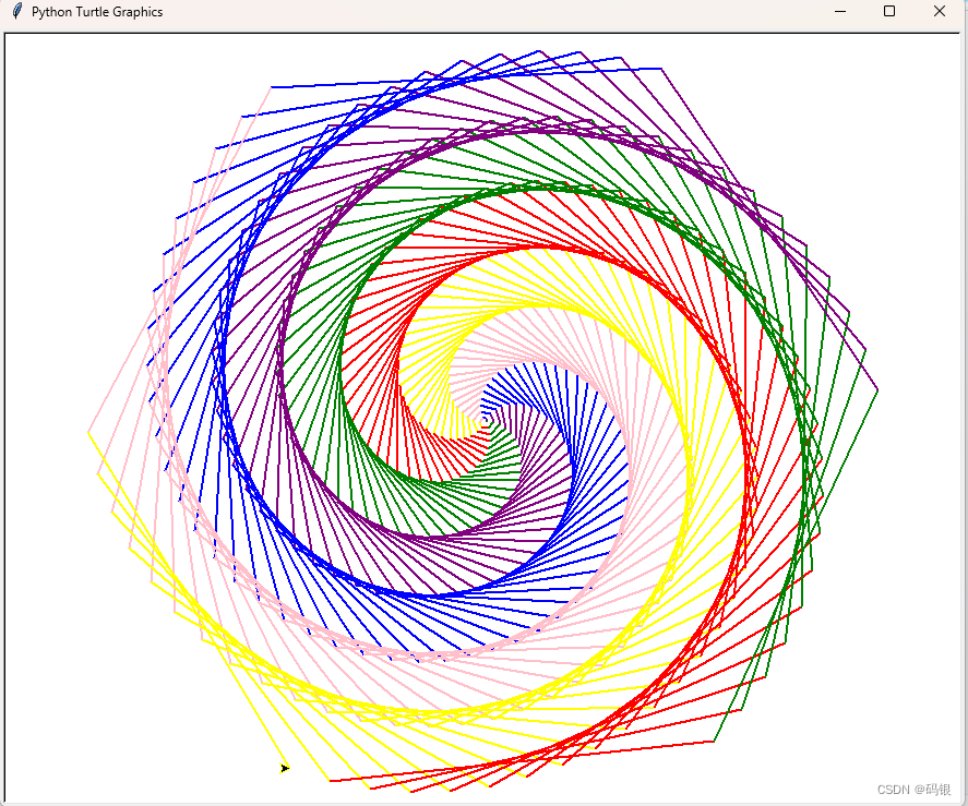
python--turtle
前言 就随便练练,学习一下turtle库的使用 正文 1.语法学习 import turtle #导入库 turtle.showturtle() #画笔显示箭头 turtle.write("我是大帅逼") #写下字符串 turtle.forward(300) …...
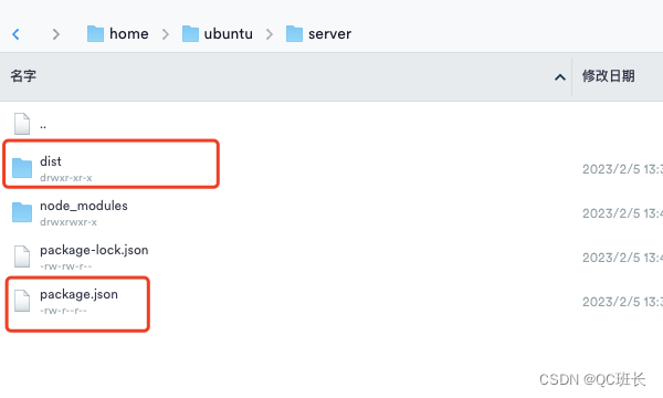
NodeJS的后端Express项目部署到Ubuntu服务器,为前端提供API服务
之前参与的web3项目后端是用NodeJS开发的,因为可以共用NPM库,采用的Express框架,第一次弄,记录下大致的部署过程如下: 1、服务器上安装NodeJS sudo apt-get install nodejs 2、安装全局NPM工具,node_mod…...
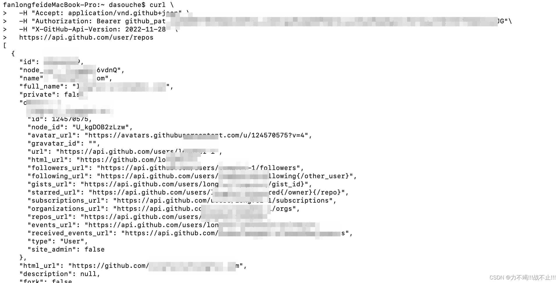
作为研发如何使用Github Api?
文章目录使用步骤账号创建进行开发者相关设置API操作演示Github API好处推荐的Github API🌟个人主页: 个人主页 🚵♀️个人介绍:每天进步一点点,生活变得好一点点。 📌作为一位开发,不管是非工作的还是工作中的人士&…...

Java volatile学习
面试题: 1、请谈谈你对volatile的理解? volatile是Java虚拟机提供的轻量级的同步机制1.保证可见性2.不保证原子性3.禁止指令重排 2、JMM你谈谈?Java内存模型 3、你在哪些地方用到过volatile?单例模式CAS底层代码 目录 一、概述 1、可见性 2、原子性…...

用神经网络分类上和下
( A, B )---3*30*2---( 1, 0 )( 0, 1 ) 做一个网络,输入为3个点,训练集A,B各有4张图片。让B的4张图片全是0.排列组合A,记录迭代次数平均值的变化。收敛误差为7e-4,每个网络收敛199次。 其中得到一组数据 差值结构 1-A-B 迭代次…...
VS Code 1.75 发布!
欢迎使用 2023 年 1 月版的 Visual Studio Code。希望您喜欢此版本中的许多更新,其中一些主要亮点包括:配置文件、VS Marketplace 签名、辅助功能改进、更轻松地调整多视图大小、树视图搜索历史、新的 Git 命令等等。让我们一起看看吧! 配置文…...

Vue2仿网易云风格音乐播放器(附源码)
Vue2仿网易云风格音乐播放器1、整体效果2、使用技术3、实现内容4、源码5、使用图片1、整体效果 2、使用技术 使用了HTML5 CSS3进行页面布局及美化使用Vue2进行数据渲染与页面交互使用Axios发送http请求获取数据 3、实现内容 实现了搜索歌曲功能,输入歌手或歌曲关…...

Spring相关面试题
文章目录请谈一下你对 spring 的理解?说一下 Spring 的核心是什么?请谈 一下你对 Spring IOC 和 和 AOP 的理解?请说一下 Spring 的 的 Bean 作用域?请谈一下Spring中bean对象的生命周期?Spring中的事务是如何实现的 &…...

操作符详解(上篇)
前言小伙伴们大家好,随着对c的不断学习今天我们将来学习操作符。在初始c语言中也介绍过操作符但也只是点到即可,今天我们将详细了解操作符。操作符分类:算术操作符移位操作符位操作符赋值操作符单目操作符关系操作符逻辑操作符条件操作符逗号…...
采样电路的3个组成部分
采样电路的使用实际上是电路的一个闭环控制过程,也可以理解为一个负反馈过程,采集的信号被传送到主控制芯片进行调整。今天就来为您介绍一下采样电路的三个组成部分分析!一起来看看吧! 这里的采样实际上分为电流采样、电压采样、…...

ffmpeg硬解码与软解码的压测对比
文章目录ffmpeg硬解码与软解码的压测一、基本知识二、压测实验1. 实验条件及工具说明2. 压测脚本3. 实验数据结果ffmpeg硬解码与软解码的压测 一、基本知识 本文基于intel集显进行压测 软解码:cpu对视频进行解码硬解码:显卡或者多媒体处理芯片对视频进…...

操作符——“C”
各位CSDN的uu们你们好呀,今天,总算是要到我们的操作符啦,在C语言中,操作符是一个极为复杂的东西,下面,就让我们进入操作符的世界吧 算术操作符 移位操作符 位操作符 赋值操作符 单目操作符 关系操作符…...

YSP的UI界面设计
文章目录一、准备工作二、UI设计1.QPushButton:三、遇到的bug一、准备工作 1.MSVC和MinGW上编译的项目,不能用另一个编译器进行编译 2.若要使用MSVC编译器,需要下载对应版本的VS 见此篇:https://blog.csdn.net/Copperxcx/article…...
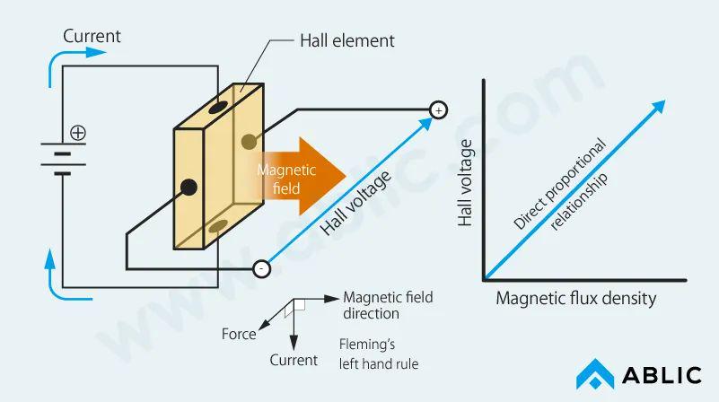
干货 | 什么是磁传感器?最常用的磁传感器类型及应用
1、什么是磁传感器?磁传感器通常是指将磁场的大小和变化转换成电信号。磁场,以地球磁场(地磁)或磁石为例的磁场是我们熟悉但不可见的现象。将不可见的磁场转化为电信号,以及转化为可见效应的磁传感器一直以来都是研究的主题。从几十年前使用电…...
详解)
操作符(运算符)详解
🚀🚀🚀大家觉不错的话,就恳求大家点点关注,点点小爱心,指点指点🚀🚀🚀 目录 🐰算数操作符: - * / % 🐰移位操作符&#x…...

【LeetCode每日一题】【2023/2/9】1797. 设计一个验证系统
文章目录1797. 设计一个验证系统方法1:哈希表代码总体1797. 设计一个验证系统 LeetCode: 1797. 设计一个验证系统 中等\color{#FFB800}{中等}中等 你需要设计一个包含验证码的验证系统。每一次验证中,用户会收到一个新的验证码,这个验证码在…...
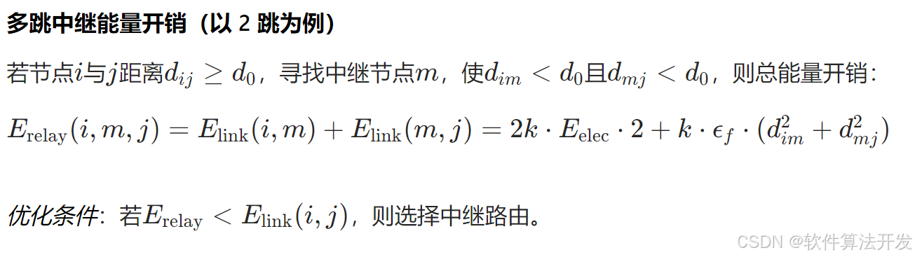
基于距离变化能量开销动态调整的WSN低功耗拓扑控制开销算法matlab仿真
目录 1.程序功能描述 2.测试软件版本以及运行结果展示 3.核心程序 4.算法仿真参数 5.算法理论概述 6.参考文献 7.完整程序 1.程序功能描述 通过动态调整节点通信的能量开销,平衡网络负载,延长WSN生命周期。具体通过建立基于距离的能量消耗模型&am…...
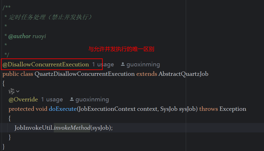
定时器任务——若依源码分析
分析util包下面的工具类schedule utils: ScheduleUtils 是若依中用于与 Quartz 框架交互的工具类,封装了定时任务的 创建、更新、暂停、删除等核心逻辑。 createScheduleJob createScheduleJob 用于将任务注册到 Quartz,先构建任务的 JobD…...
基础光照(Basic Lighting))
C++.OpenGL (10/64)基础光照(Basic Lighting)
基础光照(Basic Lighting) 冯氏光照模型(Phong Lighting Model) #mermaid-svg-GLdskXwWINxNGHso {font-family:"trebuchet ms",verdana,arial,sans-serif;font-size:16px;fill:#333;}#mermaid-svg-GLdskXwWINxNGHso .error-icon{fill:#552222;}#mermaid-svg-GLd…...

MySQL用户和授权
开放MySQL白名单 可以通过iptables-save命令确认对应客户端ip是否可以访问MySQL服务: test: # iptables-save | grep 3306 -A mp_srv_whitelist -s 172.16.14.102/32 -p tcp -m tcp --dport 3306 -j ACCEPT -A mp_srv_whitelist -s 172.16.4.16/32 -p tcp -m tcp -…...
)
Angular微前端架构:Module Federation + ngx-build-plus (Webpack)
以下是一个完整的 Angular 微前端示例,其中使用的是 Module Federation 和 npx-build-plus 实现了主应用(Shell)与子应用(Remote)的集成。 🛠️ 项目结构 angular-mf/ ├── shell-app/ # 主应用&…...

高效线程安全的单例模式:Python 中的懒加载与自定义初始化参数
高效线程安全的单例模式:Python 中的懒加载与自定义初始化参数 在软件开发中,单例模式(Singleton Pattern)是一种常见的设计模式,确保一个类仅有一个实例,并提供一个全局访问点。在多线程环境下,实现单例模式时需要注意线程安全问题,以防止多个线程同时创建实例,导致…...

在QWebEngineView上实现鼠标、触摸等事件捕获的解决方案
这个问题我看其他博主也写了,要么要会员、要么写的乱七八糟。这里我整理一下,把问题说清楚并且给出代码,拿去用就行,照着葫芦画瓢。 问题 在继承QWebEngineView后,重写mousePressEvent或event函数无法捕获鼠标按下事…...
R语言速释制剂QBD解决方案之三
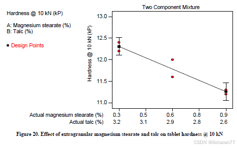
本文是《Quality by Design for ANDAs: An Example for Immediate-Release Dosage Forms》第一个处方的R语言解决方案。 第一个处方研究评估原料药粒径分布、MCC/Lactose比例、崩解剂用量对制剂CQAs的影响。 第二处方研究用于理解颗粒外加硬脂酸镁和滑石粉对片剂质量和可生产…...
宇树科技,改名了!
提到国内具身智能和机器人领域的代表企业,那宇树科技(Unitree)必须名列其榜。 最近,宇树科技的一项新变动消息在业界引发了不少关注和讨论,即: 宇树向其合作伙伴发布了一封公司名称变更函称,因…...

WEB3全栈开发——面试专业技能点P7前端与链上集成
一、Next.js技术栈 ✅ 概念介绍 Next.js 是一个基于 React 的 服务端渲染(SSR)与静态网站生成(SSG) 框架,由 Vercel 开发。它简化了构建生产级 React 应用的过程,并内置了很多特性: ✅ 文件系…...