Android FlexboxLayout布局
FlexboxLayout 布局
- 一、简介
- 二、使用
- 三、功能详解
- FlexboxLayout属性
- flexWrap
- flexDirection
- alignItems
- justifyContent
- alignContent
- dividerDrawableHorizontal、showDividerHorizontal
- dividerDrawableVertical、showDividerVertical
- dividerDrawable、showDivider
- maxLine
- FlexboxLayout子控件属性
- layout_order
- layout_flexGrow
- layout_flexShrink
- layout_flexBasisPercent
- layout_wrapBefore
- layout_minWidth、layout_maxWidth、layout_minHeight、layout_maxHeight
- layout_alignSelf
- FlexboxLayout在RecyclerView应用(FlexboxLayoutManager)
一、简介
FlexboxLayout 是2016年 Google I/O 上开源的一个布局控件,FlexBoxLayout是为Android带来了与 CSS Flexible Box Layout Module (CSS 弹性盒子)相似功能的开源布局控件。
FlexboxLayout 官方开源项目地址:https://github.com/google/flexbox-layout
二、使用
在项目的build.gradle引入flexbox:
implementation 'com.google.android.flexbox:flexbox:3.0.0'
从1.1.0开始,该库预计将与AndroidX一起使用。如果还没有迁移到AndroidX,需使用1.0.0版本,如果使用1.1.0或更高版本,需迁移到AndroidX;
从2.0.0开始,FlexboxLayout的alignItems和alignContext的默认值已从stretch更改为flex_start;
从3.0.0开始,groupId更改为com.google.android.flexbox,且上传至google-maven。旧版本的groupId(com.google.android),可以从jcenter中引用,建议迁移至3.0.0;
在布局文件中添加flexbox:
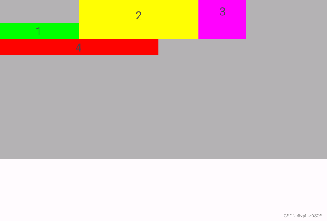
<com.google.android.flexbox.FlexboxLayout xmlns:android="http://schemas.android.com/apk/res/android"xmlns:app="http://schemas.android.com/apk/res-auto"android:layout_width="match_parent"android:layout_height="match_parent"app:flexWrap="wrap"><TextViewandroid:layout_width="100dp"android:layout_height="20dp"android:background="#00FF00"android:gravity="center"android:text="1" /><TextViewandroid:layout_width="150dp"android:layout_height="20dp"android:background="#FFFF00"android:gravity="center"android:text="2" /><TextViewandroid:layout_width="60dip"android:layout_height="20dp"android:background="#FF00FF"android:gravity="center"android:text="3" /><TextViewandroid:layout_width="200dip"android:layout_height="20dp"android:background="#FF0000"android:gravity="center"android:text="4" /></com.google.android.flexbox.FlexboxLayout>
显示效果如下:

三、功能详解
FlexboxLayout属性
flexWrap
控制是否换行和换行的方向
属性值:
<attr name="flexWrap"><enum name="nowrap" value="0"/><enum name="wrap" value="1"/><enum name="wrap_reverse" value="2"/></attr>
示例代码:
<com.google.android.flexbox.FlexboxLayout xmlns:android="http://schemas.android.com/apk/res/android"xmlns:app="http://schemas.android.com/apk/res-auto"android:layout_width="match_parent"android:layout_height="200dip"android:background="#4A000000"app:flexWrap="nowrap"><!-- flexWrap属性控制是否换行和换行的方向--><!-- app:flexWrap="nowrap"//默认 单行显示--><!-- app:flexWrap="wrap"//超过当前行,自动换行显示--><!-- app:flexWrap="wrap_reverse"//反向换行,当内容超过当前行,自动在换行到当前行上方显示--><TextViewandroid:layout_width="100dp"android:layout_height="20dp"android:background="#00FF00"android:gravity="center"android:text="1" /><TextViewandroid:layout_width="150dp"android:layout_height="20dp"android:background="#FFFF00"android:gravity="center"android:text="2" /><TextViewandroid:layout_width="60dip"android:layout_height="20dp"android:background="#FF00FF"android:gravity="center"android:text="3" /><TextViewandroid:layout_width="200dip"android:layout_height="20dp"android:background="#FF0000"android:gravity="center"android:text="4" /></com.google.android.flexbox.FlexboxLayout>
-
app:flexWrap="nowrap"
默认,单行显示

-
app:flexWrap="wrap"
超过当前行,自动换行显示

-
app:flexWrap="wrap_reverse"
反向换行,当内容超过当前行,自动在换行到当前行上方显示

flexDirection
控制主轴的方向,子元素的排列按照轴线方向依次添加
属性值:
 <attr name="flexDirection"><enum name="row" value="0"/><enum name="row_reverse" value="1"/><enum name="column" value="2"/><enum name="column_reverse" value="3"/>
</attr>
示例代码:
<com.google.android.flexbox.FlexboxLayout xmlns:android="http://schemas.android.com/apk/res/android"xmlns:app="http://schemas.android.com/apk/res-auto"android:layout_width="match_parent"android:layout_height="200dip"android:background="#4A000000"app:flexDirection="row"app:flexWrap="wrap">
<!--  flexDirection属性控制主轴的方向,子元素的排列按照轴线方向依次添加-->
<!--  flexDirection="row"默认,主轴方向按水平方向排版(行排版),从左到右-->
<!--  flexDirection="row_reverse"主轴方向按水平方向反向排版(行反向排版),从右到左-->
<!--  flexDirection="column"主轴方向按竖直方向排版(列排版),从上到下-->
<!--  flexDirection="column_reverse"主轴方向按竖直方向反向排版(列反向排版),从下到上--><TextViewandroid:layout_width="100dp"android:layout_height="20dp"android:background="#00FF00"android:gravity="center"android:text="1" /><TextViewandroid:layout_width="150dp"android:layout_height="20dp"android:background="#FFFF00"android:gravity="center"android:text="2" /><TextViewandroid:layout_width="60dip"android:layout_height="20dp"android:background="#FF00FF"android:gravity="center"android:text="3" /><TextViewandroid:layout_width="200dip"android:layout_height="20dp"android:background="#FF0000"android:gravity="center"android:text="4" /></com.google.android.flexbox.FlexboxLayout>
-
app:flexDirection="row"
默认,主轴方向按水平方向排版(行排版),从左到右

-
app:flexDirection="row_reverse"
主轴方向按水平方向反向排版(行反向排版),从右到左

-
app:flexDirection="column"
主轴方向按竖直方向排版(列排版),从上到下

-
app:flexDirection="column_reverse"
主轴方向按竖直方向反向排版(列反向排版),从下到上

alignItems
控制每行轴线上对齐方式
属性值:
<attr name="alignItems"><enum name="flex_start" value="0"/><enum name="flex_end" value="1"/><enum name="center" value="2"/><enum name="baseline" value="3"/><enum name="stretch" value="4"/>
</attr>
示例代码:
<com.google.android.flexbox.FlexboxLayout xmlns:android="http://schemas.android.com/apk/res/android"xmlns:app="http://schemas.android.com/apk/res-auto"android:layout_width="match_parent"android:layout_height="200dip"android:background="#4A000000"app:flexDirection="row"app:flexWrap="wrap"app:justifyContent="flex_start"app:alignContent="flex_start"app:alignItems="flex_start">
<!--    app:alignItems:控制每行轴线上对齐方式-->
<!--    app:alignItems="flex_start"//默认,每行子控件上下顶部对齐-->
<!--    app:alignItems="flex_end"//每行子控件上下底部对齐-->
<!--    app:alignItems="center"//每行子控件上下居中对齐-->
<!--    app:alignItems="baseline"//每行子控件中内容对齐-->
<!--    app:alignItems="stretch"//每行子控件以该行最大高度将每个子控件填充完成--><TextViewandroid:layout_width="100dp"android:layout_height="20dp"android:background="#00FF00"android:gravity="center"android:text="1" /><TextViewandroid:layout_width="150dp"android:layout_height="wrap_content"android:paddingTop="10dip"android:paddingBottom="20dip"android:background="#FFFF00"android:gravity="center"android:text="2" /><TextViewandroid:layout_width="60dip"android:layout_height="wrap_content"android:paddingBottom="20dip"android:background="#FF00FF"android:gravity="center"android:text="3" /><TextViewandroid:layout_width="200dip"android:layout_height="20dp"android:background="#FF0000"android:gravity="center"android:text="4" /></com.google.android.flexbox.FlexboxLayout>
类似于
[外链图片转存失败,源站可能有防盗链机制,建议将图片保存下来直接上传(img-pqekIpWl-1683346777203)(null)]
-
app:alignItems="flex_start"
默认,每行子控件上下顶部对齐

-
app:alignItems="flex_end"
每行子控件上下底部对齐

-
app:alignItems="center"
每行子控件上下居中对齐

-
app:alignItems="baseline"
每行子控件中内容对齐

-
app:alignItems="stretch"
每行子控件以该行最大高度将每个子控件填充完成

类似于 CSS Flexible Box Layout Module 中align-items:
图片来源

justifyContent
控制元素在主轴上的对齐方式,需要配合flexDirection或flexWrap属性来使用
属性值:
<attr name="justifyContent"><enum name="flex_start" value="0"/><enum name="flex_end" value="1"/><enum name="center" value="2"/><enum name="space_between" value="3"/><enum name="space_around" value="4"/><enum name="space_evenly" value="5"/>
</attr>
示例代码:
<com.google.android.flexbox.FlexboxLayout xmlns:android="http://schemas.android.com/apk/res/android"xmlns:app="http://schemas.android.com/apk/res-auto"android:layout_width="match_parent"android:layout_height="200dip"android:background="#4A000000"app:flexDirection="row"app:flexWrap="wrap"app:justifyContent="flex_start"><!--app:justifyContent 控制元素在主轴上的对齐方式,需要配合flexDirection或flexWrap属性来使用--><!--app:justifyContent="flex_start"//默认,每行左对齐--><!--app:justifyContent="flex_end"//每行右对齐--><!--app:justifyContent="center"//每行居中对齐--><!--app:justifyContent="space_between"//两端对齐--><!--app:justifyContent="space_around"//每行分散对齐,每个控件左右间隔均相等,控件之间的间隔比控件与边框的间隔大一倍,因为每个控件均存在左右间隔--><!--app:justifyContent="space_evenly"//每行均匀对齐,每行所有间隔均相等--><TextViewandroid:layout_width="100dp"android:layout_height="20dp"android:background="#00FF00"android:gravity="center"android:text="1" /><TextViewandroid:layout_width="150dp"android:layout_height="20dip"android:background="#FFFF00"android:gravity="center"android:text="2" /><TextViewandroid:layout_width="60dip"android:layout_height="20dp"android:background="#FF00FF"android:gravity="center"android:text="3" /><TextViewandroid:layout_width="200dip"android:layout_height="20dp"android:background="#FF0000"android:gravity="center"android:text="4" /></com.google.android.flexbox.FlexboxLayout>
-
app:justifyContent="flex_start"
默认,每行左对齐

-
app:justifyContent="flex_end"
每行右对齐

-
app:justifyContent="center"
每行居中对齐

-
app:justifyContent="space_between"
两端对齐

-
app:justifyContent="space_around"
每行分散对齐,每个控件左右间隔均相等,控件之间的间隔比控件与边框的间隔大一倍,因为每个控件均存在左右间隔

-
app:justifyContent="space_evenly"
每行均匀对齐,每行所有间隔均相等

alignContent
控制主轴对齐方式(纵向对齐),与justifyContent(横向对齐)对应
属性值:
<attr name="alignContent"><enum name="flex_start" value="0"/><enum name="flex_end" value="1"/><enum name="center" value="2"/><enum name="space_between" value="3"/><enum name="space_around" value="4"/><enum name="stretch" value="5"/>
</attr>
示例代码:
<com.google.android.flexbox.FlexboxLayout xmlns:android="http://schemas.android.com/apk/res/android"xmlns:app="http://schemas.android.com/apk/res-auto"android:layout_width="match_parent"android:layout_height="200dip"android:background="#4A000000"app:alignContent="flex_start"app:flexDirection="row"app:flexWrap="wrap"app:justifyContent="flex_start"><!--app:alignContent 控制主轴对齐方式(纵向对齐),与justifyContent(横向对齐)对应--><!-- app:alignContent="flex_start"//默认,顶部对齐--><!-- app:alignContent="flex_end"//底部对齐--><!-- app:alignContent="center"//上下居中对齐--><!-- app:alignContent="space_between"//上下两端对齐--><!-- app:alignContent="space_around"//上下分散对齐,每行上下间隔均相等,每行之间的间隔比首行/尾行与边框的间隔大一倍,因为每行均存在上下间隔--><!-- app:alignContent="stretch"//每行上下均分整个FlexboxLayout,需要app:alignItems="stretch"才有效,没有设置alignItems时,除首行紧贴边框,其他间隔相等--><TextViewandroid:layout_width="100dp"android:layout_height="20dp"android:background="#00FF00"android:gravity="center"android:text="1" /><TextViewandroid:layout_width="150dp"android:layout_height="20dp"android:background="#FFFF00"android:gravity="center"android:text="2" /><TextViewandroid:layout_width="60dip"android:layout_height="20dp"android:background="#FF00FF"android:gravity="center"android:text="3" /><TextViewandroid:layout_width="200dip"android:layout_height="20dp"android:background="#FF0000"android:gravity="center"android:text="4" /></com.google.android.flexbox.FlexboxLayout>
-
app:alignContent="flex_start"
默认,顶部对齐

-
app:alignContent="flex_end"
底部对齐

-
app:alignContent="center"
上下居中对齐

-
app:alignContent="space_between"
上下两端对齐

-
app:alignContent="space_around"
上下分散对齐,每行上下间隔均相等,每行之间的间隔比首行/尾行与边框的间隔大一倍,因为每行均存在上下间隔

-
app:alignContent="stretch"
每行上下均分整个FlexboxLayout,需要app:alignItems="stretch"才有效,没有设置alignItems时,除首行紧贴边框,其他间隔相等-
没有设置alignItems时:

-
设置
app:alignItems="stretch"时:

-
dividerDrawableHorizontal、showDividerHorizontal
dividerDrawableHorizontal:设置水平分隔线资源,配合showDividerHorizontal使用;showDividerHorizontal:设置水平分隔线显示方式
showDividerHorizontal属性值:
<attr name="showDividerHorizontal"><flag name="none" value="0"/><flag name="beginning" value="1"/><flag name="middle" value="2"/><flag name="end" value="4"/>
</attr>
实例代码:
<com.google.android.flexbox.FlexboxLayout xmlns:android="http://schemas.android.com/apk/res/android"xmlns:app="http://schemas.android.com/apk/res-auto"android:layout_width="match_parent"android:background="#4A000000"android:layout_height="200dip"app:dividerDrawableHorizontal="@drawable/divider"app:flexWrap="wrap"app:showDividerHorizontal="none"><!-- app:dividerDrawableHorizontal:设置水平分隔线资源--><!-- app:showDividerHorizontal:设置水平分隔线显示方式--><!-- app:showDividerHorizontal="none"//默认,设置水平分隔线不显示--><!-- app:showDividerHorizontal="beginning"//设置水平分隔线开始显示--><!-- app:showDividerHorizontal="middle"//设置水平分隔线中间显示--><!-- app:showDividerHorizontal="end"//设置水平分隔线结束显示--><TextViewandroid:layout_width="100dp"android:layout_height="20dp"android:background="#00FF00"android:gravity="center"android:text="1" /><TextViewandroid:layout_width="150dp"android:layout_height="20dp"android:background="#FFFF00"android:gravity="center"android:text="2" /><TextViewandroid:layout_width="60dip"android:layout_height="20dip"android:background="#FF00FF"android:gravity="center"android:text="3" /><TextViewandroid:layout_width="200dip"android:layout_height="20dp"android:background="#FF0000"android:gravity="center"android:text="4" /></com.google.android.flexbox.FlexboxLayout>
分隔线资源divider.xml:
<?xml version="1.0" encoding="utf-8"?>
<shape xmlns:android="http://schemas.android.com/apk/res/android"><sizeandroid:width="10dip"android:height="10dip" /><solid android:color="#D1D1D1" />
</shape>
-
app:showDividerHorizontal="none"
默认,设置水平分隔线不显示

-
app:showDividerHorizontal="beginning"
设置水平分隔线开始显示

-
app:showDividerHorizontal="middle"
设置水平分隔线中间显示

-
app:showDividerHorizontal="end"
设置水平分隔线结束显示

-
也可以组合使用,例如设置水平分隔线中间、结束显示:
app:showDividerHorizontal="middle|end"

dividerDrawableVertical、showDividerVertical
dividerDrawableVertical:设置垂直分隔线资源,配合showDividerVertical使用;showDividerVertical:设置垂直分隔线显示方式
showDividerVertical属性值:
<attr name="showDividerVertical"><flag name="none" value="0"/><flag name="beginning" value="1"/><flag name="middle" value="2"/><flag name="end" value="4"/>
</attr>
实例代码:
<com.google.android.flexbox.FlexboxLayout xmlns:android="http://schemas.android.com/apk/res/android"xmlns:app="http://schemas.android.com/apk/res-auto"android:layout_width="match_parent"android:layout_height="200dip"android:background="#4A000000"app:flexWrap="wrap"app:dividerDrawableVertical="@drawable/divider"app:showDividerVertical="none"><!-- app:dividerDrawableVertical:设置垂直分隔线资源--><!-- app:showDividerVertical :设置垂直分隔线显示方式--><!-- app:showDividerVertical="none"//默认,设置垂直分隔线不显示--><!-- app:showDividerVertical="beginning"//设置垂直分隔线开始显示--><!-- app:showDividerVertical="middle"//设置垂直分隔线中间显示--><!-- app:showDividerVertical="end"//设置垂直分隔线结束显示--><TextViewandroid:layout_width="100dp"android:layout_height="20dp"android:background="#00FF00"android:gravity="center"android:text="1" /><TextViewandroid:layout_width="150dp"android:layout_height="20dp"android:background="#FFFF00"android:gravity="center"android:text="2" /><TextViewandroid:layout_width="60dip"android:layout_height="20dip"android:background="#FF00FF"android:gravity="center"android:text="3" /><TextViewandroid:layout_width="200dip"android:layout_height="20dp"android:background="#FF0000"android:gravity="center"android:text="4" /></com.google.android.flexbox.FlexboxLayout>
分隔线资源同上divider.xml:
-
app:showDividerVertical="none"
默认,设置垂直分隔线不显示
-
app:showDividerVertical="beginning"
设置垂直分隔线开始显示

-
app:showDividerVertical="middle"
设置垂直分隔线中间显示

-
app:showDividerVertical="end"
设置垂直分隔线结束显示

-
也可以组合使用,例如设置垂直分隔线中间、结束显示:
app:showDividerVertical="middle|end"

dividerDrawable、showDivider
dividerDrawable:设置水平和垂直分隔线资源,配合showDivider使用;showDivider:设置水平和垂直分隔线显示方式
showDivider属性值:
<attr name="showDivider"><flag name="none" value="0"/><flag name="beginning" value="1"/><flag name="middle" value="2"/><flag name="end" value="4"/>
</attr>
实例代码:
<com.google.android.flexbox.FlexboxLayout xmlns:android="http://schemas.android.com/apk/res/android"xmlns:app="http://schemas.android.com/apk/res-auto"android:layout_width="match_parent"android:layout_height="200dip"android:background="#4A000000"app:flexWrap="wrap"app:dividerDrawable="@drawable/divider"app:showDivider="none"><!-- app:dividerDrawable:设置水平和垂直分隔线资源--><!-- app:showDivider:设置水平和垂直分隔线显示方式--><!-- app:showDivider="none"//设置水平和垂直分隔线不显示--><!-- app:showDivider="beginning"//设置水平和垂直分隔线开始显示--><!-- app:showDivider="middle"//设置水平和垂直分隔线中间显示--><!-- app:showDivider="end"//设置水平和垂直分隔线结束显示--><TextViewandroid:layout_width="100dp"android:layout_height="20dp"android:background="#00FF00"android:gravity="center"android:text="1" /><TextViewandroid:layout_width="150dp"android:layout_height="20dp"android:background="#FFFF00"android:gravity="center"android:text="2" /><TextViewandroid:layout_width="60dip"android:layout_height="20dip"android:background="#FF00FF"android:gravity="center"android:text="3" /><TextViewandroid:layout_width="200dip"android:layout_height="20dp"android:background="#FF0000"android:gravity="center"android:text="4" /></com.google.android.flexbox.FlexboxLayout>
分隔线资源同上divider.xml:
-
app:showDivider="none"
默认,设置水平和垂直分隔线不显示
-
app:showDivider="beginning"
设置水平和垂直分隔线开始显示

-
app:showDivider="middle"
设置水平和垂直分隔线中间显示

-
app:showDivider="end"
设置水平和垂直分隔线结束显示

-
也可以组合使用,例如设置水平和垂直分隔线中间、结束显示:
app:showDivider="middle|end"

maxLine
设置最大行数,只有flexWrap设置为wrap或wrap_reverse时,此属性才生效
示例代码:
<com.google.android.flexbox.FlexboxLayout xmlns:android="http://schemas.android.com/apk/res/android"xmlns:app="http://schemas.android.com/apk/res-auto"android:layout_width="match_parent"android:background="#4A000000"android:layout_height="200dip"app:flexWrap="wrap"app:maxLine="1"><!-- maxLine:设置最大行数,只有flexWrap设置为wrap或wrap_reverse时,此属性才生效--><!-- app:maxLine="1":设置最大行数为1行--><TextViewandroid:layout_width="100dp"android:layout_height="20dp"android:background="#00FF00"android:gravity="center"android:text="1" /><TextViewandroid:layout_width="150dp"android:layout_height="20dp"android:background="#FFFF00"android:gravity="center"android:text="2" /><TextViewandroid:layout_width="60dip"android:layout_height="20dip"android:background="#FF00FF"android:gravity="center"android:text="3" /><TextViewandroid:layout_width="200dip"android:layout_height="20dp"android:background="#FF0000"android:gravity="center"android:text="4" /></com.google.android.flexbox.FlexboxLayout>
app:maxLine="1"
设置最大行数为1行,只有flexWrap设置为wrap或wrap_reverse时,此属性才生效
FlexboxLayout子控件属性
layout_order
指定子元素排序优先级,值越小越排在前面,默认值为1,类型为int
例如“1” 原本在第一位,layout_order设置为2,则会在整个控件最后:
<com.google.android.flexbox.FlexboxLayout xmlns:android="http://schemas.android.com/apk/res/android"xmlns:app="http://schemas.android.com/apk/res-auto"android:layout_width="match_parent"android:background="#4A000000"android:layout_height="200dip"app:flexWrap="nowrap"><TextViewandroid:layout_width="100dp"android:layout_height="20dp"android:background="#00FF00"android:gravity="center"app:layout_order="2"android:text="1" /><!--    app:layout_order="2"--><!--    app:layout_order:指定子元素排序优先级,值越小越排在前面,默认值为1,类型为int--><!--    例如“1” 原本在第一位,layout_order设置为2,则会在整个控件最后--><TextViewandroid:layout_width="150dp"android:layout_height="20dp"android:background="#FFFF00"android:gravity="center"android:text="2" /><TextViewandroid:layout_width="60dip"android:layout_height="20dip"android:background="#FF00FF"android:gravity="center"android:text="3"/><TextViewandroid:layout_width="200dip"android:layout_height="20dp"android:background="#FF0000"android:gravity="center"android:text="4" />
</com.google.android.flexbox.FlexboxLayout>
效果如下:

没有设置时:

layout_flexGrow
设置同一轴线剩余控件所占权重,类型为float
例如将“2”权重值layout_flexGrow设置为1,则会占满该行剩余空间:
<com.google.android.flexbox.FlexboxLayout xmlns:android="http://schemas.android.com/apk/res/android"xmlns:app="http://schemas.android.com/apk/res-auto"android:layout_width="match_parent"android:background="#4A000000"android:layout_height="200dip"app:flexWrap="nowrap"><TextViewandroid:layout_width="100dp"android:layout_height="20dp"android:background="#00FF00"android:gravity="center"android:text="1" /><TextViewandroid:layout_width="150dp"android:layout_height="20dp"android:background="#FFFF00"android:gravity="center"app:layout_flexGrow="1"android:text="2" /><!-- app:layout_flexGrow="1"--><!-- app:layout_flexGrow:设置同一轴线剩余控件所占权重,类型为float--><!-- 例如将“2”权重值layout_flexGrow设置为1,则会占满该行剩余空间--><TextViewandroid:layout_width="60dip"android:layout_height="20dip"android:background="#FF00FF"android:gravity="center"android:text="3"/><TextViewandroid:layout_width="20dip"android:layout_height="20dp"android:background="#FF0000"android:gravity="center"android:text="4" /></com.google.android.flexbox.FlexboxLayout>
效果如下:

没有设置时:

layout_flexShrink
单个控件缩放比例,值越大缩放比例越大,如果设置了换行(flexWrap=“wrap或wrap_reverse”)则该属性无效,类型为float
例如将"2"缩放比例layout_flexShrink设置为2,则缩放更明显(双倍缩放):
<com.google.android.flexbox.FlexboxLayout xmlns:android="http://schemas.android.com/apk/res/android"xmlns:app="http://schemas.android.com/apk/res-auto"android:layout_width="match_parent"android:background="#4A000000"android:layout_height="200dip"app:flexWrap="nowrap"><TextViewandroid:layout_width="100dp"android:layout_height="20dp"android:background="#00FF00"android:gravity="center"android:text="1" /><TextViewandroid:layout_width="150dp"android:layout_height="20dp"android:background="#FFFF00"android:gravity="center"android:text="2" /><TextViewandroid:layout_width="60dip"android:layout_height="20dip"android:background="#FF00FF"android:gravity="center"android:text="3"app:layout_flexShrink="2" /><!-- app:layout_flexShrink="2"--><!-- app:layout_flexShrink:单个控件缩放比例,值越大缩放比例越大,如果设置了换行(flexWrap=“wrap或wrap_reverse”)则该属性无效,类型为float--><!-- 例如将"2"缩放比例layout_flexShrink设置为2,则缩放更明显(双倍缩放)--><TextViewandroid:layout_width="200dip"android:layout_height="20dp"android:background="#FF0000"android:gravity="center"android:text="4" /></com.google.android.flexbox.FlexboxLayout>
效果如下:

没有设置时:

layout_flexBasisPercent
设置控件宽度占用父控件宽度的百分比,设置后,该控件原有宽度失效,父控件需明确宽度,此设置才生效
例如 将“1” layout_flexBasisPercent设置为50%,则宽度正好是父控件一半:
<com.google.android.flexbox.FlexboxLayout xmlns:android="http://schemas.android.com/apk/res/android"xmlns:app="http://schemas.android.com/apk/res-auto"android:layout_width="match_parent"android:background="#4A000000"android:layout_height="200dip"app:flexWrap="wrap"><TextViewandroid:layout_width="100dp"android:layout_height="20dp"android:background="#00FF00"android:gravity="center"app:layout_flexBasisPercent="50%"android:text="1" />
<!--    app:layout_flexBasisPercent="50%"-->
<!--    app:layout_flexBasisPercent:设置控件宽度占用父控件宽度的百分比,设置后,该控件原有宽度失效,父控件需明确宽度,此设置才生效-->
<!--    例如 将“1” layout_flexBasisPercent设置为50%,则宽度正好是父控件一半--><TextViewandroid:layout_width="150dp"android:layout_height="20dp"android:background="#FFFF00"android:gravity="center"android:text="2" /><TextViewandroid:layout_width="60dip"android:layout_height="20dip"android:background="#FF00FF"android:gravity="center"android:text="3" /><TextViewandroid:layout_width="200dip"android:layout_height="20dp"android:background="#FF0000"android:gravity="center"android:text="4" />
</com.google.android.flexbox.FlexboxLayout>
效果如下:

layout_wrapBefore
设置控件是否强制换行,默认false,如果设置为true,则该控件强制换行展示
例如将"2",“4” layout_wrapBefore 设置为true,则该控件强制换行:
<com.google.android.flexbox.FlexboxLayout xmlns:android="http://schemas.android.com/apk/res/android"xmlns:app="http://schemas.android.com/apk/res-auto"android:layout_width="match_parent"android:background="#4A000000"android:layout_height="200dip"app:flexWrap="wrap"><TextViewandroid:layout_width="100dp"android:layout_height="20dp"android:background="#00FF00"android:gravity="center"android:text="1" /><TextViewandroid:layout_width="150dp"android:layout_height="20dp"android:background="#FFFF00"android:gravity="center"app:layout_wrapBefore="true"android:text="2" /><!--    app:layout_wrapBefore="true"--><!--    app:layout_wrapBefore:设置控件是否强制换行,默认false,如果设置为true,则该控件强制换行展示--><!--    例如将"2","4" layout_wrapBefore 设置为true,则该控件强制换行--><TextViewandroid:layout_width="60dip"android:layout_height="20dip"android:background="#FF00FF"android:gravity="center"android:text="3" /><TextViewandroid:layout_width="200dip"android:layout_height="20dp"android:background="#FF0000"android:gravity="center"app:layout_wrapBefore="true"android:text="4" />
</com.google.android.flexbox.FlexboxLayout>
效果如下:

layout_minWidth、layout_maxWidth、layout_minHeight、layout_maxHeight
layout_minWidth:设置该控件最小宽度,layout_maxWidth:设置该控件最大宽度
layout_minHeight:设置该控件最小高度,layout_maxHeight:设置该控件最大高度
例如,设置"3"的最大、最小宽度和高度都为90dip:
<com.google.android.flexbox.FlexboxLayout xmlns:android="http://schemas.android.com/apk/res/android"xmlns:app="http://schemas.android.com/apk/res-auto"android:layout_width="match_parent"android:background="#4A000000"android:layout_height="200dip"app:flexWrap="wrap"><TextViewandroid:layout_width="100dp"android:layout_height="20dp"android:background="#00FF00"android:gravity="center"android:text="1" /><TextViewandroid:layout_width="150dp"android:layout_height="20dp"android:background="#FFFF00"android:gravity="center"android:text="2" /><TextViewandroid:layout_width="60dip"android:layout_height="20dip"android:background="#FF00FF"android:gravity="center"app:layout_minWidth="90dip"app:layout_maxWidth="90dip"app:layout_minHeight="90dip"app:layout_maxHeight="90dip"android:text="3" /><!-- app:layout_minWidth:设置该控件最小宽度--><!-- app:layout_maxWidth:设置该控件最大宽度--><!-- app:layout_minHeight:设置该控件最小高度--><!-- app:layout_maxHeight:设置该控件最大高度--><TextViewandroid:layout_width="200dip"android:layout_height="20dp"android:background="#FF0000"android:gravity="center"android:text="4" /></com.google.android.flexbox.FlexboxLayout>
效果如下:

未设置时效果:

layout_alignSelf
设置单个控件的对齐方式,不同于app:alignItems是设置每行轴线上对齐方式
属性值:
<attr name="layout_alignSelf"><enum name="auto" value="-1"/><enum name="flex_start" value="0"/><enum name="flex_end" value="1"/><enum name="center" value="2"/><enum name="baseline" value="3"/><enum name="stretch" value="4"/>
</attr>
示例代码:
<com.google.android.flexbox.FlexboxLayout xmlns:android="http://schemas.android.com/apk/res/android"xmlns:app="http://schemas.android.com/apk/res-auto"android:layout_width="match_parent"android:background="#4A000000"android:layout_height="200dip"app:alignItems="flex_end"app:flexWrap="wrap"><TextViewandroid:layout_width="100dp"android:layout_height="20dp"android:background="#00FF00"android:gravity="center"android:text="1" /><TextViewandroid:layout_width="150dp"android:layout_height="wrap_content"android:paddingTop="10dip"android:paddingBottom="20dip"android:background="#FFFF00"android:gravity="center"android:text="2" /><TextViewandroid:layout_width="60dip"android:layout_height="wrap_content"android:paddingBottom="20dip"android:background="#FF00FF"app:layout_alignSelf="auto"android:gravity="center"android:text="3" /><!--    app:layout_alignSelf:设置单个控件的对齐方式,不同于app:alignItems是设置每行轴线上对齐方式-->
<!--    app:layout_alignSelf="auto"//默认,继承父元素的alignItems属性-->
<!--    app:layout_alignSelf="flex_start"//该控件顶部对齐-->
<!--    app:layout_alignSelf="flex_end"//该控件底部对齐-->
<!--    app:layout_alignSelf="center"//该控件居中对齐-->
<!--    app:layout_alignSelf="baseline"//该控件内容对齐-->
<!--    app:layout_alignSelf="stretch"//该控件控件以该行最大高度将控件填充完成--><TextViewandroid:layout_width="200dip"android:layout_height="20dp"android:background="#FF0000"android:gravity="center"app:layout_wrapBefore="true"android:text="4" />
</com.google.android.flexbox.FlexboxLayout>
实例代码效果如下:

-
app:layout_alignSelf="auto"
默认,继承父元素的alignItems属性
-
app:layout_alignSelf="flex_start"
该控件顶部对齐

-
app:layout_alignSelf="flex_end"
该控件底部对齐
-
app:layout_alignSelf="center"
该控件居中对齐

-
app:layout_alignSelf="baseline"
该控件内容对齐

-
app:layout_alignSelf="stretch"
该控件控件以该行最大高度将控件填充完成
FlexboxLayout在RecyclerView应用(FlexboxLayoutManager)
代码中设置RecyclerView的setLayoutManager为FlexboxLayoutManager,配置属性通过FlexboxLayoutManager设置即可:
RecyclerView recyclerView = (RecyclerView) context.findViewById(R.id.recyclerview);
FlexboxLayoutManager layoutManager = new FlexboxLayoutManager(context);
layoutManager.setFlexDirection(FlexDirection.COLUMN);
layoutManager.setJustifyContent(JustifyContent.FLEX_END);
recyclerView.setLayoutManager(layoutManager);
对于FlexboxLayout子控件属性设置方式如下:
mImageView.setImageDrawable(drawable);
ViewGroup.LayoutParams lp = mImageView.getLayoutParams();
if (lp instanceof FlexboxLayoutManager.LayoutParams) {FlexboxLayoutManager.LayoutParams flexboxLp = (FlexboxLayoutManager.LayoutParams) lp;flexboxLp.setFlexGrow(1.0f);flexboxLp.setAlignSelf(AlignSelf.FLEX_END);
}
使用FlexboxLayoutManager优势是:RecyclerView有屏幕外部控件回收复用机制,相对于直接使用FlexboxLayout(大量的子控件时)减少内存消耗。
官方提供了一个在RecyclerView使用FlexboxLayout(FlexboxLayoutManager)可设置的属性对照表如下:
| Attribute / Feature | FlexboxLayout | FlexboxLayoutManager (RecyclerView) |
|---|---|---|
| flexDirection | ✓ | ✓ |
| flexWrap | ✓ | ✓ (except wrap_reverse) |
| justifyContent | ✓ | ✓ |
| alignItems | ✓ | ✓ |
| alignContent | ✓ | - |
| layout_order | ✓ | - |
| layout_flexGrow | ✓ | ✓ |
| layout_flexShrink | ✓ | ✓ |
| layout_alignSelf | ✓ | ✓ |
| layout_flexBasisPercent | ✓ | ✓ |
| layout_(min/max)Width | ✓ | ✓ |
| layout_(min/max)Height | ✓ | ✓ |
| layout_wrapBefore | ✓ | ✓ |
| Divider | ✓ | ✓ |
| View recycling | - | ✓ |
| Scrolling | *1 | ✓ |
*1 Partially possible by wrapping it with ScrollView. But it isn’t likely to work with a large set of views inside the layout. Because it doesn’t consider view recycling.
相关文章:
Android FlexboxLayout布局
FlexboxLayout 布局 一、简介二、使用三、功能详解FlexboxLayout属性flexWrapflexDirectionalignItemsjustifyContentalignContentdividerDrawableHorizontal、showDividerHorizontaldividerDrawableVertical、showDividerVerticaldividerDrawable、showDividermaxLine Flexbox…...
发布过程 相关内容摘录)
GNU编码标准(七)发布过程 相关内容摘录
仅对第7章The Release Process的内容进行摘录。 文章目录 7 发布过程7.1 configure应该如何工作7.2Makefile公约7.2.1 Makefile的一般公约7.2.2 Makefiles中的实用程序7.2.3 指定命令的变量7.2.4 DESTDIR:支持分阶段安装7.2.5 安装目录的变量7.2.6 用户标准目标7.2…...

DX算法还原
早在之前作者就写过一篇关于顶象的滑块验证,潦潦草草几句话就带过了。 出于互相学习的想法,给了一个大学生,奈何不讲武德把源码甩群里了,虽然在大佬们眼里不难, 不过拿着别人的东西乱传还是不太好。自认倒霉…...

多媒体API
私人博客 许小墨のBlog —— 菜鸡博客直通车 系列文章完整版,配图更多,CSDN博文图片需要手动上传,因此文章配图较少,看不懂的可以去菜鸡博客参考一下配图! 系列文章目录 前端系列文章——传送门 后端系列文章——传送…...

免费矢量图标网站有哪些?
图标作为UI设计的必要元素,矢量图标是质量的保证。据说完美的用户体验应该从灵活性开始 。在响应设计盛行的当下,灵活矢量图标的重要性不言而喻。在这种情况下,风格齐全、质量上乘的矢量图标网站堪称设计宝藏。在这篇文章中,我们…...
基于Redis的分布式限流详解
前言 Redis除了能用作缓存外,还有很多其他用途,比如分布式锁,分布式限流,分布式唯一主键等,本文将和大家分享下基于Redis分布式限流的各种实现方案。 一、为什么需要限流 用最简单的话来说:外部请求是不可…...
权限提升:漏洞探针.(Linux系统)
权限提升:漏洞探针. 权限提升简称提权,由于操作系统都是多用户操作系统,用户之间都有权限控制,比如通过 Web 漏洞拿到的是 Web 进程的权限,往往 Web 服务都是以一个权限很低的账号启动的,因此通过 Webshel…...
python-11-多线程模块threading
python使用多线程实例讲解 1 进程和线程 1.1 进程和线程的概念 进程(process)和线程(thread)是操作系统的基本概念。 进程是资源分配的最小单位,线程是CPU调度的最小单位。 线程是程序中一个单一的顺序控制流程,进程内一个相对独立的、可调度的执行单…...
动态gif图片如何在线做?轻松实现图片在线生成gif
常见的jpg、png格式的静态图片想要变成gif格式的动态图片时,要怎么办呢?有没有什么简单实用的gif制作工具呢? 一、什么工具能够在线制作gif? GIF中文网作为一款专业的gif制作(https://www.gif.cn/)工具&a…...
浅谈联网汽车安全漏洞
“智能网联汽车存在内生共性问题,即软硬件的漏洞后门,基于此进行的网络攻击可以直接带来勒索、盗窃、大规模车辆恶意操控风险,还有数据泄露等网络安全事件。如果内生的漏洞后门问题不解决,系统自身难保,很难谈系统安…...
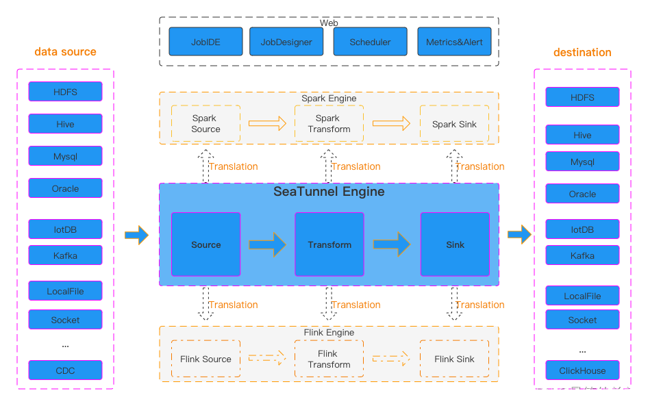
深入理解SeaTunnel:易用、高性能、支持实时流式和离线批处理的海量数据集成平台
深入理解SeaTunnel:易用、高性能、支持实时流式和离线批处理的海量数据集成平台 一、认识SeaTunnel二、SeaTunnel 系统架构、工作流程与特性三、SeaTunnel工作架构四、部署SeaTunnel1.安装Java2.下载SeaTunnel3.安装连接器 五、快速启动作业1.添加作业配置文件以定义…...

项目上线 | 兰精携手盖雅工场,数智驱动绿色转型
近年来,纺织纤维行业零碳行动如火如荼。作为低碳环保消费新时尚引领者,同时也是纤维领域隐形冠军,兰精在推进绿色发展的同时,也在不断向内探索企业数字化转型之道,以此反哺业务快速扩张。 数智转型,管理先…...
102-Linux_I/O复用方法之poll
文章目录 1.poll系统调用的作用2.poll的原型3.poll支持的事件类型4.poll实现TCP服务器(1)服务器端代码:(2)客户端代码:(3)运行结果截图: 1.poll系统调用的作用 poll 系统调用和 select 类似,也是在指定时间内轮询一定数量的文件描述符,以测试其中是否有…...
【VAR模型 | 时间序列】帮助文档:VAR模型的引入和Python实践(含源代码)
向量自回归 (VAR) 是一种随机过程模型,用于捕获多个时间序列之间的线性相互依赖性。 VAR 模型通过允许多个进化变量来概括单变量自回归模型(AR 模型)。 VAR 中的所有变量都以相同的方式进入模型:每个变量都有一个方程式ÿ…...
Spark任务提交流程
1. yarn-client Driver在任务提交的本地机器上运行,Driver启动后会和ResourceManager通讯,申请启动ApplicationMaster; 随后ResourceManager分配Container,在合适的NodeManager上启动ApplicationMaster,此时的ApplicationMaster的…...
python相对路径与绝对路径
9.1 Python 绝对路径与相对路径 - 知乎 (zhihu.com) 目录 1. 绝对路径 1.1 概念 1.2 用绝对路径打开文件 1.2 相对路径 1.3 python路径表示的斜杠问题 1. 绝对路径 1.1 概念 绝对路径 指完整的描述文件位置的路径。绝对路径就是文件或文件夹在硬盘上的完整路径。 在 Win…...
SPSS如何进行基本统计分析之案例实训?
文章目录 0.引言1.描述性分析2.频数分析3.探索分析4.列联表分析5.比率分析 0.引言 因科研等多场景需要进行数据统计分析,笔者对SPSS进行了学习,本文通过《SPSS统计分析从入门到精通》及其配套素材结合网上相关资料进行学习笔记总结,本文对基本…...
)
Python项目实战篇——常用验证码标注和识别(需求分析和实现思路)
前言:验证码识别和标注是现在网络安全中的一个重要任务,尤其是在一些电商平台和在线支付等场景中,验证码的安全性至关重要。本文将介绍如何使用Python实现常用的验证码标注和识别,以便为自己的项目提供参考。 一、需求分析 1、验证…...
MySQL基础(六)多表查询
多表查询,也称为关联查询,指两个或更多个表一起完成查询操作。 前提条件:这些一起查询的表之间是有关系的(一对一、一对多),它们之间一定是有关联字段,这个关联字段可能建立了外键,…...
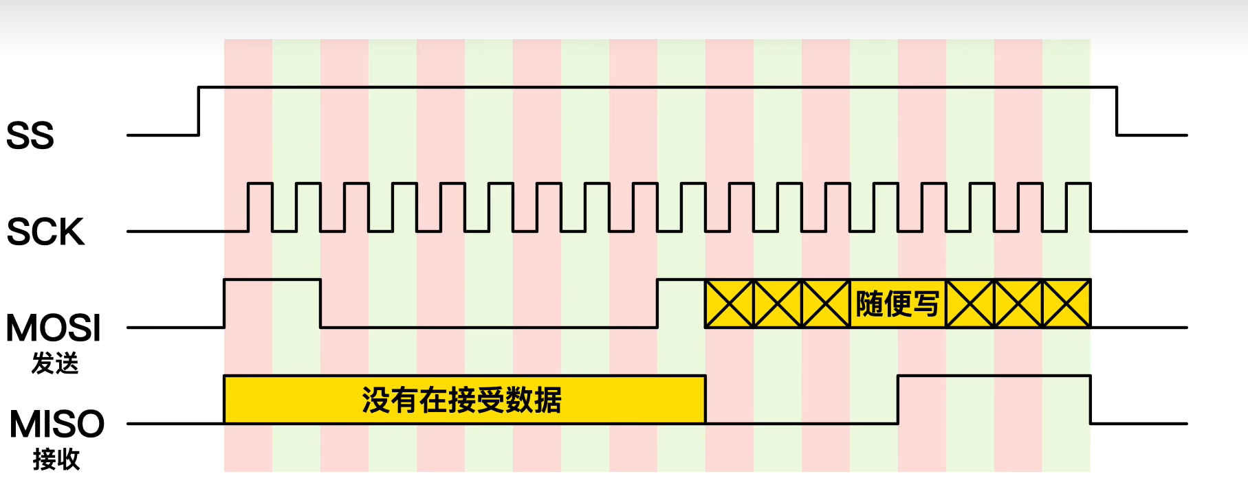
零死角玩转stm32中级篇3-SPI总线
本篇博文目录: 一.基础知识1.什么是SPI2.SPI和IIC有什么不同3.SPI的优缺点4.SPI是怎么实现通信的5.SPI 数据传输的步骤6.SPI菊花链7.通过SPI实现数据的读和写 二.STM32F103C8T6芯片SPI协议案例代码 一.基础知识 1.什么是SPI SPI(Serial Peripheral Interface&#…...
)
7步打造智能农田监测系统:用ntfy实现灾害实时预警(零代码方案)
7步打造智能农田监测系统:用ntfy实现灾害实时预警(零代码方案) 【免费下载链接】ntfy Send push notifications to your phone or desktop using PUT/POST 项目地址: https://gitcode.com/GitHub_Trending/nt/ntfy ntfy是一款轻量级的…...

从‘cl.exe找不到’到GPU编译失败:手把手教你调试MatConvNet安装中的那些经典报错
从‘cl.exe找不到’到GPU编译失败:深度解析MatConvNet安装中的经典报错解决方案 当你在深夜的实验室里盯着MATLAB命令行中不断跳出的红色错误提示,那种从期待到挫败的情绪转换,想必每个尝试安装MatConvNet的研究者都深有体会。不同于常规的安…...

【稀缺首发】2024 Dev Containers兼容性矩阵图:Node.js 20/Python 3.12/Rust 1.78全版本支持状态+已验证镜像清单
更多请点击: https://intelliparadigm.com 第一章:Dev Containers兼容性矩阵图的权威发布与核心价值 Dev Containers(开发容器)正成为现代云原生开发工作流的关键基础设施。为统一生态标准、降低环境配置成本,OpenDev…...

终极免费在线法线贴图生成器:NormalMap-Online完整使用指南
终极免费在线法线贴图生成器:NormalMap-Online完整使用指南 【免费下载链接】NormalMap-Online NormalMap Generator Online 项目地址: https://gitcode.com/gh_mirrors/no/NormalMap-Online 你是否在为3D项目寻找高质量的法线贴图生成工具?Norma…...

Windows文件资源管理器STL缩略图:3D模型预览神器让你告别繁琐查看流程
Windows文件资源管理器STL缩略图:3D模型预览神器让你告别繁琐查看流程 【免费下载链接】STL-thumbnail Shellextension for Windows File Explorer to show STL thumbnails 项目地址: https://gitcode.com/gh_mirrors/st/STL-thumbnail 还在为每次查看STL文件…...

ARMv8/v9异常处理与ESR_EL1寄存器解析
1. ARM异常处理机制概述在ARMv8/v9架构中,异常处理是处理器最核心的机制之一。当处理器执行过程中遇到无法继续正常执行的状况时,会触发异常并切换到对应的异常级别(EL)。异常分为同步异常和异步异常两大类:同步异常&a…...
]初始化策略)
Rust的#[derive(Default)]初始化策略
Rust的#[derive(Default)]初始化策略:简化代码的利器 在Rust中,初始化复杂结构体或枚举时,手动实现Default trait可能显得繁琐。而#[derive(Default)]宏则提供了一种自动化解决方案,让开发者能够轻松为类型生成默认值。这一特性不…...

OpCore-Simplify:如何用智能工具解决黑苹果EFI配置难题
OpCore-Simplify:如何用智能工具解决黑苹果EFI配置难题 【免费下载链接】OpCore-Simplify A tool designed to simplify the creation of OpenCore EFI 项目地址: https://gitcode.com/GitHub_Trending/op/OpCore-Simplify 还在为复杂的OpenCore EFI配置而头…...

告别‘炼丹’低效!手把手教你用TinyViT的‘稀疏软标签’实现快速模型蒸馏
突破计算瓶颈:TinyViT稀疏软标签蒸馏实战指南 在模型压缩领域,知识蒸馏一直是个让人又爱又恨的技术。它能将大模型的知识精华提炼给小模型,但传统方法需要反复调用庞大的教师模型,这种"炼丹"过程不仅耗时耗力࿰…...

LFM2-2.6B-GGUF在运维自动化中的应用:智能解析日志并执行故障修复脚本
LFM2-2.6B-GGUF在运维自动化中的应用:智能解析日志并执行故障修复脚本 1. 运维自动化的新机遇 凌晨三点,服务器突然告警。运维工程师小王从睡梦中惊醒,手忙脚乱地登录系统查看日志,发现是数据库连接池耗尽导致的服务不可用。这种…...